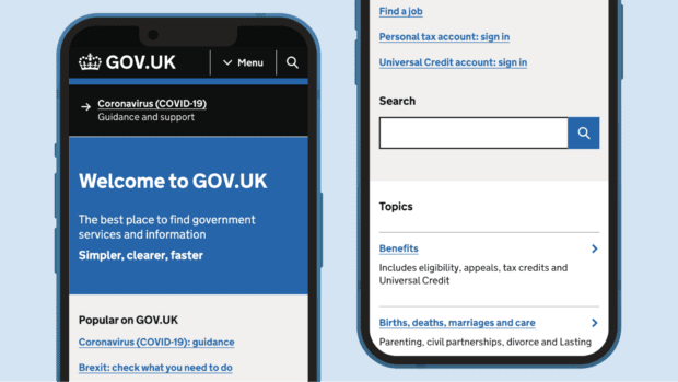
Today we’ve released an update to the GOV.UK homepage. This is the first change to this page for a while, so we wanted to share the thinking behind it.
Why we’re updating the homepage
These homepage updates are part of a broader piece of work to make it easier to find things on GOV.UK. The GOV.UK homepage is used more than 2 million times each week, it’s the front door to the UK government online, and the starting point for many when looking for information and services.
The aim with this iteration is to improve the accessibility and mobile experience of this page. This is particularly important as over the last few years we’ve seen a significant shift in device usage, with GOV.UK now mostly used on smartphones and tablets (74% of measured usage so far in 2021). So while these changes appear subtle on larger screens, on mobile we hope this is a significant improvement.
We also wanted to ensure that the routes to information and services are clear and consistent across the site, and so have aligned the homepage labelling and structure with the new sitewide menu bar.
What we’ve changed
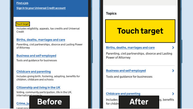
Making touch targets larger
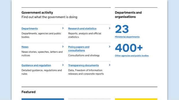
We’ve developed a new reusable page element shown below, this provides a much larger ‘touch target’ when tapping on links.
The touch target is the name for the area of the page you need to tap to follow a link. When these are too small this makes for a really frustrating mobile experience; it can lead to people tapping the wrong link by mistake, or simply abandoning a task on mobile. A range of things can make this worse, such as a smaller phone screen, how you hold your phone, and having a tremor or motor impairment. We hope the more generous touch targets make for a better user experience all round.
Increased spacing between links
In places we’re not using the new page element, we’ve added extra spacing between links, to make them easier to select by touch.
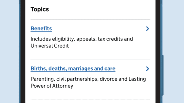
Better routes to specific types of content
Building on our work on the sitewide menu bar, we’re bringing the same groupings of ‘Topics’ and ‘Government activity’ to the homepage. We expect most people looking for services and information to navigate via topics. But people looking for specific kinds of information, like press releases, stats and transparency documents, will have easier access to this content, which is now presented in 5 sections:
- News
- Guidance and regulation
- Policy papers and consultations
- Research and statistics
- Transparency documents
We’ve slightly reduced the width of the search box on the homepage on desktop to free up space, but given the recent addition of a search button to the menu bar site-wide, we don’t anticipate a reduction in the rate of users searching. As with other page elements the search box is now taller on mobile to make it easier to tap to enter a query.
The new elements on this page are not yet part of the GOV.UK Design System. If they prove successful, we’ll explore making them more widely available to teams across government.
What comes next
We’ll continue to make improvements to the page based on usage data. Along with the homepage, we've identified 4 other elements as critical to browsing the site, which are the:
- menu bar
- topic pages
- page-level navigation (breadcrumbs and related content links)
- footer
We’ve been prototyping and testing updates to all of these things so they work together as a consistent system. After the homepage work, the next element we plan to work on is topic pages. Please subscribe to keep up to date with our work.

6 comments
Comment by Richard posted on
Looks good but not sure of the user benefits of including the 'Simpler, clearer, faster' text - it seems to add to the length of the page for no good reason.
How does the text help anyone on GOV.UK and was it user-tested?
If so, I'd be interested to know what users said about it.
Thanks
Comment by Sam Dub posted on
Thanks Richard, glad you like the update. The ‘Simpler, clearer, faster’ line has been on the GOV.UK homepage since 2012 and we haven’t changed this in the update. I can’t speak to the thinking then, but in our research rounds we didn’t see users remark on it, or see it affect their journeys. If you’re seeing this cause confusion for users we’d be keen to know.
Sam
Comment by David posted on
Really glad to see the blogs and updates on this work though do wonder how much departments and content owners are getting to contribute to this work and how users access their content.
The end of the blog mentions making improvements based on usage data but how much does that determine changes? The last blog mentioned prioritising browse over search as it had more use but I'm aware of many regular users of GOV.UK who use Google search in place of browse and the really poor site search. The data may more reflect new users rather than regular users (so not quite the 'average' user journey) who have formed their own habits based on their experience of GOV.UK.
I'm looking forward to improvements to the breadcrumbs as they really don't work the way people expect them to; very confusing to have pages with breadcrumbs and you can't actually navigate to that page using the breadcrumb options shown.
Comment by Sam Dub posted on
Hi David,
Thanks for your kind words on the blogging. Specifically in the case of site search, please be reassured this is on the radar, we know that both are critical parts of the site experience. We’ve done exploratory work to size up what’s required, as you might guess there’s no quick fix on search or we’d have done it by now. As with this browse-oriented work, it will be about building a team with specific expertise who can consistently iterate this important part of the site.
On departmental involvement on this stream of work, I’m really open to suggestions on good ways to do this. We’re currently working through the cross-government content community and managing editors group to work together and get feedback. As an example, we’re working closely with the HMRC and DWP content teams at the moment on updates to some of their topic pages as a test-case for the next phase of this work.
Sam
Comment by Rajitha Ratnam posted on
I feel like the new "Simpler, clearer, faster" banner takes up a lot more space than the previous one on desktop. Is there any way to make this less prominent? I have to scroll down more to get to the topics.
Comment by Sam Dub posted on
Hi Rajitha,
The design does give some of the elements a little bit more breathing room, intended to make the homepage feel simpler and improve mobile experience.
However the blue header hasn’t changed that much, the thing that’s pushed ‘Topics’ lower on desktop was moving the ‘Popular on GOV.UK’ section underneath the blue header, whereas previously it ran in a parallel column.
We were ok with making these changes because scroll depth hasn’t been an issue in our user research either on desktop or mobile, with information overload being a much more common problem. We would be concerned if interactions with the ‘Topics’ section dropped as a result of these updates, it’s one of the metrics we’re watching closely, and will iterate the design if needed.
Sam