Over the summer, we've been exploring ways to improve browsing GOV.UK. Our goal is to get users to their destination faster and to make pages simpler to scan and understand.
We've started with the Business section, to see what we can learn from users of this content to inform a new Browse experience across GOV.UK. As a first step in an ongoing plan to support the Browse redesign, we carried out user research on designs for the first and second level navigation pages.
Some key learnings that we're taking forward from the initial research to inform the ongoing strategy for the Browse redesign include:
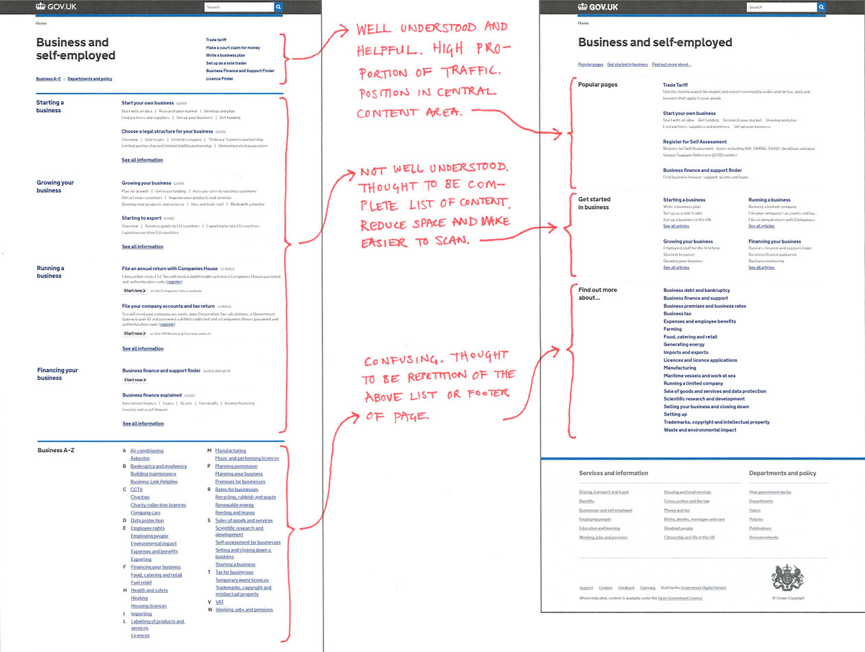
- Users understood the 'popular links' list (the four links contribute 26% of all visits to the Business section). It also helped communicate at a glance the range of content available in this section of the site, as well as key tasks that they might want to do.
- Labels next to the links, which told users what kind of content they could expect to see, were useful and well understood.
- Users thought that the amount of screen estate indicated a visual priority, and that the browse links (‘Starting in Business’ and below) covered all the content available in the Business section. The amount of information on the page overall also contributed to this effect, where users ignored the A-Z as it was too much to take in.
- Seeing how users interacted with our design concept - which was a complete reworking - reinforced to us how important it was to take a systematic approach to the changes introduced to Browse. Introducing the design in small increments means we can measure the impact of each new element on the page and be confident that the changes we are making are the right ones, and iterate the designs if they underperform.
We will share more about the programme of user research to support the Browse redesign in a later post.
Changes following user research
We’re now going to pilot the most promising changes with a new Business browse page on the live GOV.UK site. Compared to the current live page we are expecting time on page, time to content and bounce rates to reduce, and for the visits to pages included in the ‘Popular pages’ and ‘Get started in business’ to increase.
Our plan is to roll out the changes in weekly iterations to test the effect of each change. We will be watching what happens closely by monitoring a range of metrics and applying any lessons to the page design as we progress. The design will continue to iterate and improve and we will share what we learn on this blog.
Coming up...
Step 1
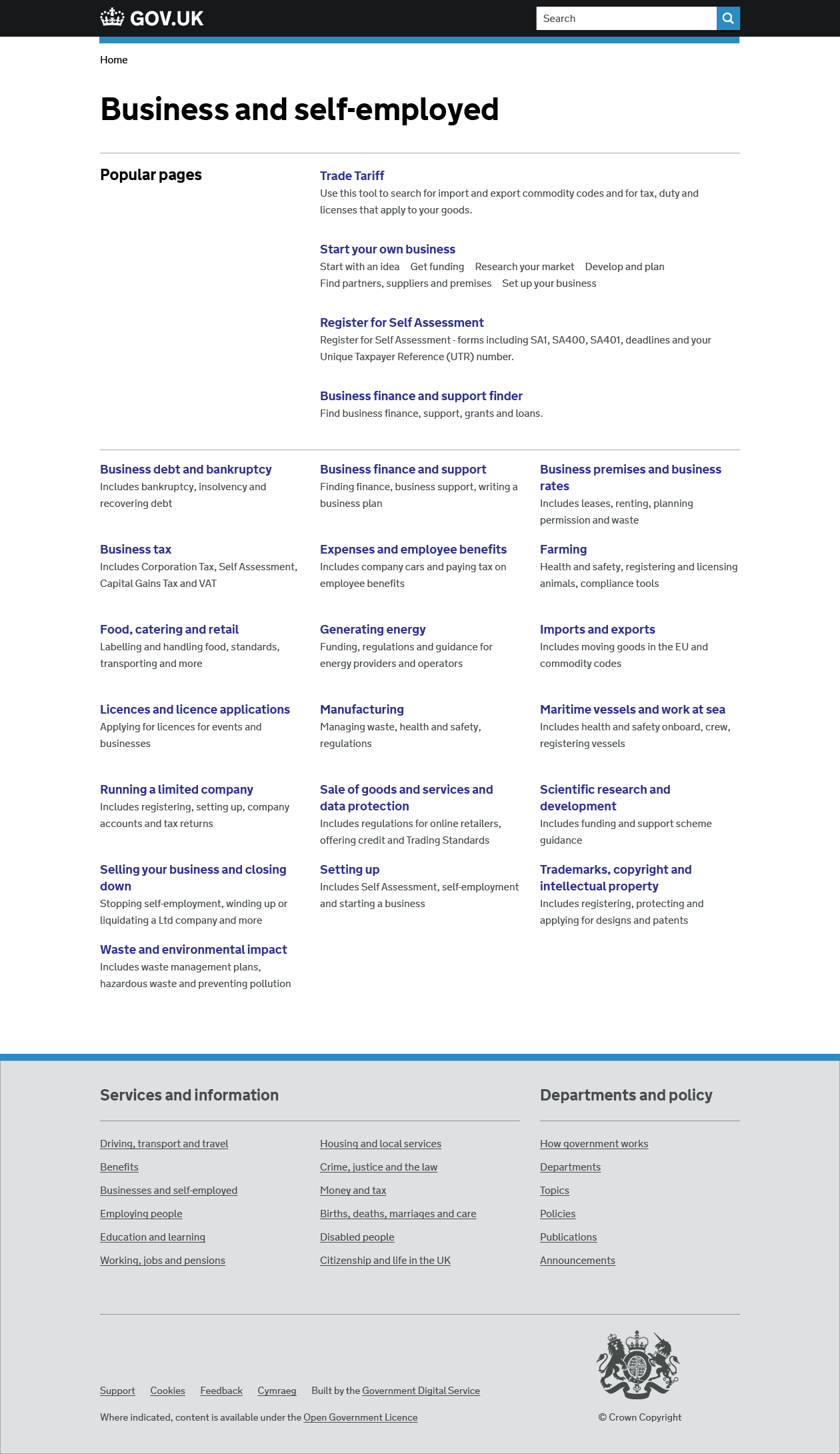
We have replaced the page description with shortcuts to popular content and this is now live. The main goal is to get the majority of users to their destination faster.
Step 2
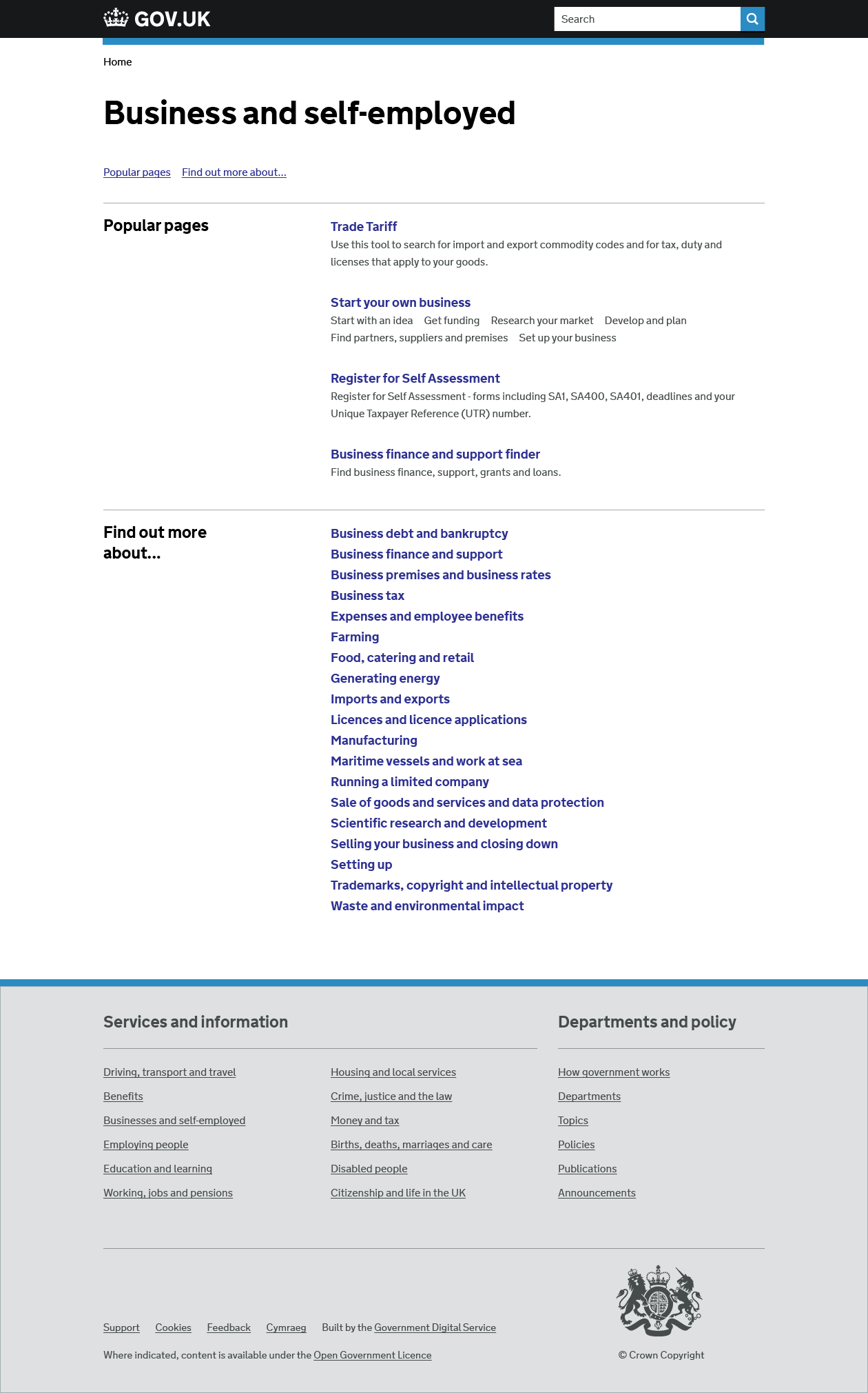
Changing the categories list to a single column and removing the descriptions. The goal is to make them easier to scan and review.
Step 3
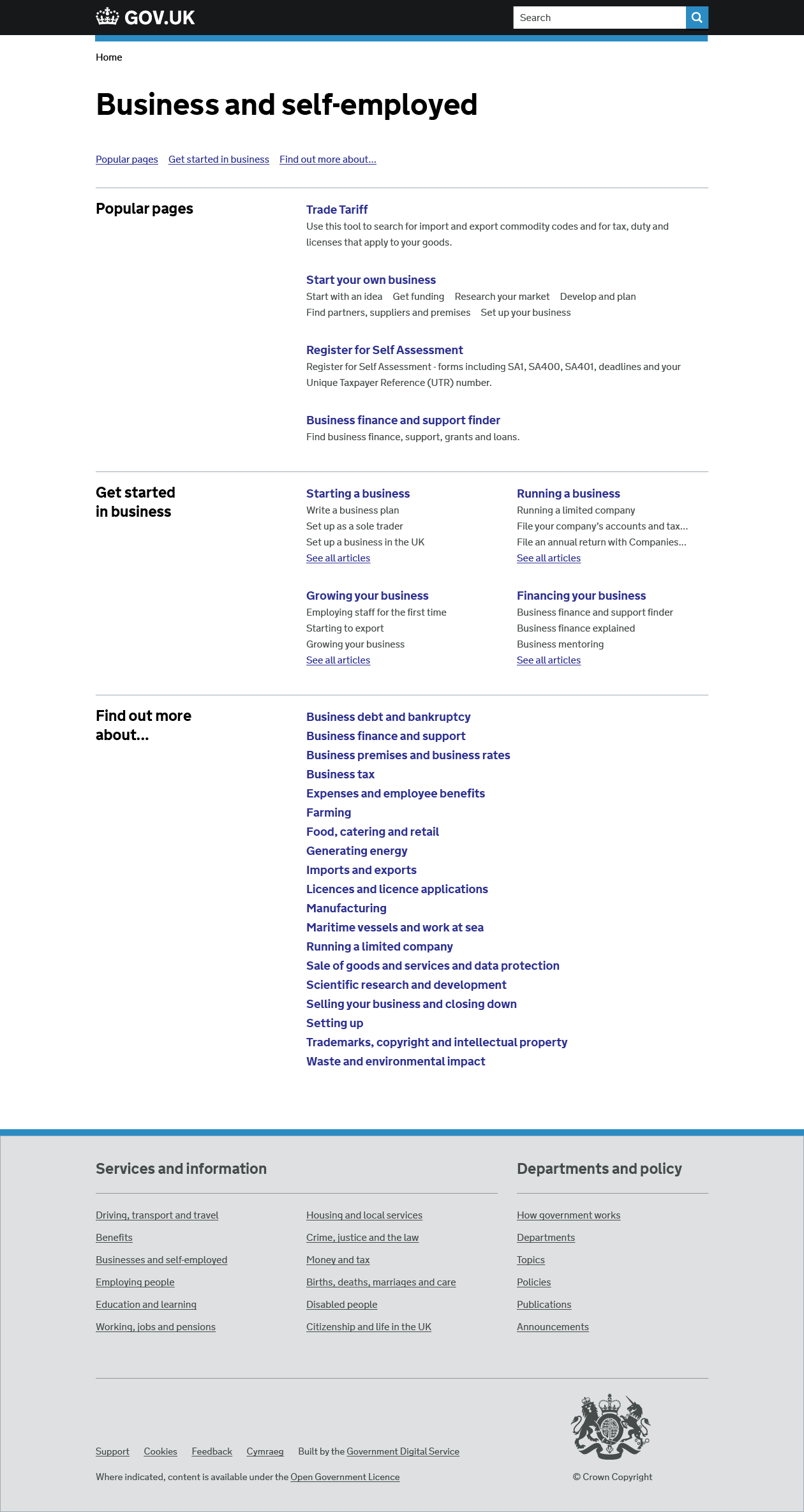
Introducing highlighted content areas. The goal is to support users exploring areas where they may need a range of content.
These changes are only to the page layout. The sub-categories will remain the same throughout the testing. We are working hard on new sub-categories so this update is likely to come after the three iterations mentioned above. For now our focus is what changing the browse page layout can achieve so we can then apply this to other parts of GOV.UK

2 comments
Comment by Andrew Robertson posted on
Thanks for this update. I find it really useful to hear what you're testing, and the feedback you're getting, how you're responding to what you find and continually iterating; quickly.
I'm interested to know if you are testing the browse pages in isolation, or also looking at the 'topic' pages and the 'policy' pages and if users understand the difference?
There seems to be overlap eg Topic 'food and farming' (https://www.gov.uk/government/topics/food-and-farming) and browse page 'farming' under business and self employed (https://www.gov.uk/browse/business/farming). And then there are several government policies associated with farming (https://www.gov.uk/government/policies?keywords=&topics%5B%5D=food-and-farming&departments%5B%5D=all&commit=Refresh+results) and also the publication type of 'policy paper' (https://www.gov.uk/government/publications?keywords=&publication_filter_option=policy-papers&topics%5B%5D=food-and-farming&departments%5B%5D=all&world_locations%5B%5D=all&from_date=&to_date=&commit=Refresh+results)
When I search GOV.UK for 'farming' the topic page 'food and farming' (https://www.gov.uk/government/topics/food-and-farming) is in the first three results. I can't see the browse page in the first few 'services' results. Appreciate this might be a one-off search issue; just wonder if there really is a need to split into topics and browse pages? Or perhaps scope to link the browse and topic pages together?
Thanks
Comment by karenloasby posted on
Hi Andrew,
This particular piece of work is just focused on the browse pages but we have also been thinking about the relationship between browse and topic pages.
I agree that there is potential for confusion. The two pages are trying to do slightly different things for different audiences at the moment. The differentiation might not be enough to justify the separate pages, or we might need to make the distinction clearer. We're at the early stages of planning research around this.
With search, I believe the browse pages don't show up at all. That's also something for us to research, especially as the topic pages do.
Karen