The eagle-eyed among you may have noticed we recently re-jigged the order of items in the header of www.gov.uk/government
Before:

After:

On the top row, "Departments", "Topics" and Worldwide" are the three main ways of viewing all aggregated content about what government is doing, and they do a lot of heavy lifting, so we wanted to list those before the lighter-weight "How government works" and "Get involved" pages.
On the bottom row, "Policies" has been moved to the left to immediately give context to what the /government section of GOV.UK is about, followed by publications which further underlines the proposition (and because it receives a high proportion of traffic). "Consultations" and "statistics" follow immediately after because they are filtered views of the publications page, so should be kept together. "Announcements" being on the right feels fitting, giving it a feeling of being the "latest" in relation to the other links.
We'll keep an eye on what effect this has on user behaviour from the analytics and future rounds of testing.
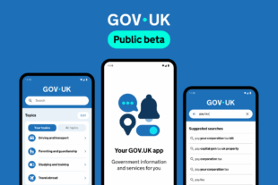
 The GOV.UK app went live in public beta in July 2025. Find out what’s been happening, and what’s coming next,