 GOV.UK site search is one of the main ways people find information on GOV.UK. It’s used more than 4 million times a month. In our strategy for growth, we said we wanted to improve site search to help make it quicker and easier for users to access government information and services.
In October we blogged about how we chose, integrated and launched a new search engine to power site search. Building on that foundation, we’ve now made several changes to GOV.UK’s search interface (where users enter, filter and read search results) to create a simpler, more user-friendly experience.
These updates include a new autocomplete feature, a streamlined design for filters and sorting, and improved readability of search results. This blog post explains these changes and what they mean for GOV.UK users.
Autocomplete
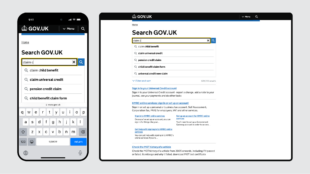
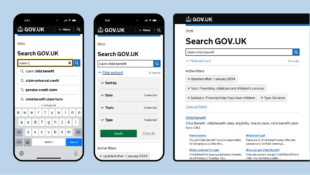
The biggest change we’ve made is adding autocomplete to the search bar across the site. Autocomplete predicts search terms as users type, helping them find the information they need faster and with fewer keystrokes.
Our goal with autocomplete is to make searching on GOV.UK quicker and more intuitive, particularly for users who may not know the exact terms to look for.
The data model behind our autocomplete feature is powered by Google Vertex AI Search, the search product we launched on GOV.UK in February. This model is trained on anonymised user search queries (from people who have consented to analytics tracking), which Google processes and refines to provide relevant autocomplete suggestions.
On the user interface side, we adapted the accessible autocomplete Javascript component - managed by the GOV.UK Design System team - to handle the displaying of suggestions and user interactions.
We made a number of design choices to ensure autocomplete supports users effectively. These include:
- shifting content down when autocomplete suggestions appear, rather than layering suggestions over the page content - this makes suggestions easier to interact with, particularly for people relying on screen readers
- displaying only 5 suggestions to avoid overwhelming users and prevent unnecessary scrolling
- highlighting suggested keywords in bold, as this is a widely used autocomplete design pattern that helps users quickly spot what they’re looking for
- showing autocomplete suggestions only after 3 characters are typed, so that we have enough of an indication of what users could be searching for to provide them with relevant suggestions
Filters and sorting

In the past, search filters appeared on the left side of the page, while sorting options were above the search results. After reviewing analytics data, we found that only a small minority of people selected filters, so we decided to simplify the design to improve usability.
Now, both filters and sorting are in a single panel above the search results. This central location keeps the layout clean and reduces visual noise, allowing users to focus on search results, while still having easy access to filters and sorting if they choose to use them.
We’ve also made changes to improve the usability of the filters themselves. These include:
- replacing the single free-text date field with separate day, month, and year fields to make the format for entering dates clearer and to reduce the risk of errors
- simplifying the filter names to make them clearer and more intuitive
To make the search results clearer and more consistent with the rest of GOV.UK, we introduced several design changes. We:
- added underlines to the titles of search results, in line with other GOV.UK pages, making it clear where users can click to find more information
- increased the font size for search results to be consistent with the rest of GOV.UK, which improves readability and makes information easier to scan
- made the results count less prominent, as there’s a large amount of content on GOV.UK and the results count can overwhelm users
User research and testing
Before launching these updates, we did usability testing to validate that the new features were intuitive and easy to use. We also did a round of user research with the Digital Accessibility Centre (DAC) to ensure that the changes work effectively for users with accessibility needs, and those who use assistive technologies.
For autocomplete, we ran an A/B test on the live site, where we showed an equal proportion of users search with autocomplete and search without autocomplete, so that we could see how search behaviour changed when users had autocomplete suggestions.
We found that:
- autocomplete suggestions were used in 55% of searches (where autocomplete suggestions were shown)
- for searches in which autocomplete suggestions were used, the click through rate (the percentage of users clicking on a search result) was 92%
These figures provided a clear indication that autocomplete was valuable for users.
Next steps
Now the changes to the user interface of search are live, we will continue to closely monitor performance data and user feedback to make sure these improvements are working well for users.
If you have feedback to share about the changes we’ve made to search on GOV.UK please leave a comment or email govuk-site-search@digital.cabinet-office.gov.uk.
Subscribe to Inside GOV.UK to get the latest updates about our work.

5 comments
Comment by Adam Robertson posted on
Looking great, well done team!
Comment by Martin Jordan posted on
Thank you so much for sharing this and also referencing the accessible autocomplete search component on GitHub. The work has come such a long way since the efforts started when we worked on GOV.UK Registers back in 2017 — https://designnotes.blog.gov.uk/2017/04/20/were-building-an-autocomplete/
Kudos!
Comment by Tom Loosemore posted on
Fantastic work on making search auto complete work well for everyone.
Back in 2012 we had take the painful decision to turn it off, as it just didn't work well enough for those who relied on GOV.UK most.
https://gds.blog.gov.uk/2012/10/03/where-has-auto-suggest-gone/?trk=feed-detail_comments-list_comment-text
Very glad to see it back, and this time working in a. truly inclusive way. Well done, all.
Comment by Geraldine posted on
Great work! Looks like a giant leap forward.
"for searches in which autocomplete suggestions were used, the click through rate (the percentage of users clicking on a search result) was 92%"
How did this compare with the non-autocomplete group? Thank you
Comment by Catriona Fraser posted on
Hi Geraldine, thanks! The click through rate was 65% for users in the group that weren’t shown autocomplete.
Catriona Fraser, Product Manager, Search, GOV.UK