We’ve recently been working on a tool called the business finance and support finder.
It’s designed to help visitors find government funding and support for their business and was in need of a review having not been worked on for nearly a year.
Having just finished the redesign, we thought we’d share some of our thinking and findings.
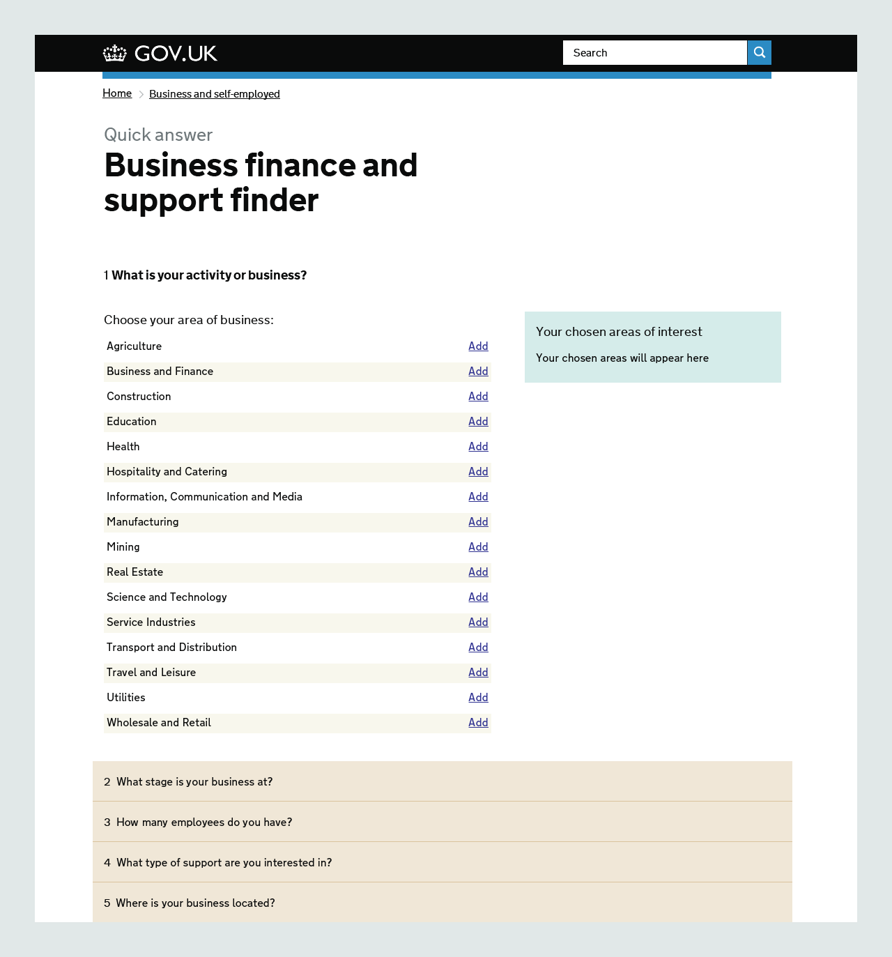
The first iteration of this tool (seen below) had various problems that made it difficult for users to find the information they need. This is mainly because we didn't know at that point what users' would require from the tool.

Research
Looking at the analytics, we made a number of discoveries.
Firstly, many users looking to find financial support would search for 'loans and grants' when in fact they were already on the right place in the site to find these.
Metrics also revealed that while the tool allowed users to select multiple business areas, only 16.9% were actually using this feature, indicating it might not be the best question to lead with.
These issues also likely contributed to the high drop-off rate.
Our approach
We wanted to look at this tool with fresh eyes, so we reconsidered everything, framing our enquiry around the original user need — namely, to find support and finance for your business.
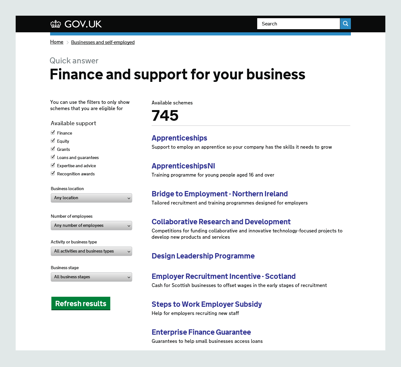
The first thing was the title. 'Business support finance finder' is not the friendliest nor user-facing of names. So we renamed it 'Finance and support for your business'. A jargon-free description of what the tool is actually for in terms that anyone can understand.
We also found the interaction pattern being used was flawed, being based on our smart answer format. This format is a bit overwrought for this tool, which is really just about filtering and drilling down through a list of schemes.
The old version also meant none of the schemes were visible from the outset without significant user interaction.
We like to re-use and not reinvent tools where possible, so we looked around for patterns that could fit. The announcements filtering pattern seemed like a much better mechanism for cutting through large amounts of results and filtering.
What's more it allows us to give all the different business support schemes to the user up front. They can then opt to filter based on their personal situation or preference.
Below is a screenshot from the revised tool.

How well did it test?
Before rolling out any revisions to the live site, we first tested our thinking. We made a prototype and tested this with five people who were in the early stages of setting up a business.
Overall, the users clearly understood how to interact with the tool. The user experience however was compromised by the quality of the data:
- Users felt that schemes should be ordered by relevance and not by a new-to-old date order. This ordering also meant it was hard for them to notice the list updating.
- We thought that showing the schemes meant that the users would understand the tool without being introduced to it. This was not the case.
- Users had difficulty putting their business into one of the offered categories and also weren't always sure what stage their business was at.
Following testing, we updated the tool and changed the result ordering based on relevance. We also added a start page before the tool to introduce users to the proposition.
We will continue to work on refining the category listing and business stage labelling based on further research.
Success criteria
We know enough at this stage to know that our revisions to the tool are a great improvement.
We will know if we’ve truly succeeded with this update based on the following —
- Reduced drop off rate
- Reduced number of relevant term searches from index page
- Schemes appearing in google
Bearing in mind that this is just a first iteration, we will write another post on this in the near future when we have enough usage data and metrics to draw any further conclusions.
In the meantime, you can view the updated tool here.
Amy Whitney and Guy Moorhouse are Designers at GDS
Follow Amy on Twitter: @amosie
Follow Guy on Twitter: @futurefabric
 The GOV.UK app went live in public beta in July 2025. Find out what’s been happening, and what’s coming next,