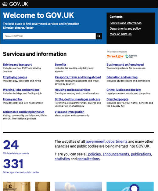
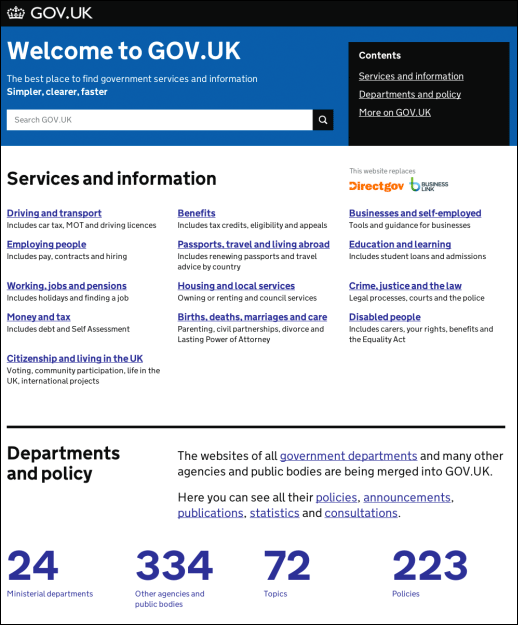
The existing homepage didn't make it clear that government statistics are produced independently of ministers.
We've changed it for a couple of reasons. Firstly, the heading 'Departments and policy' was misleading because the section includes other agencies and public bodies. Secondly, the section also includes information about statistics.

So we removed the 'Departments and policy' heading and only link once to the topics page. As always we will continue to monitor user feedback and data to ensure users understand the new change.

 The GOV.UK app went live in public beta in July 2025. Find out what’s been happening, and what’s coming next,
10 comments
Comment by Richard Albutt posted on
Not convinced this change goes far enough. Logic of the home page structure looks rather broken now that you've removed the heading 'Departments and policy'. Still the label for that section of the page in the Contents box top right.
Needs another label to describe the middle section of the home page. With 159 public bodies on board by July, some delivery bodies bigger than departments, it is time to find a broader term than 'Departments and policy'. Wish I could suggest something.
Is there evidence from user testing that the Contents box on the home page is helpful? It may get lots of clicks but I suspect many think it's main navigation and will take them to another page and not just a short hop down the home page.
Comment by Roo Reynolds posted on
Thanks, Richard.
If you (or anyone) does have better suggestions for a heading that describes departments/organisations/agencies/arms length bodies/etc we'd definitely love to hear it.
This is only a very small tweak, and we are hoping to spend some more time on the homepage.
Comment by Andrew Wiles posted on
"Services and Information" heading is not specific around who is delivering. So would be a better tag be "Policy and Organisations" and then leave users to find the department/agency of interest through search or the middle of the home page.
Comment by Amy Whitney posted on
Hi Andrew,
thanks for your feedback. As Roo said this is only a small iteration - we will be looking at the homepage as a larger piece of work soon. I will make sure the team working on it see your feedback!
Amy
Comment by E.A. Brown posted on
We've been avoiding 'information' in headings for awhile (can't change legacy ones, but in new content mainly) because it doesn't convey much.
The whole internet is information - it's a matter of what *kind* of information that's important. The logic follows the ban on FAQs - If you remove the leading question part, and retaining the rest of the sentence as a heading you end up with good explanatory paras and headings.
Is something similar possible here?
Comment by Nishant posted on
How about moving Search box to the right & "Contents" on the left ? And also reduce the search box size.
Comment by Gillian posted on
It looks a bit odd without a heading. How about 'Departments, agencies and other public bodies'?
Also, there is nothing on the statistics landing page that actually explains about statistics are produced and how they are independent of ministers.
Comment by Roo Reynolds posted on
Thanks Gillian. We're working on the statistics filter, and will be thinking about how GOV.UK can better support the process by which they are produced and how to make that independence clear.
Comment by Tom Birmingham posted on
It looks like a quandary of positioning and font-size, due largely to the legacy of the previous design. The stats are largely for context, therefore placing them uppermost left does not fit with the majority of the audiences (assumed British) left-to-right scanning and reading, because the numbers have little context until the sentence on the right is read and digested.They could also be placed there to draw the eye of people who like numbers, however for these people it matters less whether they're placed to the left or the right, as its the visual draw rather than order or structure.
You'll also note the size of the stats, and the relative size of the accompanying "The websites of all.." text is larger than the text above. In fact the numbers are bigger than any other text on the page, even the main header -- which doesn't make sense.
The whole section is lost without a header / headline tag, which the previous version offered. Because the previous and existing designs of the section are split in to two columns, it makes it awkward to add one. Similar to the 'Services and information' header, you may be better off starting with the header on the left and placing the stats on the right for context, very much like the 'this website replaces directgov & businesslink' logos provides supplementary info.
Once the section is rejigged and the text re-sized, it should make the difficult task of providing a name to the section slightly easier, even if that's for the design to allow the header to fit on one line (rather than 2 or 3).
Departments, agencies and public bodies
Policies, announcements, publications, statistics and consultations must be the produce of departments, agencies and public bodies, therefore these are not required in the header (parent > child). If some sit outside this relationship, or are a main source of user interest, then the next alternative is to have two headers, one on top of the other. Attempting to lump them all together doesn't make sense. Hope it helps and gets you thinking!
Comment by Amy Whitney posted on
Hi Tom,
thanks for your thoughts, this is an iteration on the previous design and we know that it isn't perfect.
We will be looking at a re-design of the homepage soon!