We've changed organisation pages so you can include either what were called 'featured services and guidance' or 'top tasks' links at the top of the page - but not both.
Why these link slots exist
These links exist because we've found some users still come to organisations' home pages expecting to find services as this is what they're used to having to do. They need to be able to find their way to what they need as quickly as possible without being exposed to organisational information that isn't relevant to their needs.
2 layouts
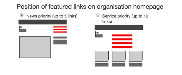
We've redesigned how these links are presented into 2 options you can choose between: 'news priority' and 'service priority' for different kinds of organisations or situations. Only people with 'managing editor' permissions will be able to do this. You'll be able to toggle between the 2 ways of presenting these links. Here's what it looks like in Whitehall Publisher:

The options are best suited to different kinds of organisations. The red lines show where these links will appear on the page design. It's also worth noticing how different the top rows of featured items with pictures are.
Find out how to choose the right layout and what to put in the links.
'Service priority'
These pages have up to 10 links. If you currently have more than 7, consider reducing them. The link to the full list of services and information doesn't count towards the limit if sub-topics are turned on for your organisation.
The links to the most popular services and guidance are more prominently placed than the slots for featuring new content.
This layout suits organisations that have little (if any) news, publishing or policy activity, but a high volume of users with very specific, service-oriented needs. You can still feature new items (eg consultations or reports) but these are given less prominence.
Switching layouts in emergencies
There might be situations where you want to switch from this layout to a 'news priority' layout. A possible example would be the Environment Agency. Most of the time, their users need quick access to a range of services and guidance so this layout would be appropriate.
If floods hit the UK on a large scale they might consider switching to a 'news priority' layout to highlight the single most important item at that time. This would reduce the prominence of the other featured links so this decision would not be taken lightly.
'News priority'
These pages have up to 5 links. They're for organisations whose users need to quickly find their way to other task-related content on GOV.UK or elsewhere (where there's data to support this).
The single big image slot for the first featured content item is intended to be used by organisations where users want to know what the latest or most important new item published by the organisation is. These are more likely to be policy-related organisations rather than organisations that offer services to the public. Users would expect this top slot to change quite often, not be a link to a piece of static content.
Why we're making the change
User research has shown people don't really understand what these links are for, and we've found a bit more flexibility would be helpful. They're also being used inconsistently so this change should make it clearer what they're for.
Existing pages: what will happen to them
Pages will switch over to the new layout automatically. You don't need to do anything.
We're in touch with the 2 organisations who currently have both of the previous types of lists enabled.
 The GOV.UK app went live in public beta in July 2025. Find out what’s been happening, and what’s coming next,
1 comment
Comment by Robin Carswell posted on
Is there any guidance on what the names for these links should be?
I find it quite confusing when some are action verbs ("Apply for xyz") and some are nouns ("Disclosure and information of abc: forms").