The Finding Things team have been working with the Department for Education and agencies to make it easier for people to find what they need on GOV.UK.
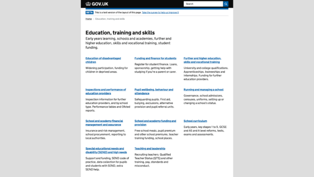
When you look at content related to education on GOV.UK, you might find that the way you navigate around the pages has changed.

New navigation
We’re testing new navigation (browse) structures to help users find what they need. These browse structures use the information from the new taxonomy, which was developed to create user-centred topics, or categories of content in the education theme. Content was then tagged to these categories by departments and agencies.
Only 1 in 10 users saw the new style of navigation to begin with - sort of like GOV.UK’s equivalent of a private beta. This was so we could see how well the new designs worked before making them available to everyone. We've since increased this to 3 in 10 users.
We’ve been testing and iterating these new browse patterns in the usability lab over the last few months. We’ll be blogging about how we decided on the new browse patterns and the many things we decided not to do along the way over on the design notes blog.
What’s next?
We’re measuring the impact of these changes. Based on the data we gather, we'll iterate the new navigation, and increase the number of people who see it as we become more confident that it works. Ultimately we'll retire the old navigation and redirect everyone to the new style navigation.
What about the rest of GOV.UK?
We believe that by taking one area of GOV.UK we can learn what works on a small scale and then work on scaling that approach. We’re already working on another theme, environment, and have 2 teams working on taxonomy and navigation based on what we’ve learnt from education - these are missions in the roadmap for next year.
Want to have a look?
You can opt in to use the new style navigation by viewing the Education, training and skills navigation page.
Holly is a product manager on GOV.UK. You can follow her on Twitter.
 The GOV.UK app went live in public beta in July 2025. Find out what’s been happening, and what’s coming next,