We’re working to make tagging content to the new taxonomy a simple, routine step in the GOV.UK publishing process.
The Finding Things team have been creating the first complete taxonomy for GOV.UK, starting with Education. This taxonomy powers a new navigation which will allow users to find any piece of content on the site by topic.
For this to work, every piece of content on GOV.UK needs to be assigned to a topic based on what it’s about. And for this to be sustainable, tagging content to topics needs to become a seamless part of the publishing process.
This month we launched the first version of the functionality to do this. It’s built into Whitehall, the application government publishers use to get content onto GOV.UK.
The new feature allows publishers (for now, just education publishers) to pick the topic, or multiple topics, that their content is about.
Most importantly, it allows them to be really specific about this.
Education publishers now have more than 150 topics to choose from. Specifying exactly what a piece of content is about, for example, ‘Key Stage 2 Maths’. This allows the GOV.UK navigation to be just as precise, showing users just the content they are interested in.
In this example, it means for the first time a primary school teacher, headteacher, governor or parent can find all the relevant government guidance about a particular subject in one place.
Creating a tagging interface
For publishers we wanted to make the process of choosing the right topic as simple as possible, and explored a number of ways to do this.
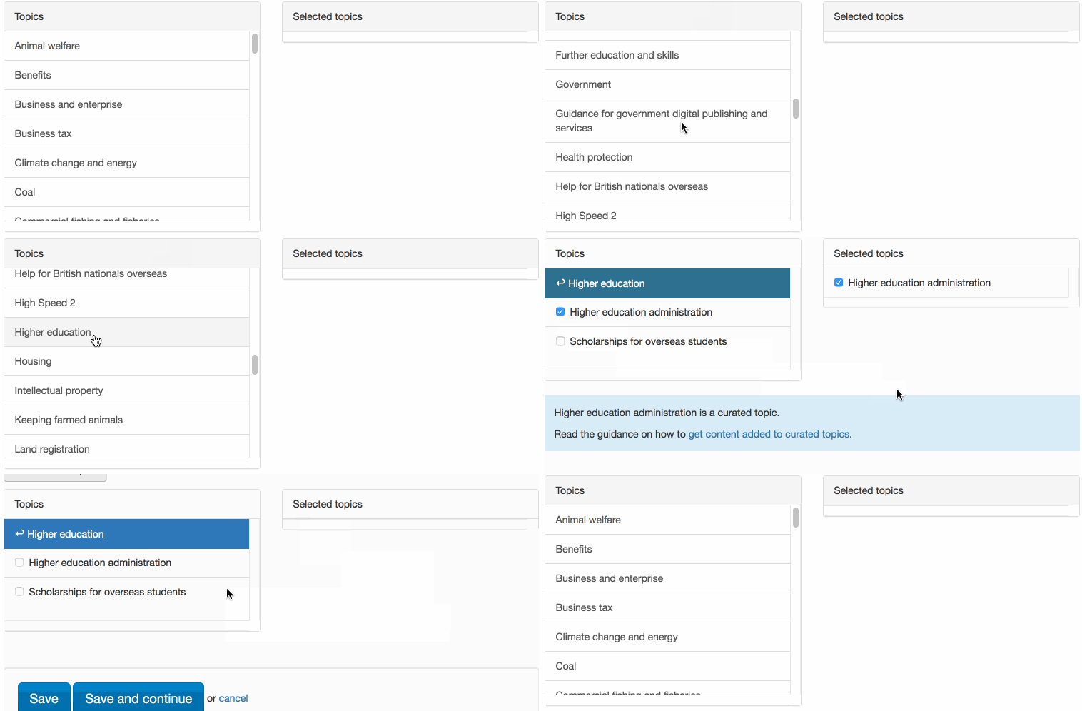
Early in the project, we tested a two column approach:

The first column allowed you to pick a high-level topic, then select any of its sub-topics. The second showed all the topics that had been chosen.
However, we now have a taxonomy with multiple levels, and it's tricky to present a column-view while giving the user the ability to both navigate into a topic, and also select it.
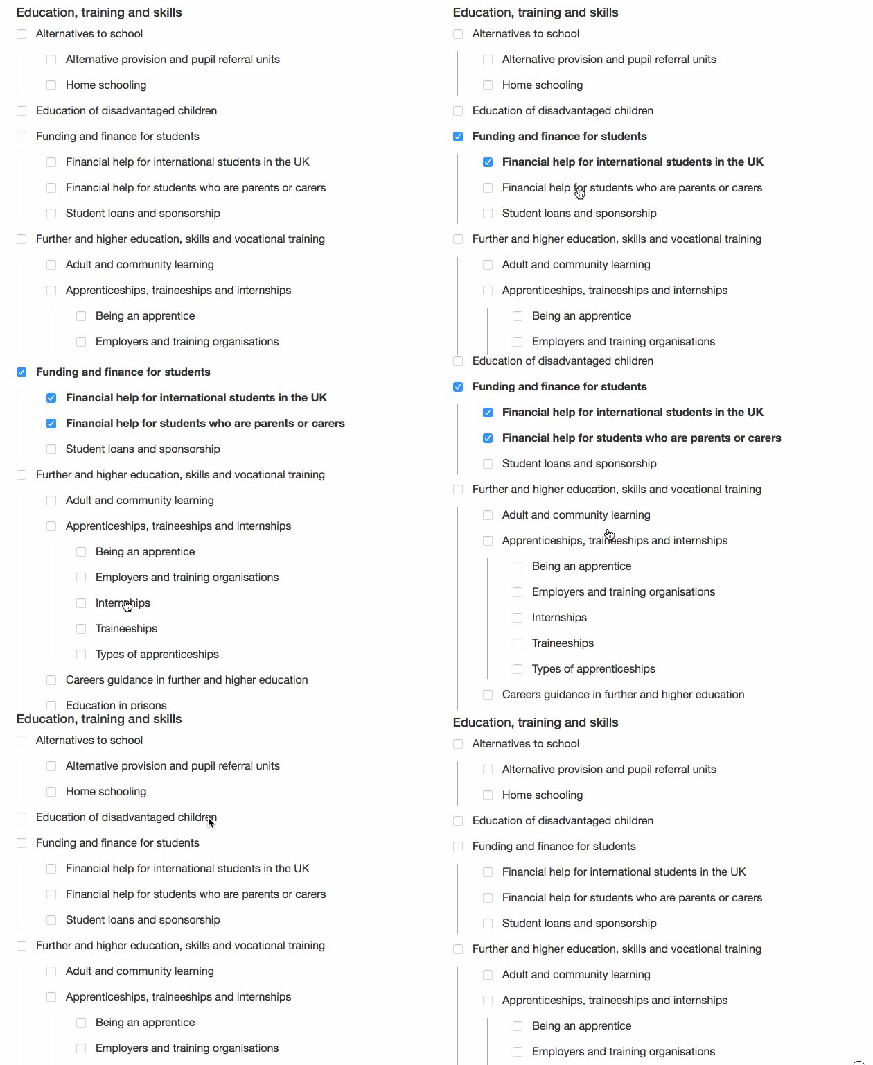
We also found that publishers appreciated being able to see the whole taxonomy at this point - to get familiar with the shape of it, and to see what topics were available.
So we iterated to a ‘tree’ design:

We tested this design with publishers, and they found it easy to scroll up and down the tree of topics and select the ones that they wanted.
We will be iterating on this design based on usage data and publisher feedback. Education is a relatively small part of the new taxonomy we are building, so we will also revisit this design as we add more topics, to check if another design might work better for a larger taxonomy.
Existing tagging options
Many publishers already have the ability to associate certain kinds of content with some high-level tags including policy areas and specialist sectors. And we’re not changing this for now, but as the taxonomy grows we will be looking at how these can these can be consolidated.
What’s next
What’s live at the moment is the simplest tool we could build for publishers to tag accurately and confidently.
We’re helped by the fact that, for now, there is a relatively small set of tags to choose from. With many more subject areas to be developed, we know we’ll need to iterate the tagging tool for a taxonomy that spans multiple subject areas, and in time, all of GOV.UK.
 The GOV.UK app went live in public beta in July 2025. Find out what’s been happening, and what’s coming next,
6 comments
Comment by Jo Smith posted on
You should consider switching to WordPress - it has lots of plugins for this sort of thing.
Comment by Sam Dub posted on
Hi Jo,
Thanks for your suggestion. As you may have spotted we do use WordPress quite a bit, it’s what powers this blog and our new campaign platform. With Whitehall Publisher, the decision was taken in the early days of GOV.UK to build a bespoke application specifically for government publishers. For us it made sense to build tagging into this existing workflow.
Comment by Catherine posted on
Having worked on taxonomies I know how difficult they can be, especially when you have a multi-topic website in which the same search terms can mean different things depending on the topic area they relate to. Changes in government departmental names and scopes of responsibilities make the task harder. For example, in year 1 of a taxonomy allowing the user to filter the search results to hits relating to Department X may get them just the relevant results but come year 5 Department X could no longer exist and the relevant hits may then be spread across two departments. 'Science' is an example of a responsibility area that has moved departments several times over the years. Good luck!
Comment by Sam Dub posted on
Thanks for the words of encouragement Catherine! The challenges you mention are ones we're thinking about a lot.
Part of the answer we think is a taxonomy that's organised into topics that match how users see a subject area. This is something we are developing in each area through research. As you suggest, organisational responsibilities within this are likely to overlap and shift, which we're designing for.
Comment by Tegan Glasheen posted on
If I'm understanding this all correctly, the tagging will dynamically create the topic listings at a top and child (though still navigation) pages. It appears now they are sorting alphabetically. Do you envision weighting or overriding that sorting so that topics known to be most sought could appear first? Does the breadcrumb reflect an IA or a path followed? How would the breadcrumb appear to a visitor coming from a search engine directly to a service-level page?
Comment by Sam Dub posted on
Hi Tegan,
Thanks for your questions – alternatives to the alphabetical sorting of pages is something we're thinking about. We're still in the first few weeks of the public beta, but led by usage data we'll be exploring ways to further improve these navigation pages.
Regarding the breadcrumb, our breadcrumb reflects the IA, so it would be same whether a users browses to a page or arrives via search. In our research users found this useful for orientation and to help them make sideways journeys to related content.