Anyone who's been managing content in the government section in the past few days will have noticed a few changes to the publishing interface.
Here's a quick round-up and explanation of those changes.
Dashboard
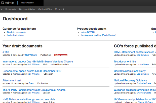
When you log in to the publisher the first screen you now see is a dashboard, instead of the usual list of everyone's documents.

Right now, it gives you:
- quick links to this blog, the product backlog, the helpdesk form and other ancillary things
- a list of your draft documents, so you can easily see your work and pick up where you left off
- a list of the most recent documents that have been force published in your organisation, so you can retrospectively review them
This is just the beginning, though. We have big plans for this dashboard. Over time we will be bringing all kinds of things to your attention here, like other editors' remarks on your content, the status of fact check requests, and notifications of documents newly tagged to your organisation, topic(s) and policies. And, ultimately, we plan to combine data from various sources to give you a view of your users' needs that are not being met as well as they should, so you can take steps to meet them better. All of that will take time, but we hope that the nascent dashboard is already proving useful.
Mandatory fields
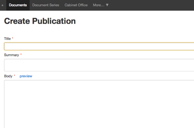
We've always had mandatory fields, but until now there was no way for you to know which fields they were until you saved the page and saw an error. We've now flagged mandatory fields using the ground-breaking innovation of a red asterisk, which should avoid these unpleasant surprises.

Reason for force publishing
You'll also have noticed that when you force publish a document you are now asked to supply a reason. The reason gets added to the document's editing history, so subsequent editors can see why the content was rushed out without being checked by another pair of eyes.
Given that to err is human, force publishing is an extreme act which should be used sparingly. A second pair of eyes review is quick and painless, whereas the consequence of errors on the government's website can be dire, so "we're too busy" is seldom a good enough reason to force publish documents. Force publishing should only ever be used when a document has to be published urgently and there is nobody else around to check it prior to publishing, and force published documents should be retrospectively checked by someone else as soon as possible afterwards. It's reasonable in these circumstances to ask you to supply a short explanation, for audit purposes and to help subsequent editors make a judgement as to how much of a quality review the document may need.
We are going to be analysing the reasons given so we can better understand the circumstances in which force publishing is being used.
Future iterations will include adding validation to catch common mistakes automatically, making the review process quicker and easier still.
 The GOV.UK app went live in public beta in July 2025. Find out what’s been happening, and what’s coming next,
2 comments
Comment by John Ploughman posted on
Nice improvements. Particularly liking the future plans for the dashboard.
Just as a side note, force publishing currently is forcing a reason, but force scheduling isn't.
Comment by Gary Bates posted on
Fields marked with an asterisk are, of course, the most logical and well known way of indicating to the user that the field is mandatory. However, each form should always include a note at the top of the page along the lines of "Fields marked with * are mandatory".