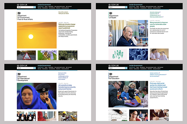
We're really impressed with departmental homepages at the moment. There's some very strong imagery being used, to help engage users and encourage them to explore further.
In this post, we thought we'd feature some examples of best practice – and share a few tips for how to make the most of your images.

Preparing an image (size and bleed)
All images should be sized at 960 x 640 pixels at 72 dpi.
You can resize images using free tools such as pixlr.com, if you don't have photoshop or any other dedicated software.
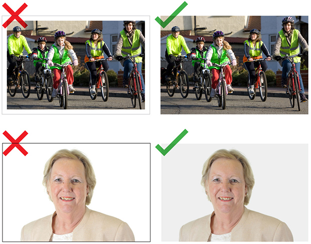
Avoid putting borders or keylines around images – your image should go right to the edge of the frame ('full bleed').
For images with a white background – such as minister portraits – put a light grey overlay on the images to distinguish them from the website's background.

Context and content
Use custom images that are current and suggestive of the story.
For example, if the story is of a minister giving a speech on rail travel you could pick an image of the minister giving the speech, or have an image of something rail travel related. Like this:

Particularly effective images combine both context and content - for example, the below picture was recently used by DfE to illustrate a story about the appointment of a Chief Social Worker for Children by Education Secretary Michael Gove.

Image quality and things to avoid
Use good quality imagery. This doesn't mean images have to be professionally shot - smartphone images are acceptable to use if the quality is sufficient.
If you don't have access to a photo library, great places to start looking are:
- Flickr Creative Commons pages (Go to the advanced search section and click ‘Only search within Creative Commons-licensed content.’)
- Google images (Go to search tools and click on 'usage rights' to find creative commons images)
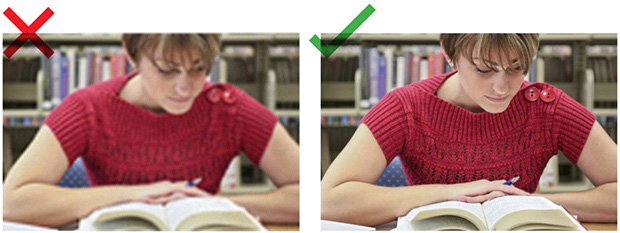
Whatever image you use, it should not be overtly blurry, grainy, stretched, pixelated or badly lit.

Avoid overusing obvious stock photography like the ones below as they can look cheesy and false. Try not to say too much with the feature images. When in doubt keep the image simple, the subject clear and let the article tell the whole story.

Also avoid using images of marketing material containing a lot of text. In instances like this try use the main image from the marketing material and put the relevant text in the story title and description.

Image attribution
You must always attribute images.
Attribution should appear at the bottom of the content page that the image is associated with, or under the image itself (NB it isn’t currently possible to put text attribution on organisation homepages).
For Creative Commons images, link to the original photo with the person's name and link to this licence with the words ‘Creative Commons’ - eg:
[Photo above by John Smith on Flickr. Used under Creative Commons.]
Read further guidance on image copyright issues.
 The GOV.UK app went live in public beta in July 2025. Find out what’s been happening, and what’s coming next,
10 comments
Comment by Rod posted on
I really like the new GOV.UK homepage.
Just one thing, the three new feature images under depts and policy...
- How government works
- Get involved
- Worldwide
...seem counter-intuitive compared to the rest of the site, where every other photo has an active hyperlink to the story.
Also is "Read more" acceptable as link text? I'm genuinely curious as all guidance on accessibility and seo suggests otherwise?
Cheers
Comment by Graham Francis posted on
Thanks Rod, I'll pass these comments on to the product team.
Comment by Paula Powell posted on
Your section on image attribution mentions that all images need to be attributed which I agree with. However, some images we use are from commercial photo libraries such as Shutterstock. Is it ok to attribute a commercial organisation on the .GOV website?
We have had advice from the National Archives who are responsible for Crown copyright and they stated that we should attribute commercial organisations but please could you clarify the situation from a .GOV.uk perspective.
Thanks
Paula
Comment by Graham Francis posted on
Hi Paula - it is OK to credit commercial organisations, if those are the terms of your agreement with them. However, you should check with the organisation to see what's needed - with some agreements, no crediting is necessary.
Comment by Andrew Robertson posted on
That's helpful, thanks. Do you have similar guidance for the use of video?
Comment by Graham Francis posted on
Hi Andrew -
No, we don't have any guidance on video usage - but it's a good idea. We'll look into it.
Comment by Dan Elmont posted on
Hi,
Are you going to provide any further guidance on the format and colour mode of the images? I think that some digital editors asked to add images are not going to know that they need to be RGB or a JPEG or PNG formats.
I have also found that not all images on GOV.UK pages are 960 x 640 pixels. For instance on the Cabinet Office page images can be found at 960 x 622 and 960 x 624.
Thanks
Comment by Amanda Kerry posted on
Re: (NB it isn’t currently possible to put text attribution on organisation homepages).....
How, therefore, should we attribute an image for a piece of content that's featured on our org homepage, but isn't used on the document itself?
Thanks
Comment by Graham Francis posted on
Hi Amanda - if attribution is needed, you should probably also feature it within the document, and attribute it there. Would that work?
Comment by Colin posted on
The suggested attribution for Creative Commons licensed images isn't correct. It is important to be clear that "Creative Commons" is not a licence, but an organisation that creates and maintains various licences each of which have different restrictions. It is vital to indicate which licence is used, in-text, rather than rely on the URL (which doesn't appear on a print-out). The licences vary by restrictions imposed, and by version. For example "Creative Commons BY-SA 3.0".
The guidance (here and elsewhere on the gov.uk standards) should be amended to ensure the specific CC licence used is made explicit. Also the text above suggests a link to the CC BY-NC-ND 3.0 licence is required, when of course a link to the relevant CC licence is required.
It would be more helpful if the example was realistic and actually had a link to a real photo combined with the photographer's name.