You might have noticed that the design of GOV.UK hasn't changed much for a while. Or at least, not visibly.
A lot of the work we've been doing has been behind the scenes. For example, experimenting with how to organise the 300,000 pages on GOV.UK to figure out how to make the navigation and search work better for users. Or designing admin workflows for local authorities and councils to make sure the GOV.UK links to their local services are working.
But our work is about to get more visible. For the first time you'll truly be able to navigate GOV.UK by subject area, rather than siloed according to the website it was on before it moved to GOV.UK.

We’ll be writing in more detail about these changes over the next few weeks. Here’s some more detail on how we got to this stage.
Rebuilding and redesigning our infrastructure
We had to rebuild and redesign our tagging infrastructure and tools. Previously this was done separately in each publishing app, making it impossible for publishers to see how any of the content fitted together. The new tools give us a single, complete view of the website.
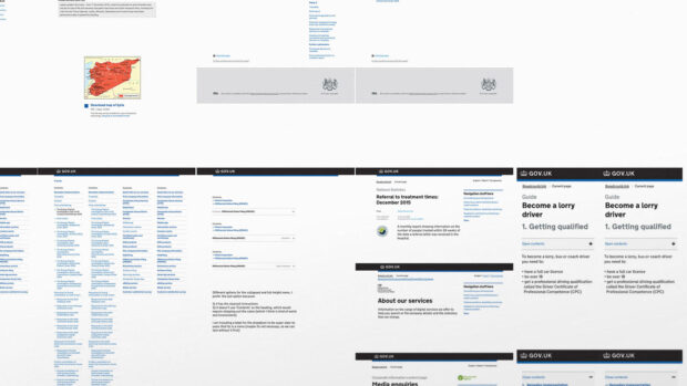
To actually get the new navigation displaying on GOV.UK, we had to get the HTML into the page templates. Because of the original architecture of GOV.UK we used to have over 140 different page templates. Even if most of them look really similar, it still would have been very slow and expensive to iterate the navigation across that many templates. So we've been auditing and aligning the design across them, reducing duplication and unnecessary differences.

This is a huge job, but it's going to let us roll out new features and experiment with the design quicker and with way less risk, and make it faster to adopt patterns being developed by the rest of GDS and the cross-government design community.
And to test this work we've had to rebuild our A/B testing framework. The previous version was implemented using javascript in your web browser - it worked OK for small things like button text, but wasn't appropriate for bigger design changes. We'll be putting the new framework to good use in the future.
We’ll keep iterating
It's taken a lot of time and development work to get to this point. The flipside of that is we've had plenty of time in the user research lab to make sure it works.
That said, no amount of lab testing can simulate the breadth of complexity contained in GOV.UK and the needs users have of it. If you see something new that doesn't work as well as it should, let us know using the beta banners on the new pages, or by commenting on this blog post. It'll be a lot simpler for us to improve it now than it has been before.
We’ll be blogging more specifically about the features, research and design of the new education taxonomy and navigation soon.
Mark is Head of Design for GOV.UK.
 The GOV.UK app went live in public beta in July 2025. Find out what’s been happening, and what’s coming next,
3 comments
Comment by Anonymous ex-Directgover / Businesslinker. posted on
"For the first time you'll truly be able to navigate GOV.UK by subject area, rather than siloed according to the website it was on before it moved to GOV.UK."
Directgov and Businesslink already did this (albeit across two site rather than one) before GOV.UK replaced them, and that was about ten years ago. 🙂
Comment by Mark Hurrell posted on
Hi Anonymous ex-Directgover
GOV.UK always allowed you to navigate the 3000 items of content that were formerly be on Directgov and Businesslink by subject area.
The work this post is talking about is integrating that navigation with the other 300,000 web pages and 250,000 PDFs that make up the rest of GOV.UK.
Thanks, Mark
Comment by Adrien posted on
Could you guys share more details about the new A/B testing framework? Thanks.