At Government Digital Service, everything we build must be accessible. It’s one of our design principles, 'This is for everyone':
Accessible design is good design. Everything we build should be as inclusive, legible and readable as possible. [...] The people who most need our services are often the people who find them hardest to use. Let’s think about those people from the start.
Accessibility acceptance criteria are one of the tools we use to make sure our user interfaces are accessible.
What are accessibility acceptance criteria?
They are a list of conditions that a user interface must meet to be considered accessible. They help us raise awareness of access needs and maintain accessibility as we iterate.
GDS has used acceptance criteria for years (for example, this 2015 Verify blogpost about acceptance criteria and in the 2014 GOV.UK style guidance), so formalising and expanding the accessibility-related acceptance criteria seemed logical.
Be aware that accessibility acceptance criteria alone won’t make your service accessible – read more guidance on building an accessible service.
Raise awareness
Accessibility acceptance criteria raise awareness about what accessible means in a specific context. They’re more specific than general accessibility guidance, such as the Web Content Accessibility Guidelines (WCAG).
By drafting the criteria upfront, we are forced to think about accessibility and the range of users from the start.
Maintain accessibility
Accessibility criteria also help us maintain accessibility as we iterate. Without them, it’s easy to introduce accessibility regressions when iterating on interfaces.
Even when we know an interface has been built well, and that effort went into making it accessible – how do we make changes without breaking accessibility? What stops our new definition of accessibility from being incomplete or different to the original definition?
Outlining accessibility issues in criteria helps us record the decisions that were made in earlier iterations and allows us to define the rules that keep something accessible.
Examples of accessibility acceptance criteria
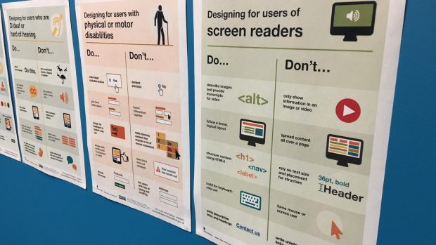
Accessible autocomplete on GOV.UK
At GDS, we first used accessibility acceptance criteria when building the accessible autocomplete in January 2017. The team working on this (Theodor Vararu, Léonie Watson and Ed Horsford) defined the autocomplete accessibility criteria – the necessary behaviours that an autocomplete needs to meet to be usable by assistive technologies. The field with autocomplete must:
- be focusable with a keyboard
- indicate when it has keyboard focus
- inform the user that it is an editable field
- inform the user if there is a pre-filled value
- inform the user that autocomplete is available
- explain how to use autocomplete
- inform the user that content has been expanded
- inform the user when there are matches, or if there are no matches
- inform the user how many matches are currently available (optional)
- inform the user as the number of matches changes
- enable the user to navigate the available matches using touch or keyboard
- inform the user when a match is selected
- inform the user which number the currently selected match is - for example, 1 of 3 (optional)
- inform the user if a match is pre-selected
- enable the user to confirm the selected match
- inform the user when a match is confirmed
- return focus to the editable field when a selected match is confirmed
Translation component on GOV.UK
When we link to a translation of a GOV.UK page, we identify the following criteria:
The translation navigation links must identify the language of the link for correct screen reader pronunciation.
While this is true for all words that are in a different language, it is especially important to consider in the context of this component. Here there is a high risk of introducing an accessibility barrier.
Banner component on GOV.UK
On banners that place white text on a blue background, the criteria we use highlights the importance of contrast ratios:
The banner must have a text contrast ratio of at least 4.5:1 against the background colour to meet the WCAG AA guidelines.
While all text must have a sufficient contrast ratio, this component’s use of colour has an increased risk of introducing a barrier.
Writing accessibility acceptance criteria
These are the guidelines we use for writing accessibility acceptance criteria.
Start with accessibility needs
Identify where there is a high risk of introducing an accessibility barrier and include criteria that prevent it.
If similar things already exist, review them and test them with users who have access needs. For example, the original criteria for the accessible autocomplete were derived from tests made by Theodor Vararu (a frontend developer in the autocomplete component team) on existing autocomplete libraries.
Often, the hard work of defining what accessible means has been documented in guidelines like WCAG. Extract rules that are specific to what you’re building and link back to the guidelines to give context. Consider which rules are most easily broken and give them prominence.
Don't be too generic
Criteria are useful if they are specific and testable.
When we began writing accessibility acceptance criteria for components, we had difficulty knowing what to include. For example, with components that contain links, should the criteria list everything that makes a link accessible? How much of this becomes a reproduction of existing guidelines?
For the translation component, it was helpful to create a shared definition of an accessible link that we could link to. This avoided diluting the criteria while giving us a place to record more generic decisions.
Don't define the solution
Like acceptance criteria in user stories, accessibility acceptance criteria describe an outcome rather than the solution.
The criteria should give room for interpretation and allow designers and developers to make improvements over time. Ideally, if technology or designs change, the criteria will still apply.
For example, in the banner component criteria, we state the required contrast ratio, but we do not limit the design with implementation specifics such as font size or colour.
Iterate criteria
As something is built and tested, continue to refine your criteria as you find missing needs. When accessibility bugs are found – a browser bug, a screen reader quirk, new technology misbehaving – add further criteria and treat them like a failing unit test.
What next?
Writing accessibility acceptance criteria for user interfaces on GOV.UK is a new practice which we will continue to refine and build process around. We’ll include accessibility acceptance criteria in our component guides and developer documentation (see the contents list component for an example).
We're also keen to hear from others who’ve used accessibility acceptance criteria (or something similar), and what they’ve found – please leave a comment.
Paul is a senior frontend developer on GOV.UK. You can follow him on Twitter.
 The GOV.UK app went live in public beta in July 2025. Find out what’s been happening, and what’s coming next,