Over 700,000 people receive email updates from GOV.UK. These notifications help people find out when government information they’re interested in changes. At GOV.UK, we’re working on making it easier for people to sign up to receive the notifications they need, when they need them.
People sign up to receive updates for very different reasons. Some subscribers need to know when guidance changes, so they can ensure they are compliant with it. People working in the healthcare sector can sign up for alerts about safety recalls of specific pharmaceutical products and medical devices. Others simply subscribe out of personal interest.
Regardless of the reason why people get updates, they need to know what they’re going to receive when they sign up. Subscribers need notifications that are both relevant and timely.
Helping people to understand what they can sign up for
There are a number of different ways that people can sign up for GOV.UK email updates. You can sign up for notifications about a specific topic, build a more bespoke subscription by filtering down to a list of results in one of our finders, or sign up to notifications from a specific government department.
This variety means that we currently send email updates to over 9,400 unique mailing lists, with many more combinations available - potentially millions. Many combinations are obscure. For example, users can sign up to get notifications about ‘announcements related to the British Library, Employment and Nigeria’, which is unlikely to ever trigger an update. Over 3,000 of our lists have never sent an alert.
We know that users value flexibility in subscription choices. However, this flexibility creates complexity, which can occasionally cause confusion and lead to a mismatch between what users think they’re signing up for and what they actually get. This can be problematic, especially when users start to receive updates that they don’t need. So how do we help them sign up for just the content that matters to them?
Running a design sprint
At the beginning of the project we ran a design sprint. We began by defining our goal: to helps users sign up for the right thing first time round, so they receive relevant notifications, when they need them.
We reviewed existing approaches to automated notifications, taking inspiration from sources such as Wikipedia, GitHub and The New York Times. Then we sketched ideas for how we might design an improved sign up flow and subscription management interface. We then used these ideas to build a prototype.
We’ve been testing and iterating this in the lab, while we work to rationalise the technical architecture behind our email alerts service that will enable us to make changes to the live site. So, what have we learnt?
Helping users subscribe to the right thing, first time round
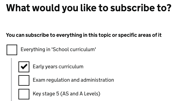
We know that people value choice when signing up for updates. Someone signing up for notifications about the national curriculum might only be interested in changes affecting primary schools. So, we built an explicit step into the sign up flow offering users the opportunity to make their selections more specific to their interests.

This approach worked well for content tagged to the new education taxonomy on GOV.UK. Users could browse content in different topic areas, and then make an informed decision about whether it was relevant to them, before signing up for updates.
Rules about the number of topics within a given layer of the new taxonomy meant that users weren’t overwhelmed with too many choices when signing up. The topics generally made sense to people and users appreciated the opportunity to refine their selection when signing up to a broad topic
Stretching design patterns
Applying this approach to other areas of GOV.UK exposed some interesting design challenges. At present, people can receive updates from different departments, but there is no option to choose specific areas of interest. We want to introduce choice here, but the underlying information architecture complicates this.
Departmental content is tagged to different policy areas. Typically, the majority of content is tagged to a few areas. For example, 80% of content from the Department for Work and Pensions is tagged to three areas: welfare, employment and pensions. However, there is a ‘long tail’ of DWP content tagged to an additional 36 policy areas, content that some users might need updates about.
There is a balance to strike between enabling people to make meaningful choices about what they receive, and not overwhelming them with too many options. There is also a clear interdependence between our information architecture and design. We are working hard to develop a single site-wide, subject-based taxonomy, which will allow us to implement our new approach to email updates across the range of content on GOV.UK.
If you currently subscribe to GOV.UK email updates and want to help us to improve them, please get in touch.
Michael is a user researcher on GOV.UK. You can follow him on Twitter.
 The GOV.UK app went live in public beta in July 2025. Find out what’s been happening, and what’s coming next,