The Modelling Services team recently blogged about the launch of step by step navigation. This is a new navigation pattern that shows users all the content and transactions they need to complete a service, on GOV.UK and beyond.
We realised that one of the most important stages of building step by step navigation is mapping a user’s journey through a service. This enables us to understand the journey in as much detail as possible, including the different routes a user can take. It allows us to identify the parts of the journey the step by step navigation should cover and the content we should include.
However, we also realised that there are other times journey mapping could be useful beyond building step by step navigation. For example, a department could use a service map to understand a user’s likely journey to and from their content. Or the process could provide valuable insight for a content improvement project, exposing gaps or highlighting where external content already meets the user need.
So, we want to share the process we’ve been using to map service journeys. As we start to use this design pattern more widely on GOV.UK, we’ll learn new ways we can improve this process. But for now, it’s a good starting point.
Mapping a user’s journey through a service
We chose ‘Learning to drive a car’ as our first use of step by step navigation. As we mapped the journey, we discovered 5 main steps we needed to follow to complete this process:
1. Collate all the content items around a theme
We started off by working out what content we might need to include. We took a broad-brush approach, looking at all the content around the theme of ‘driving’, knowing that we could always refine it later on. We looked at:
- browse lists, especially curated browse lists
- mainstream guides, because they often describe the steps to complete a service
- any relevant external content
We also used Google Analytics data to find content on our theme by searching for URLs that contained keywords related to our theme, and to understand which pieces of content are viewed the most.
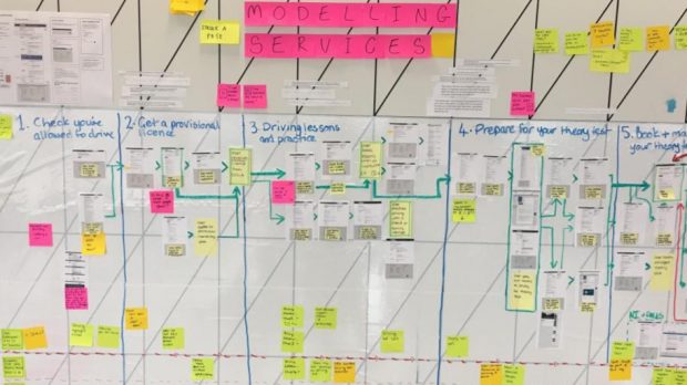
2. Print off all the content items and stick them on a wall
Next, we printed off screenshots of all the content items. Having physical copies allowed us to lay them out, move them around and see what content types the journey contained. We began to form an idea of the journey’s complexity and any possible variations it may involve.
We also kept a spreadsheet listing all the content items so we weren’t at risk of losing our work.
We stuck the printed content items to the wall, and spent time as a team discussing each step and moving the content into tasks roughly in the order they need to be done. We used arrows to indicate dependencies, as well as any non-linear or branched parts of the journey.
3. Group and categorise the content
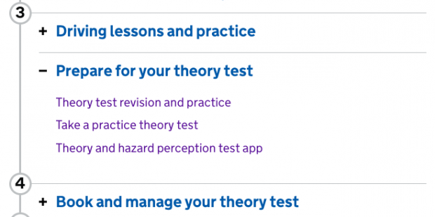
The step by step pattern requires us to split the content into tasks and subtasks. A subtask is a chunk of the overall journey that a user would be able to do in one sitting – for example, ‘Practising vehicle safety questions’ is a subtask of the task ‘Driving lessons and practice’.
We quickly realised that not all of the content was essential to the journey. We found that, broadly, it fell into one of 3 categories:
- primary tasks all users need to do to complete the journey (for example, take a driving test)
- secondary tasks that some users might need to do (for example, complain about a driving instructor)
- guidance or context around how to do the secondary or primary tasks (for example, the ‘Theory test: cars’ guide)
Grouping the content in this way helped us work out what content we should prioritise in the step by step navigation, and what content we might not need.
4. Audit the content titles
It’s important that the content we link to from the step by step navigation is clearly titled so users can easily decide if they need to read it. This might mean using link text that differs from the title of the page it links to.
Action-oriented titles are good, such as ‘Apply for your first provisional driving licence’. This content can be part of the step by step navigation as is.
Titles like ‘Theory test: cars’ aren’t as good. It’s not clear why a user would need to use this content. So we used ‘Theory test revision and practice’ as a clearer, more descriptive link text in the navigation.
Our testing so far has shown that this doesn’t confuse the user, as they understand that the link text relates to the specific task they're doing.
5. Iterate and iterate again
Throughout the mission we reiterated the journey map based on our user research. This involved:
- re-grouping content
- removing some less essential steps
- adding new ones we didn’t know about before
Doing this helped us to simplify and improve the final journey we presented in the task list.
Doing the hard work to make it simple
Our testing of the step by step navigation prototypes often taught us that less is more, with simpler, stripped-down task lists faring better in the labs. However, it was still very useful to map out the process with a wide range of content. This gave us a fuller idea of the possible journeys users could take, so we could optimise those journeys within the step by step navigation.
What’s next
As well as ‘Learning to drive’, we’ve now mapped and designed step by step navigation for more complex journeys (for example, getting a divorce) and tested these in the lab.
We’ll keep improving on the mapping process this quarter and beyond. We wholeheartedly encourage others working on services to try this out and see how it goes … and to let us know where it can be improved!
Gabrielle and James are content designers on GOV.UK.

2 comments
Comment by David Chassels posted on
You lot so out of touch with supporting user technology sticking post it notes on a wall......try digital mapping then click to have first run to test and play with....UK Sport had for 15+ years low cost high efficiency and of course constant change supported.
See https://bpm.com/bpm-today/in-the-forum/5919-is-process-modeling-less-important-with-low-code-bpm
Comment by James Butler posted on
Hi David, and thanks for your suggestion. It sounds like digital mapping/process modelling suit you best, but we find Post-its work well for us, particularly in an office where we have a lot of wall space and like to make our teams’ work visible. Working on a wall can be a useful first step during collaborative work, before building a digital map.