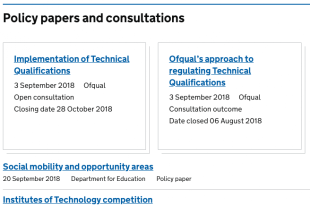
Over the summer, GOV.UK's content pages and site navigation team improved the 'supergroups'. These are buckets of document types that help users pick relevant content from topic pages.
Supergroups are currently used as headings in navigation, like 'News and communications' and 'Guidance and regulation'. They help users make sense of the different content types on GOV.UK when picking from a list of links. The supergroups contain subgroups, which describe specific document types, for example statistics or news stories.
However, we had some feedback suggesting they needed some changes. We used a number of data sources to improve the names of the supergroups and subgroups, as well as which content types appear in them.
We had some feedback about the labels from lab sessions, for example "government doesn't publish news". As qualitative data, while it was useful it was also necessarily subjective and limited. With labels and other explanatory text on navigation pages, it can sometimes be complicated to identify what’s not working and why.
Combining data sources
We tree-tested the existing version. This involves asking users where they would click if they were looking for a particular type of content in an imaginary task. We ran it as a survey on GOV.UK which allowed us to gather thousands of responses over a few days.
Interpreting these responses required looking across several tasks because with quantitative data from the tree-testing, it's not always clear why people are making their choices. As a method it's also limited because respondents cannot see examples of content in the supergroups, which they would normally be able to see.
By combining qualitative insights from the lab with quantitative insight from tree-testing, we learned:
- some users found the term 'alerts' misleading because they thought it referred to email alerts
- terms like 'transparency' and 'incident reports' can be misleading without context
- 'engagement' did not mean much as a label to users
We also drew on helpful feedback from colleagues across government who expected to see certain content types in different sections than they currently appeared in. We've been able to fix these.
Next round
After coming up with what we hoped was an improved version, we ran another round of tree-testing with the same tasks. This was so we could benchmark and identify if the change was an improvement.
Some tasks remained unchanged but others showed significant improvement. For example, users were able to understand 'Research and statistics' well. We also changed the 'Services' group to include task-focused, 'mainstream' guidance. This seems to match users' understanding of what 'services' means.
One change we did not make was changing 'News and communications' to 'Announcements and updates'. We considered this in response to feedback that "government doesn't publish news".
However, tree-testing showed that while users found 'Announcements and updates' as clear as 'News and communications', they were taking longer to choose 'Announcements and updates' with similar accuracy compared with the previous round of testing. So we're sticking with 'News and communications' to help people find what they're looking for more quickly.
Alan is a senior content designer on GOV.UK.
 The GOV.UK app went live in public beta in July 2025. Find out what’s been happening, and what’s coming next,
1 comment
Comment by Lucy Kennedy posted on
Thanks for this post, Alan - really interesting stuff!