GDS' mission is to design and protect the user experience of government. GOV.UK is not only used by 11 million users each week, but also by over two thousand civil servants to publish information in more than 700,000 pages.
This means there’s a lot of content on the site, with thousands of items edited and published every week. This content includes critical and life-saving content relating to everything from COVID-19, taxes, or receiving emergency consular support.
Most civil servants publish content on GOV.UK using a tool called Whitehall - a bespoke content management system. This is one of our main publishing applications and is home to around 80% of the content on GOV.UK.
As part of the work of the GOV.UK publishing team, we regularly iterate and improve Whitehall to ensure it meets user needs. From our user research, and analysis of performance data in Google Analytics, we noticed that one of the highest errors for publishers was uploading images so we wanted to see how we could improve this.
By making it smoother to upload, errors were reduced by a third. This makes it easier for civil servants to use images in their content and saves time. Meaning important government content is published quicker, helping users get information faster, clearer and in a more engaging way. Also helping improve accessibility issues for those with reading difficulties or using assistive technology.
This is part of our strategy work, particularly our focus on reducing the complexity of our publishing tools. Something we’ve blogged about before and will blog about again so watch this space!
What the problems were
Uploading images
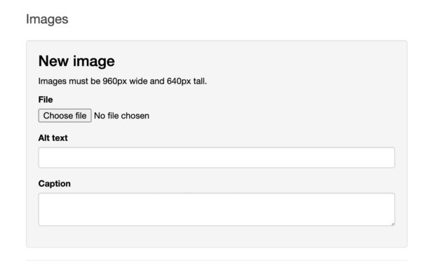
Previously, adding images into Whitehall was complicated. For starters, the image prompt was located in the middle of a long page which was filled with required and optional input fields that generated the structure of a GOV.UK page. Publishers sometimes made mistakes and would have to re-enter information, slowing the publication process. We noticed that many errors were from uploading an incorrect file type, as well as uploading images that were in the wrong dimensions.
In the latter case, a publisher would come across an error message if the image’s dimensions were not exactly 960 pixels by 640 pixels. Even if they had inputted all the fields correctly. In order to proceed in the document creation process, publishers would need to find a third-party tool to then resize images to those specific dimensions. As a result, images would sometimes appear distorted or pixelated just so they could adhere to those strict image dimensions.
Deleting images
We also realised that deleting an image caused further frustration for users of Whitehall. This was because we were using a numbered process, where every image uploaded to a document was given a number that a user then added in markdown for the image to appear in the final draft. When a user deleted an image, everything had to be reordered and their page updated manually which wasted time and effort.
How we approached the problem
To help solve the problems identified, we ran a design 'charrette', an activity to help us generate as many design ideas as possible within the team in the shortest possible time. We brought together 10 people from various disciplines, including a user researcher, a delivery and a product manager, a front and a back-end developer, along with a couple of content designers.
After becoming familiar with the problem space, we ran a 5-minute rapid sketching session following which everyone shared their sketches on how they would go about designing a possible solution. Even though each participant’s approach was influenced by their respective discipline, common patterns and ideas were present. We explored and refined these further, while ensuring that they not only abided by interaction design best practice but were also viable.
We worked in an agile way, starting small and building incrementally, so before starting technical implementation, we broke down the various design ideas into a number of phases. This allowed us to prioritise features based on a combination of user needs and complexity of implementation.
How it works now
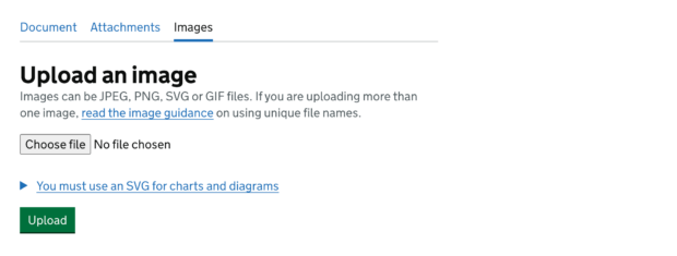
A dedicated tab for uploading and managing images
We have streamlined the workflow, so that images no longer have to be uploaded on the edit document page. Instead, they now appear on a dedicated tab once a new document has been saved. This dedicated images tab allows publishers to upload images and manage those that have already been uploaded. For instance, publishers can make any necessary adjustments to the image and copy the image’s unique markdown code.
Cropping images
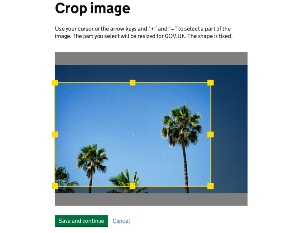
Whitehall now allows publishers to upload images greater than 960 pixels wide by 640 pixels high, with the ability to crop images to the correct aspect ratio available within the publishing application.
An updated markdown identifier for images
The issue of having to update markdown identifiers when an image is deleted or replaced has also been addressed. The application now uses the uploaded image's filename and type as its markdown identifier, rather than a numerical value. This change should help publishers ensure the correct image appears in the right place in their document, as well as removing the task of having to update image markdown.
Alt text
We take accessibility seriously and we aim to be world-leading. This is to ensure that pages on GOV.UK can be viewed and understood by all users equally. In line with our content guidance we have removed the alt text field and suggested that alt text descriptions should be added to the main body copy instead. This means the description is available to everyone.
What’s next?
Since launch, there has been a 33% reduction in errors in relation to everything images within Whitehall. We’ve also heard great things from users including the following from a content designer at the Department for Environment, Food and Rural Affairs:
We don’t have to spend too much time requesting properly sized images or resizing images using third party software – the process is much more streamlined!
We’re not stopping here though! We are committed to continuing to improve the experience for publishers on GOV.UK, and want to keep iterating to make the process easier.
We will be exploring further work on images, such as changing the lead image, replacing images or bulk uploading. We are also looking at how we can build on our previous work by refining the wider process of adding, uploading and changing content.
If you have any questions or feedback about this update or publishing, you can email publishing-service-feedback@digital.cabinet-office.gov.uk.
We are also running regular sessions to test our ideas and learn from government publishers. If you’d like to take part in user research, sign up through the Google form or by emailing us.
Subscribe to Inside GOV.UK to keep up to date with our work.


 The GOV.UK app went live in public beta in July 2025. Find out what’s been happening, and what’s coming next,
19 comments
Comment by Sach posted on
👍
Comment by Kevin posted on
> In line with our content guidance we have removed the alt text field and suggested that alt text descriptions should be added to the main body copy instead. This means the description is available to everyone.
So rather than use the method outline in internationally recognised standards to support assistive technology, you feel that you are good to come up with your own approach?
There is a high chance that if users are not asked to add alternative text (and possibly taught what it is all about) then they won't bother adding it at all. Also, a text explaination of an image isn't programmatically associated with the image in the same way that alternative text is, so the context is likely to be lost for assistive technology users. Finally, the text on the page is likely to not be structured in such a way as to support a description of an image so it adds more textual clutter which can make it harder for some readers.
Comment by GOV.UK Publishing Team posted on
Hi Kevin,
We are continually trying to improve GOV.UK and make sure that it works for everyone. As well as regularly auditing the site, we work with other users with access needs and accessibility is a core part of our service standard.
Our approach is for GOV.UK, and we understand that those creating information online need to carefully decide if the image needs to be described using alt text. For example, decorative images will not need alt text. For GOV.UK, our guidance (https://www.gov.uk/guidance/content-design/images) advises that by describing the image in the body text, we can make sure the page is accessible to as many people as possible.
We will continue to do more user research and make any necessary adjustments as needed.
Best, GOV.UK Publishing Team.
Comment by Andrew Rainey posted on
Are you able to show any examples of your new approach to Alt Text please?
Just when I look at the images on the blog its still using Alt Text so wondering where I could see this in action?
Thanks
Comment by GOV.UK Publishing Team posted on
Hi Andrew,
Yes, for an example you could look at is: https://www.gov.uk/government/publications/direct-and-indirect-health-impacts-of-covid-19-in-england-emerging-omicron-impacts/direct-and-indirect-health-impacts-of-covid-19-in-england-emerging-omicron-impacts
Best,
GOV.UK Publishing Team
Comment by Andrew Rainey posted on
Did you test this new approach to Alt Text with screen reader users and how did they get on?
Seems like when I tried to use JAWS it ignored the image and description completely on this page
https://www.gov.uk/government/news/nda-hosts-competition-to-find-cyber-experts-of-the-future
Comment by GOV.UK Publishing Team posted on
Hi Andrew,
Thank you for your comment. We based our approach on trying to make GOV.UK as accessible to as many people as possible. By describing the image in the body text, this description can be accessible to people using magnification or custom colour schemes, as well as those using screen readers.
We will continue to do more user research and make any necessary adjustments as needed.
Best, GOV.UK Publishing Team
Comment by Guy Hickling posted on
You say "In line with our content guidance we have removed the alt text field and suggested that alt text descriptions should be added to the main body copy instead. This means the description is available to everyone."
Does this mean that you are going to monitor and test all images and ensure that content authors have actually done as you suggested. Or is this actually going to result in authors not wanting to putting the text on the page, but now they can't put it in the alt text either so will end up excluding blind people from images completely! Think about it - why would an author want to describe an image in text on the page, if the image is already shown visually anyway???!!! That would just clutter up the page with duplicate information.
Your intentions are good, but if you think you should go against an entire industry of accessibility guidance and start forcing a totally different solution of your own, then you need to ensure it happens. Don't just take away from blind people without enforcing the alternative solution! If you are not prepared to make the investment in testing your alternative happens, then reinstate the alt text field so that those content authors who understand accessibility can actually use it for the purpose it is intended for.
Comment by GOV.UK Publishing Team posted on
Hi Guy,
Thank you for the comment. At GOV.UK, we are always working and looking to improve the site.
Our approach is for GOV.UK, and we understand that those creating information online need to carefully decide if the image needs to be described using alt text. Our guidance is that by describing the image in the copy, we are making the descriptions available to all users, for example people using magnification or custom colour schemes, as well as those using screen readers. We chose not to do both to prevent audio clutter and content repetition.
We will continue to do more user research and make any necessary adjustments as needed.
Best, GOV.UK Publishing Team.
Comment by Chris posted on
Would be interesting to know what end-user testing has been undertaken with customers, and how this influenced the decision to remove alt-text.
Comment by GOV.UK Publishing Team posted on
Hi Chris,
Thank you for your comment. For GOV.UK, our guidance advises that by describing the image in the body text, we can make sure the page is accessible to as many people as possible. Our guidance is that by describing the image in the copy, we are making the descriptions available to all users, for example people using magnification or custom colour schemes, as well as those using screen readers. We chose not to do both to prevent audio clutter and content repetition.
As well as regularly auditing the site, we work with users with access needs and accessibility is a core part of our service standard. We will continue to do more user research and make any necessary adjustments as needed.
Best, GOV.UK Publishing Team
Comment by Sean Loraas posted on
This practice goes against years of development and best practices that provide image descriptions for individuals that cannot perceive the image. This will take us back to those individuals not knowing if the image is fully described in the text or not, leaving them with that old anxiety inducing question, "What am I missing?" By the fact that someone was mindful to include an alt text description, those who use assistive technology such as screen readers, are reassured that they aren't missing something important that those with vision only can access. I would encourage you to reconsider the removal of this important accessibility feature. By relegating this feature to the honor system, which for the vast majority of content creators have rarely if ever described their visuals, you are sending the message that it's not important enough to be a feature.
Alt-text descriptions make it possible for a huge number of people to have access to the information provided by images. I am not expecting those people who have always left out the full descriptions of images, infographics, charts, etc... to start editing their content and add full image descriptions. It is better to require the Alt Text Description field be populated in order to post content.
Comment by GOV.UK Publishing Team posted on
Hi Sean
Thank you for your comment. We want to make sure GOV.UK is accessible to as many people as possible.
For GOV.UK, our guidance advises that by describing the image in the body text, we can make the description available to as many users as possible - for example people using magnification or custom colour schemes, and also those using screen readers. We chose not to do both, as we wanted to prevent audio clutter or content repetition.
Our guidance is for GOV.UK, and we understand that those creating information online need to carefully decide if the image needs to be described using alt text.
We will continue to do more user research and make any necessary adjustments as needed.
Best, GOV.UK Publishing Team
Comment by Beverley Gormley posted on
Please reinstate the alt text field, and include the description in the main body of text. This makes it accessible for everyone, By removing the alt text field and only adding the description to the text body you aren't improving accessibility. It needs both.
Comment by GOV.UK Publishing Team posted on
Hi Beverley
Thank you for your comment. For GOV.UK, our guidance advises that by describing the image in the body text, we can make sure the description is accessible to as many people as possible. We chose not to do both to prevent audio clutter and content repetition.
We will continue to do more user research and make any necessary adjustments as needed.
Best, GOV.UK Publishing Team
Comment by Clive Loseby posted on
Alt Text and Captions / Descriptions have different, although overlapping roles. Alt Text is about as basic as you can get in terms of web accessibility and yet so many people fail at this hurdle. Not because it is difficult but generally through lack of awareness and education.
In addition, the phrase "decorative text" is open to interpretation and not adding alt text to images that someone may consider decorative, can lead to viewers who have both cognitive and visual disabilities not fully understanding the content of a page.
Did you not consider that, by removing such a fundamental tenet of accessibility in this way and presenting it as a progressive move and, in effect encouraging others to do the same, is going to reduce awareness of website accessibility, rather than improve it?
I am all for innovation in web design and understand that you must have worked extremely hard on improving your internal systems but I am extremely concerned at the damage this will do. I would urge you to have a rethink on this aspect of your development.
Thank you
Comment by GOV.UK Publishing Team posted on
Hi Clive, thank you for the comment.
We are always working on GOV.UK, and trying to improve the site and we will continue to do more user research and make any necessary adjustments as needed.
Our policy is for GOV.UK, and we understand that those creating information online need to carefully decide if the image needs to be described using alt text. For GOV.UK, our guidance advises that by describing the image in the body text, we can make sure the description is accessible to as many people as possible. We chose not to do both to prevent audio clutter and content repetition.
Best, GOV.UK Publishing Team
Comment by Alexis Bushnell posted on
We're any of the people on the team for these decisions disabled? Were any accessibility experts hired to ensure that your solution was indeed in line with your claim to "take accessibility seriously and... to be world-leading"? Because the outcome would strongly suggest not.
The alt text field exists for a reason - the fact nobody on the team knew this is astounding and says a lot about how much you actually value accessibility.
Comment by Liam posted on
This seems to have totally misunderstood what alt-text and the purpose it serves.
You’ve confused alt-text (what would I be looking at if I could see it) and captions (why am I looking at this). They are different and serve different purposes.
The example given to Andrew features non-compliant alt-text. You can’t just say ‘this is a chart’ you need to describe what the chart shows. As a sighted user I can perceive it: your alt text wouldn’t help me if I couldn’t.
Why would you try to work outside of of agreed W3C best practice and agreed international standards.
Your ‘captions’ are not programmatically aligned with the image. This will just confuse assistive technology.
Nothing about this makes sense.