![]()
As of today, GOV.UK has a new crown in its logo. This blog post explains why we’ve made the change and how we’ve done it.
Why the crown has changed
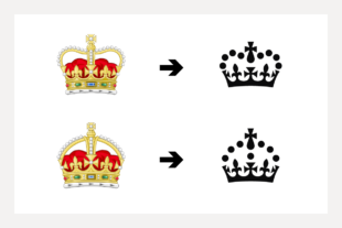
In September 2022, the College of Arms announced His Majesty King Charles III’s Royal Cypher, which features the monarch’s chosen crown. This Cypher features the Tudor Crown, rather than the St Edward’s Crown chosen by Queen Elizabeth II following her Accession in 1952. Her Royal Cypher was itself a change from her father King George VI.
On each accession, the monarch will choose a Royal Cypher, or symbol to represent their personal authority. You can see the Royal Cypher in many places, for example post boxes, on police and military uniforms or on the side of official buildings.
Forms of the crown are being gradually updated across government to reflect the monarch’s choice of crown, featured in His Majesty’s Royal Cypher. This includes GOV.UK, the digital home of the government, which is a hugely important part of public life in the UK. The GOV.UK crown is one of many official instances of the crown so it forms one part of this change. For this work, we’re focusing on instances of the GOV.UK logo which do not include the Royal coat of arms or government departments’ crests.
How the crown has changed
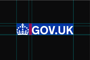
We wanted to create something that was faithful to both the official heraldry and the visual identity of GOV.UK. We redrew a simplified version of the crown, making sure it appeared clearly at smaller sizes and lower resolutions. The different proportions of the new crown meant we had to subtly tweak the GOV.UK logo’s typography and spacing to complement it.
We worked with the Government Communication Service (GCS) and the Royal Household to confirm the final version.
Rolling out the new crown
GOV.UK’s crown is an important part of GOV.UK’s brand, which is one of the most recognisable digital services in the UK according to YouGov. It has not been updated since the site went live in 2012, so we had to work out how to implement this change in a consistent and ordered way.
Once we had the new designs, we needed to roll it out across GDS-owned instances of the GOV.UK crown. This included the GOV.UK homepage, the sitewide menubar, and GDS owned apps, like the Identity Checker App.
However, this change is a cross-government effort. Although GOV.UK looks like a single thing to users, it’s made up of multiple different website domains, which are owned by various government departments. These departments are required to update the crown in their locally owned services and channels.
The GOV.UK Design System makes it possible to do this in a consistent way through its centralised open-source codebase, GOV.UK Frontend. The Design System team updated the crown in versions 5.1, 4.8 and 3.15, to make sure that services using older versions of GOV.UK Frontend can update it as easily as possible.
We’re taking a phased approach to implementation, starting with the sitewide menu bar and homepage, and seeing it rolled out across GOV.UK in the next 2 weeks.
It’s live
With huge thanks to teams across government, today is when the new crown is seen for the first time across GOV.UK.
It first went live on the GOV.UK homepage and in the sitewide menu bar. You can also see it in other GOV.UK domains such as campaign.gov.uk and blog.gov.uk.
Departments are making changes to their services between today and 1 March. During this time, users may see both new and old versions of the crown.
We also want to thank GCS for their support and for leading the wider changes to symbols of state; thank you.
If you need support
If you’re from a government department you can get support to update to the latest version of the Design System. You can also ask any questions directly to the Design System Team on:
- cross-government Slack: #govuk-design-system channel
- email: govuk-design-system-support@digital.cabinet-office.gov.uk
If you want the logo in an image file for internal instances of the GOV.UK crown, please email govuk-design-system-support@digital.cabinet-office.gov.uk.
Subscribe to Inside GOV.UK to find out more about our work.
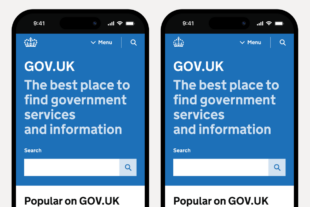
This post was updated on 21 February, 2024, to amend the image comparing screenshots of the GOV.UK homepage on a mobile device. The previous image showed incorrect formatting of the page’s strapline.

13 comments
Comment by Jonathan C posted on
The font appears to have changed also: the line break in "services and information" has moved.
Comment by Richard Blackledge posted on
Hi Jonathan,
Thankyou for your comment and for highlighting this. We have looked into the issue and it has now been fixed.
Thanks,
Richard
Comment by Love preet singh posted on
Very good 👍
Comment by Martin posted on
https://insidegovuk.blog.gov.uk/wp-content/themes/gds-blogs/favicon.ico is still the old icon, and there is a wild link rel="shortcut icon tag that uses it.
Comment by Richard Blackledge posted on
Hi Martin,
Thankyou for your comment and for highlighting this. We have looked into the issue relating to the favicon and it has now been fixed.
Thanks,
Richard
Comment by Shushma posted on
Both of us get the two ninety nine support money in the family or one of us as we are a couple
Comment by Richard Blackledge posted on
Hi Shushma,
Thanks for getting in touch. It looks like your question relates to the Cost of Living Payment. More information about the payment is available here: https://www.gov.uk/guidance/cost-of-living-payment. If you have a further question relating to a Department for Work and Pensions policy you can contact the DWP ministerial correspondence team here: https://www.gov.uk/guidance/contact-the-department-for-work-and-pensions-about-its-policies.
Thankyou,
Richard
Comment by Muhammad Arslan Haider posted on
That's good.
Would you also change the crown in copyright image, a unicorn and a lion wearing Elizabeth crown.
https://www.nationalarchives.gov.uk/information-management/re-using-public-sector-information/uk-government-licensing-framework/crown-copyright/
Comment by Laura Yarrow posted on
Hi Muhammad,
Thanks for getting in touch.
The work referred to in this blog post is specifically about instances of the GOV.UK crown and GOV.UK logo, which do not include the Royal coat of arms or government departments’ crests.
Best,
Laura Yarrow, Head of Design, GOV.UK
Comment by Sruthi Kunjupillai posted on
The new crown logo favicon has 2 dots, whereas the main logo on the Header has 3 dots. Is this an intentional change to fit the logo in the browser tab?
Comment by Chris Ballantine-Thomas posted on
Hi Sruthi,
Thanks for your comment. The shape of the crown in the favicon is formed by fewer dots to ensure the logo renders as clearly as possible in a smaller size.
Best,
Chris Ballantine-Thomas, Senior Interaction Designer, GOV.UK Design System
Comment by Charles Ian McDonald posted on
I would be interested to know if anyone did a cost analysis on potentially increased toner/printing costs in relation to having a white GOV.UK logo on a black background versus a black GOV.UK logo on a white background? It's my hunch that the new version will cost considerably more to produce in a large print run.
Comment by Laura Yarrow posted on
Hi Charles,
Thanks for getting in touch. The crown and GOV.UK logo can be displayed in either white or black. The background can also be changed depending on the design context.
Best,
Laura Yarrow, Head of Design, GOV.UK