The information in this blogpost may now be out of date. See the current GOV.UK content and publishing guidance.
There are a lot of publication pages on GOV.UK: over 40,000 at the last count. They look simple, but it can be tricky to get them right.
The Department of Health (DH) digital team has produced guidance on how to edit and produce publication pages.
Annelise Jespersen, Digital Communications Manager at DH, explains why they produced the guidance and how it helped:
Our previous approach to publication pages was quite different to GOV.UK – they were usually written in a newsy style, and relied more on WordPress tags and categories than SEO.
We needed a quick and easy guide to help us get out of deeply ingrained habits and adapt swiftly to the GOV.UK style. We also needed something that was suitable for both experienced and new web editors. This guidance has been - and continues to be - really useful for us.
We’re publishing the DH guidance below, slightly edited so that it can be used by all departments.
General advice
Publication pages should be really short and straightforward. They exist for one simple purpose: to help the user find the publication that matches their needs as quickly as possible.
So think about:
- search and SEO (ie include relevant keywords and phrases that users are searching for)
- providing clear, concise information about what a publication is (so users can tell at a glance whether it will tell them what they need to know)
- context (government often publishes lots of documents which look superficially similar – how will you help the user to find the right one?)
But don't:
- summarise what the document says (you're just repeating what's in the document)
- include general information about the topic covered by the publication (this isn't the place for it)
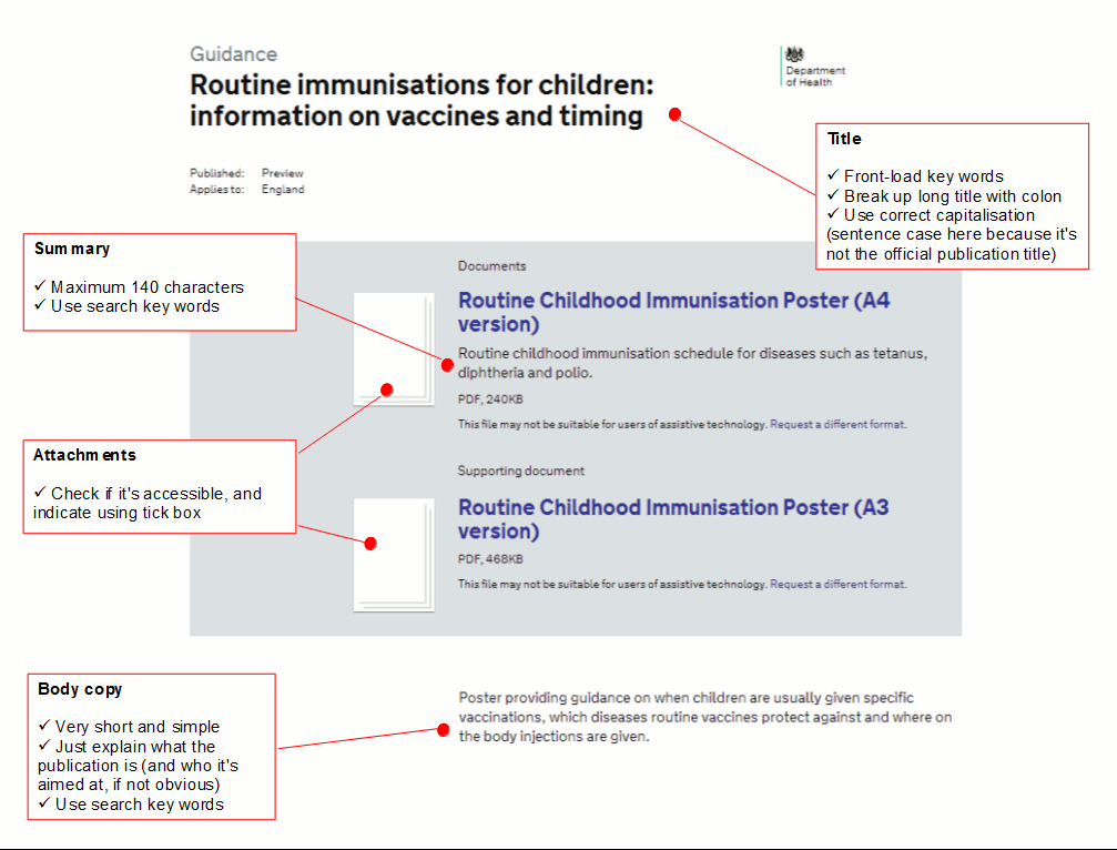
A good example
Page titles
Don't be afraid to change page titles ...
You don't have to use the official document title as the website page title. If it doesn't work for the website, change it:
- front-load keywords and use colons to break up long titles (it helps users to scan) – eg 'Planning appeal procedures: technical review' works better than 'Technical review of planning appeal procedures'
- titles need to make sense as part of a government-wide website (eg 'IT within the department' doesn't work as a GOV.UK page - which department are we talking about?)
… but don't get too far away from the official publication title
GOV.UK users often know exactly which publication they’re looking for, and search for it by name. So while the page title doesn’t have to be exactly the same as the official publication title, it shouldn’t be so different that these users can’t recognise it.
Also, government often has lots of publications on a single theme. So titles should be specific enough to let users pick out the publication they're looking for from a long list of similar search results.
Summary
The summary should clarify - very briefly - what the document is, for anyone who’s not sure from the title (bear in mind that the summary is the part of the page that’s usually shown in search engine results, underneath the page title).
Try to include search keywords that aren’t already used in the title.
No more than 140 characters.
Don't start with 'This document...' or 'This publication...' - save space with something like 'Proposals on' or 'Guidance for...'.
End with a full stop.
Body copy
The body copy should clarify - in slightly longer form - what the document is, for anyone who’s still not sure from the title and summary.
Give the user just enough information to let them decide whether it's the publication they want. It shouldn't take more than a few sentences:
- explain what the publication is (and who it's aimed at, if it’s not obvious)
- include any search keywords that aren't already used in the title or summary
- don't include links (unless the publication you're uploading only makes sense when read alongside another publication – eg if you're publishing an update on a report, it's fine to include a link to the original report)
Attachments
Attachment title
Usually it's best to use the official name of the publication. But sometimes it makes sense to shorten it to aid scanning, especially if it's in a long list of attachments.
In the example below we’re publishing two attachments on the same page; a white paper (the lead document) and the associated impact assessment (a supporting document).
Here 'Equity and Excellence: impact assessment' works better as an attachment title than 'Equity and Excellence: Liberating the NHS – impact assessment'. The latter is too long.
Equity and Excellence: Liberating the NHS
Equity and Excellence: impact assessment
'Attachment is accessible' tick box
Tick the box if the attachment you're uploading is an accessible PDF. It's important for people using assistive technology like screen readers, and stops the 'Request a different format' email address appearing.
Don't tick the box if the attachment you're uploading is:
- a non-accessible PDF
- another document format (Word, PowerPoint, Excel, CSV) - unless you know for a fact that it's been produced to meet accessibility standards
How to check if a PDF is accessible
If you have a copy of Acrobat Pro, run a full accessibility check.
If you only have Acrobat Reader, do the following (it's not 100% reliable, but a good indication):
- download the file to your desktop and open it using Acrobat Reader
- right click and select 'Document properties'
- if it says 'Tagged PDF: yes', then it's probably accessible – if it says 'Tagged PDF: no', it's probably not accessible
See the Government Service Design Manual for more about creating accessible PDFs.
Associations and tagging
Publication type
Look at the purpose of the document rather than the format. See the guidance on content formats, but for example:
- use 'guidance' if the publication is telling someone what to do or how to do it
- use 'policy paper' if the publication defines the government's position on something
Don't upload responses to consultations as a publication: these should be added as attachments to the original consultation page.
Related policies
You can associate the publication with one or more policies.
But you don't have to use it: only do so if the publication relates to something covered on the policy page.
Lead organisation
Almost always the department who is publishing the publication.
Alternative format email address
This is the email address that people use to request versions in braille, large print format etc. Choose your department from the options listed.
The email address only appears if you don't tick the box saying 'Attachment is accessible'.
Document collection
If the publication is part of a recognised document collection – eg 'DH spending over £25,000' – select the collection here.
Other departments have similar document collections, so make sure you select the correct one for your department.
Don't create ad hoc publication collections – it’s a good idea to have someone in your digital team to co-ordinate all of your department’s publication collections.
Excluded nations
If the publication applies to England only, tick the boxes for Scotland, Wales and Northern Ireland.
Access limiting
Only tick this if there's a reason to stop people from other government departments viewing it prior to publication (eg because it's market-sensitive data).
Scheduled publication
Use this option to set a future publication date. Bear in mind that you still need to get it second-eyed (or force schedule it under special circumstances) – otherwise it will just stay in 'submitted' state and not go live.
[Photo above by La Melodie on Flickr. Used under Creative Commons.]

 The GOV.UK app went live in public beta in July 2025. Find out what’s been happening, and what’s coming next,
4 comments
Comment by Fran W posted on
Hello, I am not sure that the advice above is the same as in the style guide?
The style guide says: The body of a publication page is used to provide a summary of the publication in plain, neutral language – to reassure the user that it is (or isn’t) what they’re looking for. Include what the publication is about and its purpose.
But DH say above: don't summarise what the document says (you’re just repeating what’s in the document).
This seems to be conflicting information. Could editorial please clarify, or perhaps supply more examples?
Thanks.
Comment by Stephen Gill posted on
Hi Fran,
Thanks for raising this.
The purpose of the body copy is help the user work out whether they've found what they are looking for. So it should be a brief description of what the publication is, including SEO keywords. And it should say who the publication is aimed at, if it's not obvious.
I think that's what we were trying to get across in the style guide - but I agree that the language could be clearer. We'll look at changing it when we make the next revision to the style guide.
Hope that helps to clarify things.
Comment by Alison Enright posted on
This is a really useful article - very helpful for those of us moving over to GOV.UK. Is there one for detailed guides? Would be really useful if there was a blog like this for each of the content types.
Comment by Stephen Gill posted on
Hi Alison
Nice of you to say so.
The GOV.UK style guide has guidance on how to use each of the content types, including detailed guides: https://www.gov.uk/design-principles/style-guide (in the section called 'Content types'). You'll see that we used this blog post as the basis for some of it.
Guidance on the more mechanical stuff - eg tagging and metadata - is in the manual for GOV.UK Publisher http://alphagov.github.io/inside-government-admin-guide/