We're currently redeveloping the Child Benefit tax calculator, a tool which takes care of a large number of very different user needs. It's the first bespoke calculator for GOV.UK, which will be a move away from the 'choose your own adventure' smart answer format.
It's a particularly challenging calculator to develop from a content perspective, because it's talking to such a wide variety of users and asking them for very different things - such as a prediction of their adjusted net income for a tax year that hasn't finished yet. We got the calculator to an acceptable stage and then ran a day of user testing with 5 people who'd be caught by the charge sat in a lab to run it through.
The user testing proved that some elements of the new calculator worked, while other parts of the calculator clearly needed more attention. The best way to get the content design right is to collaborate with the other content designers - to use their expertise, and to talk it through. Agile has proven extremely liberating here.
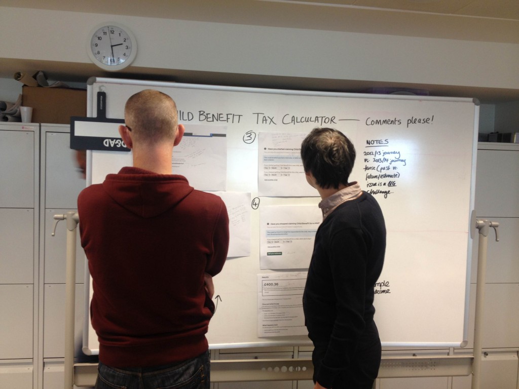
A Google document or a lengthy email thread didn't feel like the right place for feedback on this calculator, so we printed each screen of the calculator on a sheet of A3 paper and stuck it up on a board. Yes, we don't have to do everything on our MacBooks! I asked the other content designers to scribble all over the sheets and the flow - and it's really worked.

 The GOV.UK app went live in public beta in July 2025. Find out what’s been happening, and what’s coming next,