The information in this blogpost may now be out of date. See the current GOV.UK content and publishing guidance.

So over the past few weeks, we’ve been talking to a bunch of government organisations about updating your homepages to follow our new guidance on top task links.
First of all, many thanks to those of you who have revised their links, and improved the language. We'll shortly be looking at the impact this has had.
But in listening to your feedback, we've become aware of a couple of areas in which we might need to revise our guidance a bit.
Top tasks: needs we missed before
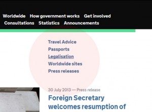
Our previous guidance focused on the use of the top tasks box as a way of signposting users to significant alternative destinations - for example, to mainstream guidance. This, in our minds, should still be the primary focus of the top task links.
But we’ve also become aware that ‘top tasks’ have become a vehicle for a couple of things you want to do with your homepage, and don’t have the ability to do elsewhere:
-
promote heavily used publications
-
push microsites, campaign sites or specific corporate pages which are particularly important to your organisation
We’re going to revisit the design of organisation homepages to provide alternative, more appropriate, solutions to both of these needs. But until that is delivered, we’re allowing top task slots to be used to meet these needs.
Guidance which still stands

The rest of the previous guidelines still stand.
In particular, top task links should not duplicate other links on your homepage - use them very sparingly, and only where there is evidence that they’re relevant to users.
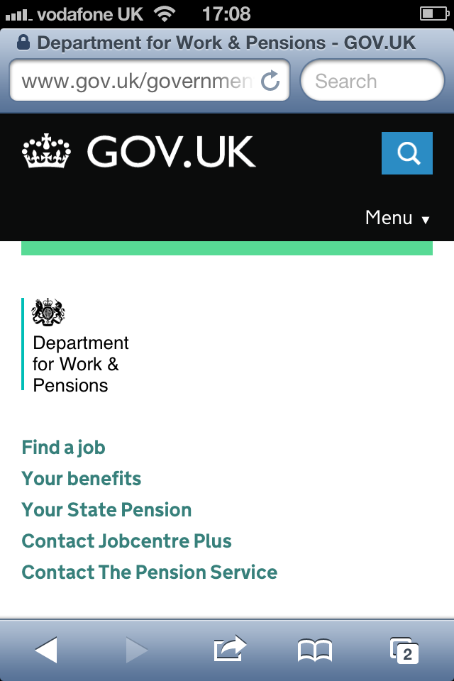
As the screenshot demonstrates, top tasks are the only part of your homepage visible at first to mobile users - a third of GOV.UK’s audience.
 The GOV.UK app went live in public beta in July 2025. Find out what’s been happening, and what’s coming next,
4 comments
Comment by John Ploughman posted on
Hi Graham
Great to see the acknowledgement that some of the guidance needs revisiting and the homepage design needs to be looked at.
For the Driving Standards Agency, most people end up on our homepage because they want to access one of our services - usually booking a theory or practical driving test. We're using top tasks to provide them with a quick way to do this.
The biggest problem we have is that we've got these relatively small links, while we have big pictures and much more screen space being use on featured documents, which arguably aren't what most people are looking for.
Are there any thoughts on giving more space to promote mainstream content rather than the corporate stuff?
As an executive agency we're also not sure if our management is important enough to be above our corporate information and contact details in the layout.
More people look at our corporate information than the profiles of our management team, eg 10x more people look at our complaints procedure than our Chief Executive's profile (although most are reaching the complaints procedure through search).
I'd be interested to know if there are any thoughts about whether executive agencies need a slightly different treatment to departments ('Be consistent, not uniform' 🙂 )
Thanks!
Comment by Andrew Robertson posted on
Will the way search results on GOV.UK for departments and agencies be reviewed? For example, search GOV.UK for 'dvla' you get the link to their home page, with four other links below the summary text (What we do; contact details; policies; ministers). These four work fine for main government departments, but not agencies who don't have ministers and don't really have 'policies' ('publications' would be better). I think 'what we do' and 'contact details' work fine for any organisation. Those four consistent links are also displayed and therefore don't work for organisations that haven't yet migrated, and those that are keeping their website eg MetOffice.
Based on this blog post about top tasks, perhaps the quick links in search could be customised for each organisation for the more popular things where people might be looking for the organisation first rather than the service they offer? Would it help divert people from search away from the organisation page to what they want more quickly?
So DVLA might have search result quick links to 'driving tests', Environment Agency might have a link to 'flood warnings', HM Passport Office might have a link for 'get or renew passport'
Appreciate my question might be low on the priority list, but does seem to tie in nicely with the top tasks so thought I'd ask.
Thanks
Comment by Antony Hopker posted on
Very interesting to hear about the concern with big pictures in Driving Standards Agency.
My executive agency (which has a picture library of zero images, though we can try and contrive something from our department) does not feel the need to have any pictures to carry out its quite tightly-focused, workforce-oriented work. We are very transactional and have multiple audiences who need signposting to multiple transactions at any one time. Signposting those is much more important than filling up the top of the screen with images. If people have to start scrolling down the home page to find the link they need, surely that page isn't working?
We're not on gov.uk yet and we'll be following this and other developments (such as browsing) with interest as these are the issues that have been exercising us for some time.
Currently we don't have any profiles of our management and it's not something we've discerned a user need for!
Comment by Neil Williams posted on
John, Andrew
These are all good points and well made. I am talking with designers about revisiting organisation homepage designs soon. See notes on this Pivotal ticket if you're interested in seeing how I have summarised this for discussion in the team here: https://www.pivotaltracker.com/story/show/56520124
I'm choosing to disregard the comments about management team - I think it's important that we push transparency and accountability about who's running all these organisations, and do so in a consistent way on all the pages. We might dial the prominence down over time but not yet. The other changes we're considering would give you space to promote your complaints procedure higher.
Andrew - your suggestion of more nuanced search result links is a good one. We're some way off being able to implement that yet but I've made a note of it on the epic, it's the right direction to be heading in. See: https://www.pivotaltracker.com/epic/show/648935