Since it launched nearly a year ago, the departments and policy section of GOV.UK has included a publicly viewable change history on all pages, including a note from the editor as to what has changed (a bit like a Git commit message).
Any significant update to a page causes it to:
- have a new "updated" date stamp, with a short note of what has changed, like this:
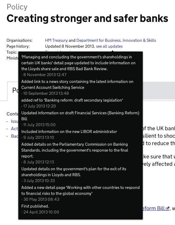
- jump to the top of all the chronologically-sorted lists on the site, like the announcements and publications pages or the "latest" block on topic and organisation pages
- appear as a new item in atom feeds and email alerts
Publishers can choose whether an update is substantive enough to warrant all the above things happening, or whether it's a minor change which should bypass all that. (For example, notifying email alert subscribers each time you fix a broken link or typo is just annoying).
However, we've seen lots of examples of people being confused by this - for example mistaking the "change notes" for an internal comment, or alerting users to minor things such as adding new metadata. So we've looked at how we can tweak the interface to make things clearer.
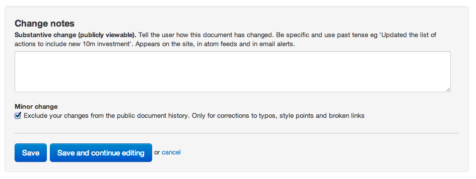
Before
This is what the interface looks today. There's a fairly high cognitive load involved in understanding the consequences of your choice:
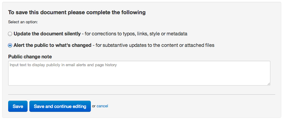
After
And this is what it will look like from later today. The choices are clearer, and the text field will disappear when the first radio button is selected:
It's a small change, but we hope publishers will find this much clearer, and that it will eliminate the mistakes we sometimes see.
