Back in June, I wrote about retiring our format icons — they didn’t test well and ultimately weren’t useful to users.
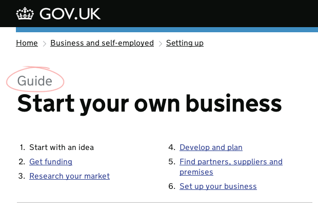
Though the icons were removed, we kept the format names. These are labels that denote the type of content a user is looking at, an example of which can be seen below.
I’ve long since been of the mind that these aren’t beneficial to users.
The original intent was that they be displayed to help users familiarise themselves with different content types. However, testing has shown that they are not effective.
So we removed them.
We did this quietly a fortnight ago and since then we haven't had one comment or complaint from users, nor from colleagues at GDS.
Asides from not being useful, they also occupy valuable screen space on smaller viewport devices that could be put to better use — allowing the page content to move up into view.
There are one or two places where these labels make sense as they actually help describe the content, such as foreign travel advice and here on this blog, so we left those as they are. But otherwise, they are gone.
Iteration and improvement of a site like GOV.UK is as much about taking things away as it is about developing new features.

4 comments
Comment by Andrew Robertson posted on
Did you choose to keep the 'Licence' label or has it been missed on page https://www.gov.uk/waste-carrier-or-broker-registration ?
Comment by Guy Moorhouse posted on
Hi Andrew,
Thanks for the comment.
'Licence' has been left intentionally on pages that *are* licences as this is a useful label that is descriptive of the content. In this instance however, I think you are right and it's been missed — good spot.
There are various other things that clearly need addressing with that page to, so thanks for the feedback.
Have a great Christmas.
Comment by Adrie van der Luijt posted on
At Universal Credit we used both a header and a title on each screen. The header indicates the section and the title relates to the specific screen. Together they form a unique combination that helps call centres / helplines quickly identify the screen to which the customer's query relates.
At CAP Services / Rural Payments Agency however all our headers have just been stripped out with the argument that the customer hardly notices them and that they clog up screens. I am aware that GDS thinking on this has evolved (https://insidegovuk.blog.gov.uk/2013/12/20/removing-format-names/) from a UX perspective, but has the operational benefit been considered?
Comment by Guy Moorhouse posted on
Many thanks for the comment Adrie.
When designing for GOV.UK, our priority is always the user — we base our decisions as much as possible on what will help them.
We wouldn't change the design and user experience to benefit the organisation if it's not also helpful for users. However if changing something has an operational benefit *and* in turn a user benefit, we would of course consider it.