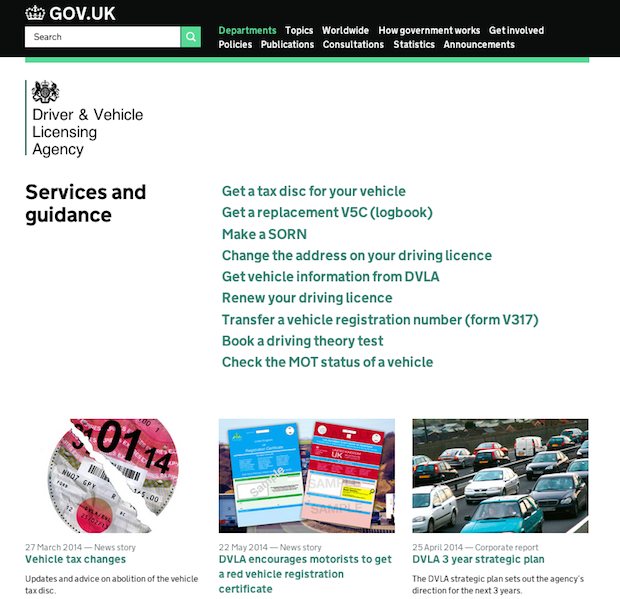
We’ve already written a post about the new organisation template and our reasons for creating it. This is an update about the impact of using the new layout for DVLA.

After the search page and the home page, DVLA's organisation page is the most searched on page of GOV.UK. This shows that many users can't find what they're looking for straight away. The searches made from the page are almost all for services, forms and guidance.
This confirms that users visiting DVLA's organisation page often use it as a starting point to access services provided by DVLA, like getting a tax disc, rather than to find news and policy information. Users have an established relationship with DVLA and closely associate it with the services it delivers, so it's a good fit for the new organisation page which puts the focus on services and guidance.
We worked with DVLA to decide which services and guidance to feature on the new organisation page. We looked at the most popular ‘top task’ links from the previous organisation page, and then analysed the search terms to see what was missing, and added these in. We ended up with a list of 9 links. Interestingly, two of these services are delivered by DVSA, not DVLA, but thousands of users a week try to find them from DVLA's organisation page so it made sense to include them.
Two weeks after DVLA adopted the new organisation page, searches have gone down on the page by 40%. That represents 1100 people per day on average who arrive on this page and don’t need to search within GOV.UK to find the information they’re looking for.

We’re pleased with the success of the new layout for DVLA and look forward to seeing it used by more service-oriented organisations on GOV.UK.
 The GOV.UK app went live in public beta in July 2025. Find out what’s been happening, and what’s coming next,
8 comments
Comment by E. Brown posted on
HI Alice,
Interesting development. Look forward to seeing more examples.
Rereading past entries, I note that some authors have update blog entries from the past year - but they aren't highlighted as 'new'.
I stumbled across a post that was updated this month, from last year:
https://insidegovuk.blog.gov.uk/2013/07/12/caches-scheduled-publishing-and-consultations/
There's no calendar on this blog, so I can't review items by date, only in sequence or by category. Is it possible to do an occasional 'roundup' of such updates, so we can keep track of changes to past statements?
We refer to the blog daily to answer our questions ('I think there's a blog post about that...') so knowing if an answer has changed is pretty important to us.
Cheers,
E. Brown
Comment by Graham Francis posted on
Hi Elizabeth
Cheers for the comment - it's a good point.
We're aware that people rely on our blogposts for guidance (and in fact have just published an index of the most useful posts here https://insidegovuk.blog.gov.uk/publishing-on-gov-uk-where-to-find-guidance/).
And from time to time we have updated past posts, so that they're the comprehensive source of 'truth' on a particular subject.
Our rule of thumb has been that if publishers need to take action - or we're changing our guidance - we publish a fresh blogpost.
But if we're just adding detail or clarity to an existing blogpost, we don't republish - and leave the post at its original URL.
Perhaps however, looking at the example you give, we should
(i) be more explicit about any revision history (e.g. at the bottom of the blogpost, say when and why it was updated).
(ii) mention in our week notes that we've updated guidance on X or Y
Would that work?
And
Comment by Hayley posted on
Last updated at the top, full revision history at the bottom? Thinking: if I've read it before, the bottom is a bit late for me to go 'oh that's why it's not how I remember' or similar. Be good to know that right away. Equally don't want revision history to distract first time readers.
Yes to mentioning in the week notes.
P.S. I love that you update this stuff. It does put me in mind of the whole 'is a blog always the best format' conversation though.
Comment by Francis Rowland posted on
Thanks for sharing a nice little case study. It's also something that offers a useful perspective on some work I am doing right now.
In wondered if you could add to this post, though. I'd really like to see a graph / comments on usage, to show that it stayed about the same (or perhaps increased?) over the same time period. That would underline the fact that users are still finding what they need without relying on search.
Comment by Alice Newton posted on
Hi Francis, good point. I should have said that usage stayed the same (although it didn't increase), and the impact of the different homepages on page-searches tested as significant to p<0.01 level.
Comment by Andrew Robertson posted on
We've had some feedback from customers and staff that our home page (and others on GOV.UK) is very long and hard to find contact details. Are there any plans to introduce any sort of contents list to the page, similar to the top-right of the main http://www.gov.uk page, consistent across all org pages?
Also, any progress on altering the quick link 'ministers' on search results page for an organisation? This only works for government departments, not ALBs. I'm also not convinced that 'policies' is the best link for ALBs; perhaps 'publications' or 'services'?
Comment by Alice Newton posted on
Organisation pages have quick links on the top right for linking to the most popular content related to the organisation - we have no plans to introduce a contents list.
You're right that the ministers link doesn't make sense for agencies on the search results page - our analysis has shown that very few people click on these links in any circumstances (on all but one org, there were fewer than 10 clicks per month), so we're intending to remove them for the moment.
Comment by Andrew Robertson posted on
Thanks for the reply, Alice. You're probably not aware that the Environment Agency has a different layout at the top of the page compared to other organisations: we can't feature 'top tasks'.