Here’s an example of how a multi-disciplinary team of user researchers, performance analysts, content designers and developers work together to improve the user experience on GOV.UK.
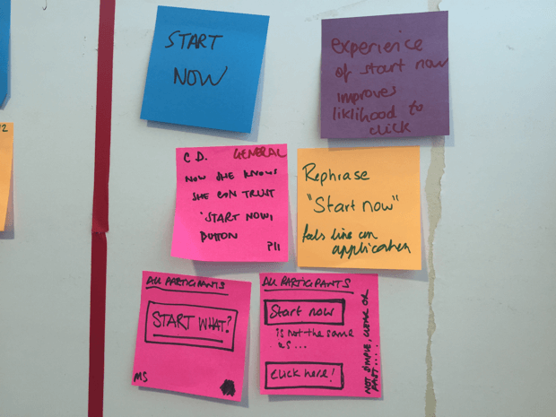
In our last round of user research benchmarking we saw a worrying pattern of behaviour. When people reached a page with a ‘Start now’ button on it, instead of clicking this button they navigated to other pages about the subject.
These pages led them back to the ‘Start now’ page, where they would continue the pattern of ‘circular navigation’, becoming increasingly frustrated that they couldn’t complete the task.

Because we observed this behaviour in so many users in the lab, we analysed the data for these pages to see how common it was in real life.
We found that 1 in 3 people (177,000) looked at the ‘Start now’ page more than once, and 31,000 people saw it more than 4 times. This confirmed that ‘circular navigation’ exists and is a real problem. We also found feedback comments like, "your site sent me round in circles".
Usability testing is something we do all the time. It lets us ask users why they behave the way they do. In this case, they told us the words ‘Start now’ scared them - they thought it would start some process, rather than giving them a customised answer to their question.
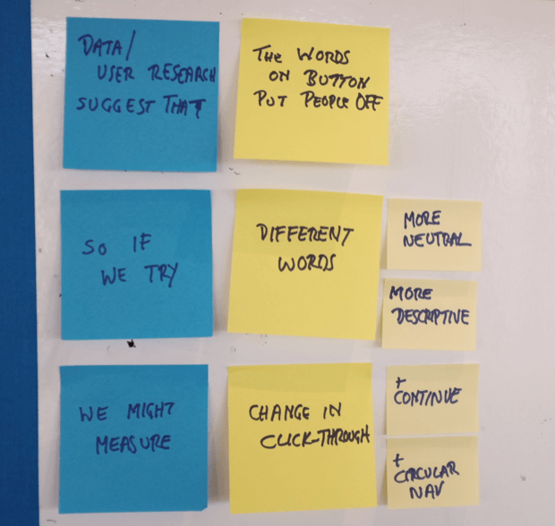
So we decided to test whether changing the wording on the buttons would alter how many people clicked it.
We tested 3 different pages with ‘Start now’ buttons on them. We tested one more neutral and one more specific way of wording the button, as well as the original ‘Start now’ on each of the 3 pages.
We ran the test for 2 weeks to allow for variations in traffic on different days. The pages get high volumes of traffic so we were confident the results would give us some statistical significance.

The test pages
We tested 3 pages with the green 'Start now' button:
The results
This table shows the change in how many people clicked on the button.
| Page | Button text | Click rate change |
|---|---|---|
| Overseas passport application | 'Start now' | 0 |
| 'Next' | +5.1% | |
| 'Get application information' | +1.9% | |
| Child maintenance calculator | 'Start now' | 0 |
| 'Calculate' | +2.2% | |
| 'Estimate your child maintenance' | +3.5% | |
| Getting married abroad | 'Start now' | 0 |
| 'Find out how' | -13.6% | |
| 'Get more information' | -18.8% |
The results instantly raise more questions. Why did the ‘Getting married abroad’ test produce such different results?
One possibility is that both variations make it much clearer what people will find when they click the button - just more information. So if someone was expecting more than that, clicking the button wouldn’t have helped them, and so the reduction in clicks is a good thing.
It’s also important to remember that the content of the page is most important. If the content is confusing or does not match the user’s needs that is likely to make more of a difference than the wording of the button. We think the content may be the relevant factor with 'Getting married abroad'.
What we learnt
The button text does make a difference
The differences between the click rates were statistically significant. They were not just random variation.
Don’t stop with just one test
Testing 2 variations each time demonstrated the risk of being satisfied with small improvements.
If we’d just tested ‘Get application information’ on ‘Overseas passport applications’ we might have thought a 2% increase was a strong signal. We wouldn’t have known we could get more than twice that increase with ‘Next’. It’s a great example of the ‘local maxima’ trap.
There is no magic button
Don’t jump to the conclusion that something which has one effect in one context will have the same effect in another context.
‘Get application information’ resulted in a 2% increase in clicks on one page, but ‘Get more information’ generated a 19% drop in clicks on another. The words are very similar but the results are very different. There is no magic button.
You never can tell
No matter how much experience and expertise you have, you can never really know which version will produce which result every time.
What happened after people clicked
As part of the analysis we also checked on the abandon rate after people clicked on the button. It would be bad if changing the button text lured more people into clicking it only for them to decide the information was not what they needed. We would’ve been wasting their time.
It turned out that changing the wording on the buttons didn’t alter the continuation rate.
The analysis also highlighted the difference in the rates between different subjects. We can see this easier if we look at ‘abandon’ rates rather than ‘continuation’ rates. The abandon rate for ‘calculate child maintenance’ was much lower than for ‘overseas passport applications’, even though the questions which follow are more complicated.
| Page | Button text | Abandon rate |
|---|---|---|
| Overseas passport application | 'Start now' | 11% |
| 'Next' | 12% | |
| 'Get application information' | 11% | |
| Child maintenance calculator | 'Start now' | 4% |
| 'Calculate' | 4% | |
| 'Estimate your child maintenance' | 4% | |
| Getting married abroad | 'Start now' | 6% |
| 'Find out how' | 7% | |
| 'Get more information' | 7% |
This is a reminder to consider the context and the user needs. Someone trying to estimate child maintenance may be more motivated than someone looking for information about passport applications.
Of course we don’t know the context for any of the users - so it’s important to remember that the wording of the button may only be a minor factor influencing behaviour.
But what happened before people clicked
I’ve left the bad news until last. We intended to see if changing the button text would reduce ‘circular navigation’. Unfortunately, because of a problem with the tracking, the data on this was flawed. This question is going to have to wait for the next round of tests.
What’s next
We’ll carry on testing.
In particular we want to re-test this same group of pages to check the effect of the neutral ‘Next’ button in other contexts.
As human beings we cling to the idea of finding something we could apply everywhere to improve user experience. When we do that we’ll also be able to test another set of variations to explore ‘Getting married abroad.’
We’ll also be able to investigate the tracking issues and have another go at reporting on ‘circular navigation’.
And of course we also want to carry on testing other things and other pages as well.
Tim Leighton-Boyce is a Senior Performance Analyst at GOV.UK. Follow him on Twitter.
 The GOV.UK app went live in public beta in July 2025. Find out what’s been happening, and what’s coming next,
4 comments
Comment by Lucy Hayes posted on
Hi Tim,
This is an excellent demonstration of the use of usability testing and analytics together to improve the user experience. Thanks so much for sharing. It’s also very interesting to see how your variants performed differently in different contexts, which is something to be mindful of across digital services. I also think the approach of continued testing and improvement is great and is something we hope to do more of in HMRC.
I wondered if you had any examples where your A/B testing or analytics identified a problem that hadn’t been seen in user testing?
Comment by Tim Leighton-Boyce posted on
Thanks Lucy, it would be great to hear more about what you're doing too.
We've done another round of tests on the same pages and I hope that we can blog about those results as well. A single test is only a starting point and we're constantly learning.
To answer your other question: our starting points for A/B testing are usability tests and analytics, so the hypothesis is always built around some observation. So far I'm not aware of something else becoming apparent during the tests, although you could say that the hunch that it's the content, not the button, which is the issue here with 'getting married abroad' counts as 'something else'. But I can certainly think of examples where analytics has revealed a problem which hadn't been seen in user testing. Here's an older blog post about a case where analytics revealed that the big problem for users was not one which would show up in a usability test, such as entering a postcode, but a problem with the data in the system: https://dataingovernment.blog.gov.uk/2016/05/18/tracking-errors-and-alerts-for-operational-insights/ We had no idea about that until we saw the data and the insight set the direction for one of our missions.
Comment by Chekman posted on
Your users could be providing misleading excuses for a lack of action. Sometimes if you observe what they do (or don't do) on screen it conflicts with how they actually explain it away. All part of the wonderful enigma that is the human mind!
Have you considered the possibility that the problem may revolve around the design of the button, that its flat design points to "the lack of signifiers on clickable elements"?
See: https://www.nngroup.com/articles/flat-design/
Comment by Tim Leighton-Boyce posted on
Thanks, Chekman. That's a very good point about what people say not always being the real explanation. And thank you for the link about the button design.