Christine recently created a new course for HM Revenue and Custom's (HMRC's) content designers. The 2 teams in Newcastle and Manchester are well practised at writing content to user needs but wanted to look at the whole user journey.
Julie: I've written content for the GOV.UK website for a few years now and I'm proud of what we produce. But while we often solve the immediate problem, we can overlook the wider user journey.
Mapping the journey of users
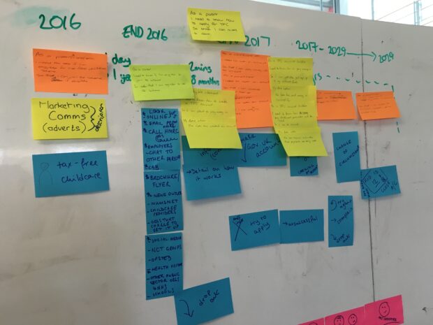
Christine: We started the session by imagining the whole user journey for the new tax-free childcare policy, which is currently being developed and will be available early 2017.
James (one of the participants) suggested we map the emotional journey of the user too. I loved this idea - so we added it on.

We could quickly see from the journey map that users would likely use this service over several years. We talked about how important it was to talk to users and work out how much they know when they they come to the service for the first time.
We could see the whole journey and the time between each contact with HMRC. This gave us a better understanding of how much background each piece of content needed.
Adding user needs to the journey map
We identified needs for the journey and discussed what information users would need at each stage.

Julie: When Christine explained what she wanted us to do it seemed quite overwhelming - build a journey from scratch about a subject none of us had any knowledge of! But once we started to work collaboratively and broke the journey into different stages it naturally evolved.
I was really impressed with the clarity this gave us about how a user would go through the service and what they would need. I’m certainly going to build this into my content design process.
Asking other content designers for help
Christine: Content designers must make sure the users have all the information they need to complete their tasks. It’s difficult not to get overwhelmed by too much information, or by catering to the organisation’s needs, rather than the user’s.
I spoke to 2 senior content designers at GDS about how they hold critique (crit) sessions. In these sessions 4 or 5 content designers gather to look at a piece of content to unravel complexity or see if it could be improved.
The content designer takes content to a crit session when they’ve reached a dead end or want some fresh ideas. Perhaps their rate of improvement has started to slow down. They might explain the background of the content to the group, or not.
Crit sessions support the content designer, who’s the authority on this piece of content and not obliged to take any of the suggestions made. The content designer should come away invigorated and with ideas. The sessions are informal - they’re about sharing ideas and not about getting approval.
A good way to participate in a crit session is to ask questions of the content designer. Chances are they have thought about it already, so it’s a chance to air those thoughts - and possibly assumptions.
Ground rules for a crit session
- Support the content designer.
- Don’t use it to replace 2i/approval.
- It’s about the content, not the writer.
- Be clear about what help you need.
- Be specific when giving your thoughts.
- All thoughts are respected and considered.
Julie: I already run a regular crit group. We meet to support each other and look at each other's content. We'll have extra sessions if someone needs support right away. When you're writing content it's very easy to reach a point where you can't see the wood for the trees because you've just spent too much time on a page.
Crit sessions help us build simple, understandable content. Crits help you to take a step back and look at your content again with fresh eyes and listen to suggestions and opinions from other members.
In the advanced writing training we learned about and used new tools and techniques. We also strengthened and improved our existing skills and practices. Christine really motivated us and helped us to improve our working methods. I thoroughly enjoyed the course (I'm unlikely to be writing this if I didn't)!
It was interesting, interactive and directly relatable to my role. Plus - there were grapes and cake - what's not to like‽
We’re hoping to run more sessions in future, so if you’re interested, please get in touch by emailing gov.uk-training@digital.cabinet-office.gov.uk.
You can view the slides on Slideshare.
Christine Cawthorne is a content and style trainer for Government Digital Service. Julie White is a content designer at HMRC.
 The GOV.UK app went live in public beta in July 2025. Find out what’s been happening, and what’s coming next,