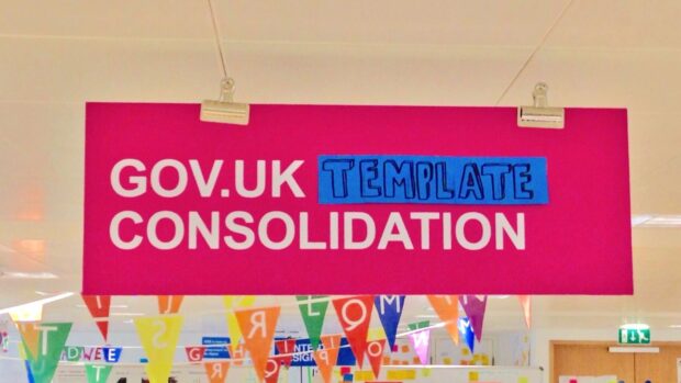
Our team is here to simplify the GOV.UK frontend architecture and design, so that it’s simpler and faster for us to iterate, making way for exciting improvements in the future.

GOV.UK currently has over 340,000 pages across over 140 frontend templates, and these are visited over 80 million times a month.
'Frontend' and 'templates'
- templates are different ways of displaying content on GOV.UK, such as tax manuals, news stories by departments, press releases and many more
- frontend is the interface between GOV.UK and the user
- frontend architecture describes how that interface is built
Why so many templates
As each team iterated on the templates, they’ve grown to have their own versions of common features, with variable user experiences. This resulted in templates being tangled up in a number of publishing applications and frontend rendering applications, making them difficult to work on.
Challenges with the current frontend architecture
As a result of iterating quickly, we’re left with a large amount of technical debt. Pushing a new feature across GOV.UK requires lots of effort to update all the applications.
This means only some templates are worked on to have changes made, which leads to an inconsistent frontend design and user experience of GOV.UK.
Also, our new developers and starters need to understand the specifics of our frontend architecture just to get up to speed.
Making GOV.UK frontend simpler
This work is part of GOV.UK’s objective of improving navigation and orientation. Once we’ve simplified the frontend architecture, other teams will only have to make navigation improvements once, rather than lots of places across GOV.UK.
A big part of our work will be reducing the amount of frontend code and break down our 140 templates into reusable components and consolidate to around 10. This will make the layout and navigation of content across GOV.UK consistent in design.
In the long term this will allow new features and functionality to be added more easily throughout GOV.UK, and with greater confidence by our teams.
Why we’re doing this now
The migration programme is centralising all the content in one place - the Content Store, making it simpler to consume by the frontend. This means the template consolidation team can now begin to untangle the frontend architecture and make consistent template designs.
Putting users first
This work is a great opportunity to make templates accessible for all of our users. To do this we have partnered up with the accessibility team to address accessibility throughout our work.
We understand that publishers are an important user group in our work. They see their content being published every day and understand how content is laid out and displayed to our users.
This work will not change the publisher workflow, especially the content types they use to publish. We will continue to engage with publishers throughout our work. This is to ensure we agree to the consistent layout displayed to users for the various content types they publish on GOV.UK.
What we’re doing at the moment
We’re in our discovery phase at the moment. Our first task is to understand the function of each of the 140 templates. We’re doing this by researching user needs of each template, which will ensure we do not lose unique user experiences when we consolidate.
To make the frontend architecture simpler we need to understand it ourselves. So we’re unpicking the current state of the frontend and looking at ways to make it easier to work on.
If you have any questions please get in touch.
Humin is the Template Consolidation team's associate product manager. Follow him on Twitter.
 The GOV.UK app went live in public beta in July 2025. Find out what’s been happening, and what’s coming next,