The GOV.UK Publishing Frontend team has created tools to help developers and designers ensure a consistent user interface across the site.
We’ve already reduced the number of templates and design patterns used on GOV.UK. Now we’ve created a style guide of design patterns that live in applications and tools.
Creating a frontend component guide
Back in 2014, we developed a model for building components (such as breadcrumbs and search boxes) and created design patterns that serve templates to users.
However, at the time, we had no way of documenting the patterns. This was confusing for developers and designers, and made it slower to iterate designs.
To fix this, in late 2017 we converted the design patterns of our biggest frontend applications into components and created a frontend component guide.
The guide contains a list of components and production-ready code, and examples of how they can be used on GOV.UK. We also set rules, called principles and conventions, which help us to update the guide organically and set a standard of writing components on GOV.UK.
Benefits of the component guide
This work has created a common language for our designs and the way they are developed on GOV.UK.
Frontend teams are already identifying components more easily, re-using standard patterns and iterating templates quickly in one place. The result is there’s a more consistent look and feel to elements across the site.
Testing of our designs is also more streamlined, as we’re able to test the impact of changes across GOV.UK in one place. This empowers GOV.UK teams to scale designs with greater confidence.
Here are some examples of how we’ve done this.
Making components accessible to all
Everything we build on GOV.UK, including components, must be accessible to everyone.
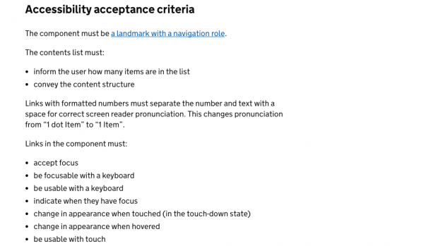
The site’s accessibility standards are wide reaching, so we defined bespoke accessibility criteria for each component. We then made sure that each component met its individual criteria.
We also added automated testing to our components so that accessibility issues are highlighted before going live. This means that when we iterate a component, errors will be picked up automatically.
Because automated testing can only cover certain aspects of accessibility, we added extra manual tests where necessary. This prevented changes being made that could make components less accessible in the future.

Visual regression testing
One of the biggest challenges facing developers and designers on GOV.UK is knowing how their changes will affect the live site. With over 350,000 pages on the site, it can be very difficult for them to find and track the impact of their changes.
We’ve set up visual regression testing to help make this easier. Visual regression testing looks for differences between what you’re working on now and what the site looked like before, and highlights those changes to the developer with minimal effort. This means developers can immediately see the effect of their changes and whether they’re acceptable.
It’s a huge challenge to implement visual regression testing, but we’ve laid the groundwork for rolling out a standard way of doing it to the whole of GOV.UK in the future.
Sharing our patterns across government
We’re working with the rest of the Government Digital Service, including the GOV.UK Design System team, to ensure components are implemented in a consistent way.
This is helping to prevent design duplication and encourages collaboration across government so that users experience a more consistent look and feel throughout their visit to GOV.UK.
Find out more
More blogs will be coming soon about our frontend work.
Humin is a product manager on GOV.UK. You can follow him on Twitter.
 The GOV.UK app went live in public beta in July 2025. Find out what’s been happening, and what’s coming next,