GOV.UK is 6 years old, and over the past 6 years it has grown into quite a large, complex website. We have a range of publishing applications that allow us to publish things like guides, manuals and news articles, each of which have their own content types, layouts and frontend code.
These layouts all use slightly different design elements and all had different ways of presenting similar types of content.
This combination of technical and design debt means it can be challenging for us to iterate and ship changes across the site. Not having a universal navigation system can also lead to a disjointed user experience.
Following on from a piece of work to consolidate the templates we use, we set out to create a single layout with consistent design elements and information hierarchy.
How did we approach the problem?
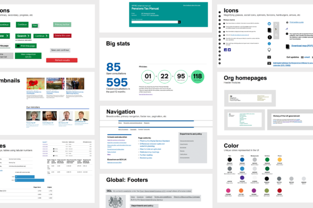
We did an audit of all the design, layout, typographic and visual elements across the content pages on GOV.UK.
We also audited and grouped similar kinds of content such as addresses, metadata and informational banners so that we could ensure they were treated consistently. This also allowed us to make sure these were all covered by any new or iterated design elements we used.
The resulting lists gave us a good idea of every combination of content and elements that may appear on the site and how best to display them.
Once we had a master list of the content and design elements on GOV.UK content pages, we were able to create a consistent hierarchy of information that could be applied across all content. This formed the basis of a new, simplified layout.
We grouped content elements and created rules for how they should be displayed together. For example, sometimes we have banner information that appears on its own, other times we have multiple banners grouped together. This was achieved by using components with contextual rules, meaning the same component would look different depending on its context.
Because there are a lot of content types and formats, it took us a while to roll out the layout changes, and we’re still working on improving them further. It can be a tricky process, and we rely on a combination of visual regression testing and eagle eyed team members to spot issues with the design.
What are our next steps?
Now that we have a single content page layout and a group of reusable components, we are able to implement universal navigation changes to the site. These changes will link up disparate or difficult to find content, allowing our users to complete their tasks seamlessly. It also allows for more efficient iteration of components, ensuring that GOV.UK is consistent and accessible.
Our work on tackling design debt has left us in a better position to carry out any further changes to GOV.UK's design, while giving our users a more unified experience across the site.
Mia is a designer on GOV.UK.
