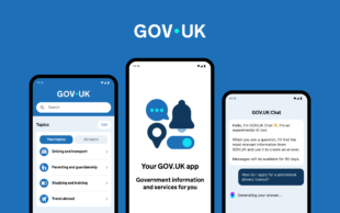
When building the live version of GOV.UK back in 2012 we decided early on it needed to be responsive in order to work well across mobile devices. It sounds obvious now, but back then that approach wasn’t necessarily taken for granted. We were, and are, committed to making sure that GOV.UK is available to everyone.
Moving forward to 8 years later and we often talk about being ‘mobile first’ in our approach to design – but what does that really mean? There is a difference between building responsive interfaces vs ‘mobile first’ design and I would argue that up until now we have been the former.
Increasingly our users are accessing government content through their mobile device, and for some, this is their only point of access. So if we are to move to a world where we are truly mobile first we need to start reviewing our design and research processes.
We need to continually understand the context of how our users interact with government information. This work is in line with our wider strategic goals of meeting users where they are and we’ll continue to apply this ethos to improve the mobile experience for users of GOV.UK.
The evolving device usage landscape
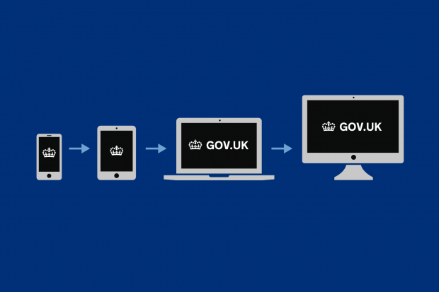
When we launched GOV.UK, mobile usage in the early days was at about 19% (December 2013 figure). The number of mobile users came as a surprise to some colleagues who didn't initially understand the value of investing so much time making GOV.UK responsive for mobile devices.
We are now in a world where consistently over 50% of the users on GOV.UK are using the site on mobile devices. This figure changes for different user tasks and transactions but generally stays high – consistently above the numbers on desktop. Alongside this, data shows mobile phones are the most popular devices across most age groups when accessing the internet.
What this means for our team is an opportunity for a change in mindset from being desktop led but responsive in our approach, to being truly mobile first in our design practice when designing some of the more complex elements of GOV.UK.
This may involve moving into the world of more inherent mobile design patterns. It also means doing more focused usability testing and prototype development on mobile devices.
Some early work
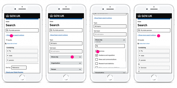
The search team on GOV.UK recently launched an improved search experience for users on mobile devices. This included better search algorithms and the introduction of clearer mobile oriented patterns when the user interacts with search results and search filtering.
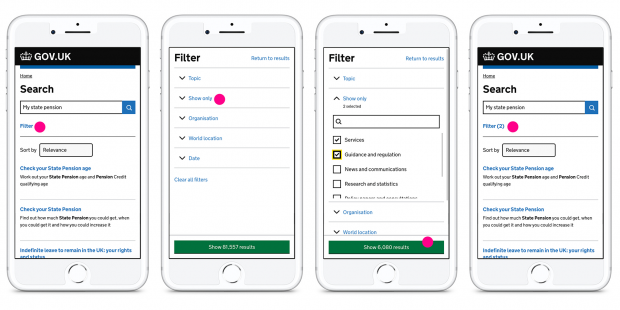
The new filter design involves a full screen takeover so the user can easily interact with the complex results filtering without the distraction of other page elements. It also involves the introduction of a sticky navigation button at the bottom of the screen to give the user a clear and obvious route back to their newly filtered results page.
Our team have also been looking at some of the more holistic aspects of GOV.UK usability on mobile devices. We want to make sure we continue to meet the highest accessibility standards and work towards other relevant specifications like touch targets from the Human Interface Guidelines by Apple.
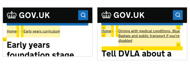
One of the first items we improved is the use of breadcrumbs on GOV.UK when viewed on mobile devices. Long breadcrumbs can become quite cumbersome on small screens, so we introduced new logic for breadcrumbs on mobile devices as well as improving general elements like spacing to improve touch targets.
Next steps
We are going to continue to improve the mobile experience across GOV.UK. We have a snag list of items we want to make better that we’ll continue to do incrementally. We’re also going to be looking at more strategic mobile first interventions we can focus on in high usage areas of GOV.UK, an example being the coronavirus landing page.
We’ll be closely monitoring mobile completion rates of user journeys when compared to desktop equivalents, noting how we can potentially improve these journeys for mobile users. We’ll also be asking for help from other departments regarding interrogating the data around mobile usage within and across services to highlight any issues that we're not yet aware of.
We also need to get better at understanding the behavioural differences of those users who use mobile for certain tasks over desktop and vice versa. Another area we want to learn more about is how and when they move between devices to complete different tasks and see if we can improve the flow across those devices.
Currently a lot of our qualitative lab based usability testing is done using desktop tasks. We are continuing to improve our approach to usability testing and user research, especially with people who use mobile devices for a lot of their interaction with government digital services and information.
We will keep you posted on our progress. We hope you start to see improvements in your mobile interactions with government services, and please comment or give feedback with questions and suggestions.