We are trialling a GOV.UK account. Why? The answer is probably completely unsurprising: we believe a GOV.UK account can help us better meet our users' needs.
GOV.UK was built to help transform how people interact with the government. It achieved this by making government services quick to find, easy to understand and simple to use.
For simple tasks, where the user knows what they are looking for and can achieve their goal quite quickly, GOV.UK works well. But often things users need to do are complex and involve multiple steps and interactions across time.
When these different steps cross departmental boundaries, things can get particularly difficult because government departments are not always joined up. And unfortunately there is a risk that this could get worse as each government department builds their own account functionality to meet their specific purposes.
We know that there are over 100 places on GOV.UK where a user can login already, and that trend will only continue.
This is where a GOV.UK account can help. We hope to make government easier to navigate by joining together different services and giving users a single, safe and secure way of signing in.
But there are many questions to answer about the right way to do this, so we’ve been doing lots of user research. Here are 5 things we’ve learned so far.
1. Having lots of accounts is frustrating
Most of us who do things online will have to use sign-in details to access services. As the amount of online services we use increases, so does the number of different sign-in details we need to access those services.
Part of the problem with this is managing which details or passwords are relevant to which service when you need to sign in. Basic security means we should use different passwords, so this can be a lot to remember. As a result we sometimes get these wrong - and getting locked out of an account or having to reset a password is frustrating. And while there are tools like password managers to help with this, we know lots of people don’t use them.
For us this points to the fact that there is value in creating a simpler landscape where users don’t have to remember several different sign-in details to access and use government services.
2. Users see government as one thing, and they expect things to be joined up
One of the main successes of GOV.UK has been simplifying government information for users. People don’t need to understand the intricacies of which department is responsible for which policy to find the guidance they need.
We’ve seen in user research that many users apply this same mental model whenever they have to sign in or create an account to use a government service: if they’ve already got an account with government, why would they need to provide their data again to create another account? Surely they can use the one they already have?
Why are they asking for all this information when they already know it?
- Participant quote
3. There is no one-size-fits-all approach. People want to handle their identities in different ways
Users expect things to be joined up, but not always.
The first account trial consists of adding account functionality on the Brexit transition checker. The checker asks users questions about both their personal situation and their business in order to give them a single set of results outlining the actions they need to take to prepare for the end of the Brexit transition.
One thing that we learned in our user research sessions is that the approach of mixing personal and business works well for some users, but does not meet all users’ expectations.
Users of GOV.UK have different tasks they want to complete and may ‘wear different hats’ (different identities) to achieve those tasks. The convenience of bringing things together is important to some users, but others feel uncomfortable about blurring what they perceive to be clearly separate aspects of their life. This could be between one job and another, home and work, or things they might do for themselves or on behalf of someone else.
As a result we know the GOV.UK account needs to be flexible enough to allow people to manage different identities.
4. People get frustrated when the account shows them things that are not related to the task they are doing
In our prototyping research we experimented with asking users a few questions and providing them with content recommendations based on the information they provided.
We found that users found it confusing and frustrating if those questions or recommendations didn’t feel specifically relevant to the task they were doing at the time.
if buying a pair of shoes, shouldn’t have to disclose family details
- Participant quote
By contrast, we saw that users reacted much more positively where we provided a clear explanation for why a recommendation was being shown or a question was being asked.
![Screenshot of 'Because you said' model showing a page with title saying: Services and guidance for you. These recommendations are based on data about [hyperlinked] - then 3 services - Checking a job applicant's right to work. Make sure a job applicant can work in the UK - check they have the right documents and make sure you're not prosecuted for employing an illegal worker. Because you said you employ people from outside the UK, Update this if it's not correct [hyperlinked]. Import goods from outside the EU: step by step. How to bring goods into the UK from outside the EU, including how much tax and duty you'll need to pay and whether you need to get a licence or certificate. Because you said you import goods. Update this if it's not correct [hyperlinked]. Export goods to countries outside the EU: step by step. How to move goods from the UK to countries outside the EU, including any special rules you'll need to follow for your goods in the UK and the destination country. Because you said you export goods. Literal text. This is followed by text containing a hyperlink reading "Update this if it's not correct](https://insidegovuk.blog.gov.uk/wp-content/uploads/sites/24/2020/12/Services-and-guidance-for-you-.png)
More broadly this finding showed us the importance of having really well-designed journeys that sensitively link together different areas and contexts in a way that works for the user.
5. People’s desire to engage with privacy varies a lot
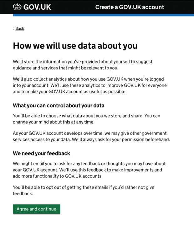
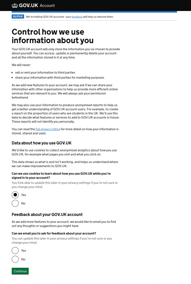
Privacy is another area where we’ve seen a range of attitudes. We’ve seen many users who’ve whizzed through our privacy screens, using “this is all standard GDPR”-type comments to describe them, as they look to move through as quickly as they can.
We’ve also seen privacy-conscious users who are uncomfortable sharing their data for fear of misuse and want to know more detail about what will happen with their data. Some users were very critical of early prototypes where they were not given much control over how the account would use their information.
We’ve learned that it’s important for us to take both of these attitudes into consideration in our designs. For example, we introduced radio buttons to encourage users who were rushing through to slow down and engage with the privacy aspect of the account. At the same time we’re making sure the detail is there for those who want it or who are seeking further reassurance.


In other words, we are trying to treat our approach to designing the account’s consent model very much like we treat designing for the range of access needs, in that we believe designing for the whole spectrum of needs will lead to better design overall.
Next up
Now that the GOV.UK account trial is live we’re using everything we’ve learned in user research to decide where the account should go next.
Given how complex this is, we still have many unanswered questions. We will be doing more research to answer them and test out the riskiest assumptions in the project.
Here are a couple of examples of the sorts of questions we want to look into:
- what level of personalisation do users want in their account?
- how can the account save people time and effort in their interactions with government - for example, how should an account help services talk to each other so users don’t have to tell government the same thing in several different places?
If you are using the account, do provide feedback on your experience using the form in the account.
We’ll continue to blog about the things we learn so subscribe to read updates from this blog.
 The GOV.UK app went live in public beta in July 2025. Find out what’s been happening, and what’s coming next,
1 comment
Comment by Isaac posted on
Some great insights here, thanks for sharing! Great to see you continuing to work in the open on this.