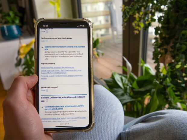
We recently improved the accordion component as part of ongoing work to make sure GOV.UK is accessible and meets user needs.
An accordion allows users to show and hide content sections on a page. In this blog post, we're talking specifically about how we improved an accordion component. GOV.UK is built on a set of designs, patterns and components; when we update them, changes are deployed across the platform for a consistent user experience.
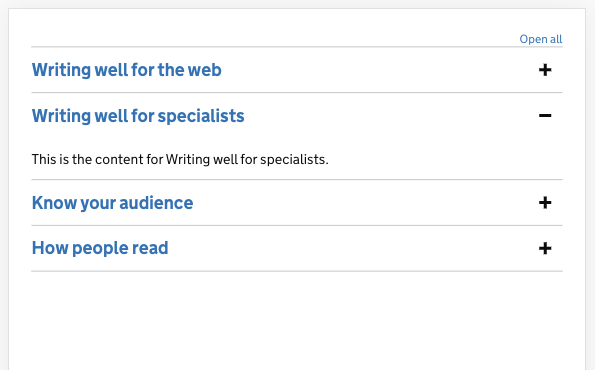
As well as deploying the improved component to the GOV.UK, we also wanted it to replace the GOV.UK Design System accordion component used by cross-government digital teams to build services.
Meeting accessibility standards
We needed to redesign the accordion to meet the Web Content Accessibility Guidelines (WCAG) which are detailed standards public sector organisations have a legal duty to meet. We needed to meet WCAG 2.1 AA standards which are also known as “success criteria”.
We knew the accordion component did not meet 2 WCAG success criteria:
- WCAG 1.3.1 Information and Relationships - some accordion sections had blue-coloured headings which could be mistaken for links, users might think clicking on them led to another page
- WCAG 3.2.4 Consistent Identification - GOV.UK used 3 accordion styles with slight visual and functionality differences and these inconsistent styles could cause confusion and stop users being able to predict their functionality

As the component will eventually live in the GOV.UK Design System, we additionally had to build it to the Design System’s principles of usability, consistency and versatility and accessibility. But we also wanted to go beyond just meeting the required standards by building the most accessible accordion possible and share our findings by working openly.
Our development approach
To resolve the lack of style consistency, we iterated on an existing award-winning step by step accordion pattern. This helped us align the “open-and-close” element in the updated accordion with the GOV.UK step by step component for a consistent design language.
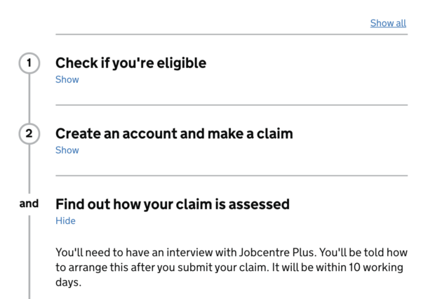
The accordion, like GOV.UK, follows the progressive enhancement methodology. We started by making it work first in HTML before adding Cascading Style Sheets (CSS) and JavaScript (JS) because HTML is the most resilient layer - even when CSS or JavaScript fail or the user switches them off, HTML will still render correctly. This also means that if the HTML fails, there is no webpage. Progressive enhancement benefits all users because “all your users are non-JS while they’re downloading your JS”, so observing it makes your website more robust for all users, another WCAG accessibility principle.
What we changed
As well as establishing a consistent accordion style across GOV.UK, we:
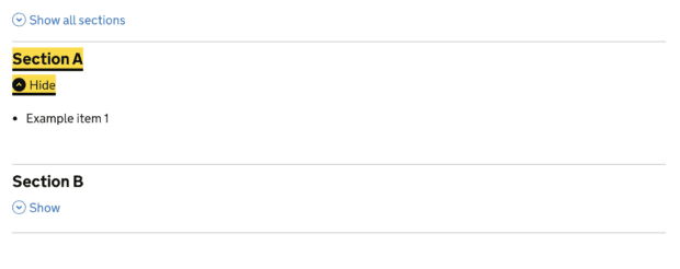
- updated “Open all” with the more explicit text “Show all sections”; we also moved this button (with text) to the left of the accordion to be easily seen by magnification software users
- redesigned the accordion by removing blue-coloured link styling to distinguish that the controls are not links but a mechanism to reveal/hide sections in the accordion
- replaced the “+” icon with an arrow icon and “Show/Hide” text - this helps voice control enabled users interact more easily with the accordion by saying “click show” or “click hide” (which avoids confusion over how to select this icon by voice) - and we also added hidden text “Show this section” and “Hide this section” to give screen reader users more context when navigating
- created a new arrow icon, or chevron, to clearly indicate that the action of clicking on it can show and hide each section; we also gave it a hover or focus colour to highlight the change of state
Accessibility testing
Before releasing the new component, we tested it:
- across various browsers
- with different assistive technologies such as Voiceover, JAWS and NVDA
- considering how punctuation improved the experience
- to meet WCAG AA colour contrast guidelines
- by magnifying it with tools such as Zoom 300% (increases the webpage size) and 300% Zoom Text Only (only increases the webpage text)
We tested across various platforms and assistive technologies because they all interpret webpages slightly differently. We also asked accessibility specialists in the Central Digital and Data Office (CDDO) to review the accordion as it would be eventually deployed across GOV.UK.
We found a few problems including that when a user changed the colour settings in the Firefox browser, parts of the accordion weren’t visible. A user might increase or reduce the colour contrast for comfortable reading if they are visually impaired or looking at a webpage in difficult light conditions, for example bright sunlight. We fixed this issue by using “<a href="https://developer.mozilla.org/en-US/docs/Web/CSS/@media/forced-colors">forced-colors</a>” and “<a href="https://developer.mozilla.org/en-US/docs/Web/CSS/@media/-ms-high-contrast">high-contrast</a>” media query.
We also found that when we zoomed into the accordion, the chevron icon did not scale in line with the text. This is because it was originally pixels so we updated it to use relative values or EMs. The update also helped us to meet other WCAG success criteria that relates to resizing text such as WCAG 1.4.4, WCAG 1.4.8 and WCAG 1.4.10.
The result
The updated accordion component is now live across the main GOV.UK publishing platform and a future iteration will shortly be rolled out by the GOV.UK Design System for UK department digital teams to use in service platforms. It meets WCAG and Design System design digital standards and was iterated following accessibility testing.
If you’d like to know more about accessibility on GOV.UK, you can read about our work to meet the accessibility regulations deadline and how data specialists helped make GOV.UK more accessible.
Subscribe to Inside GOV.UK to find out more about our work
We’re recruiting at GDS so if you’re interested in our work, take a look at our GDS careers page
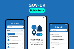 The GOV.UK app went live in public beta in July 2025. Find out what’s been happening, and what’s coming next,
6 comments
Comment by Kate posted on
Nice work! I'm wondering if the "click hide" and "click show" improvements will work as you expect them too. With multiple versions of the same link on the page (assuming it's not just one accordion heading being used at a time), Dragon and other voice control users will be shown a list of numbers beside all the identical links and will have to select one. Using the accordion header as the trigger to expand/collapse could save a step here.
Maybe you've already accounted for that by allowing both the accordion header and the show/hide buttons to activate the accordion. Looking forward to seeing the working component in the Design System. Thanks for sharing.
Comment by Owen Jones posted on
Hi Kate,
Thank you for your comment.
Your guess is correct that we’ve accounted for this. The entire accordion “header” section, title and button, can be used to open and close the associated section.
Thanks, Owen
Comment by Jonathan posted on
When will it be live in the design system?
Comment by Chris Yoong posted on
The Design System team plans to release it before the end of 2021, however it will be a bit longer before it starts to appear on GOV.UK, as individual teams will have their own schedules for updating components.
Thanks, Chris
Comment by Charlotte posted on
Really interesting read, and great to see the work go into this. How has it tested with users in general? ie general usability and understanding, rather than specific accessibility bowser and assistive tech type tests?
Thanks
Comment by Chris Yoong posted on
Thanks for the question Charlotte. Though we haven't had the resources to put this in a lab, we have had a number of accessibility and internal design reviews. We feel this is an improvement on what we had, and we hope to test further and iterate with time
The design was based on a thoroughly researched step-by-step component (including lab research with users that had access needs, and a thorough Digital Accessibility Centre review). We have addressed a number of accessibility issues while keeping the visual design as close to the previous component as possible.