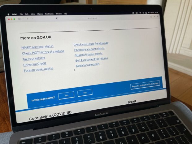
We recently updated the feedback component to be more resilient using progressive enhancement and to be accessible and usable when Cascading Style Sheets (CSS) and/or JavaScript are disabled or unavailable. We did this to improve GOV.UK for all our users, and particularly people with cognitive disabilities or visual impairments.
What is the feedback component?
Components are reusable parts of the user interface that have been made to support a variety of applications. The feedback component is designed to sit at the bottom of every one of the more than 500,000 pages on GOV.UK so our users can submit feedback about the page they’re currently on.
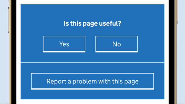
With CSS and JavaScript enabled, the feedback component displays under the heading "Is this page useful?". Under this heading there are buttons for “Yes” and “No”. There is one button underneath them for “Report a problem with this page”.
The component uses JavaScript to handle interactions such as button clicks. For example, someone can give positive feedback by clicking the “Yes” button. Or they can click “No” or “Report a problem with this page” to toggle the visibility of 2 hidden forms to submit detailed feedback.
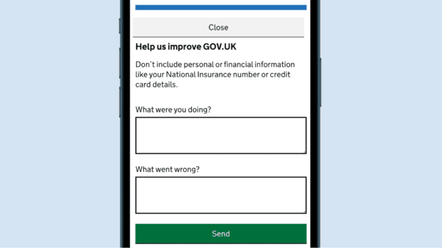
For example, when people click on "Report a problem with this page" they see a short form with the heading “Help us improve GOV.UK”. Under this are 2 boxes asking “What were you doing?” and “What went wrong?” so people can give feedback on the page. This feedback can show what is working well, and also can demonstrate any concerns.
Problems we wanted to fix
Without CSS enabled, people saw the component toggle buttons and both feedback forms all at the same time which was confusing.
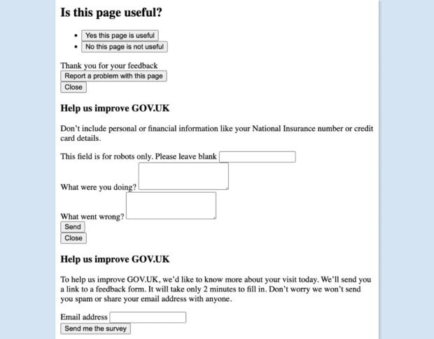
For example, in the image above both feedback forms were shown at the same time with the same heading “Help us improve GOV.UK” but with different ways to give feedback. One form asked people to give feedback on the page. Another form asked people to give their email address to receive a survey. Also, “Thank you for your feedback” was displayed under the toggle buttons before people interacted with the component to give their positive feedback.
Interactive elements such as “Report a problem with this page” or “Close” were broken; clicking, or touching, any of these buttons had no effect.
These issues meant a poor user experience for some people.
This was because CSS classes set the visibility of the component elements which were then added or removed by JavaScript. When CSS was unavailable, the CSS classes used to toggle element visibility were not detected, so everything was visible and the interactive buttons did not work.
Who was this affecting
This was a problem for many different types of users including people with cognitive disabilities or visually impaired people.
People with cognitive disabilities can experience difficulties with memory, problem-solving, attention or visual comprehension. The issues we found resulted in a cluttered layout and too many distractions, making for a frustrating experience and ultimately creating a barrier to providing feedback.
Visually impaired users may prefer to disable CSS, use their own styles, or do both to define a much larger text size and thereby encounter the same problems.
Navigating the page with a screen reader was really difficult. For instance, when tested with VoiceOver and using Chrome, the rotor identified duplicate headings for “Help us improve GOV.UK” and duplicate buttons “Close expanded button” and “Send button”. How would someone know the difference or which one to select? Also, the confirmation message, “Thank you for your feedback”, was read even though a form had not been submitted.
How did we fix it?
Going back to our progressive enhancement principles, we wanted to make sure that the component would remain usable without CSS and JavaScript.
Using the HTML hidden attribute instead of CSS classes to set the visibility of component elements seemed the best way for us to achieve this. Since it’s an HTML attribute it is not affected by the absence of CSS or JavaScript. We added the attribute to any elements that should be hidden by default (like the form whose presence is controlled by the “Report a problem with this page” button), leaving the survey sign-up form visible (usually controlled by the “No this page is not useful button”).
When CSS is unavailable following this fix, everything should work exactly the same - only without styling.
When JavaScript is unavailable, the component should only show the survey sign-up feedback form. This is because the JavaScript adds interactivity by displaying buttons to submit feedback, or toggle the visibility of the 2 feedback forms, to progressively enhance the form.
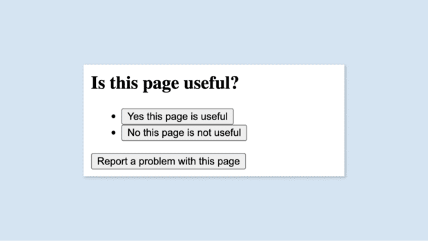
Now, if someone visits GOV.UK without CSS but with JavaScript, people see the heading “Is this page useful?”, with 2 bulleted buttons underneath saying “Yes this page is useful” and “No this page is not useful”, as shown above. Under the bulleted buttons there is one button that says “Report a problem with this page”.
They can interact with the buttons to leave positive feedback or to complete either of the feedback forms.
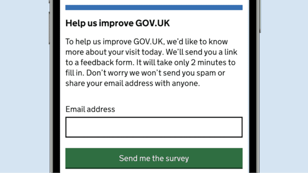
With CSS but without JavaScript, people are only offered one way to give feedback which prevents them seeing 2 forms with duplicate headings. They are shown the survey sign-up form where they can fill in the email address single-line text field, click or touch the “Send me the survey” button and submit the form, as shown above.
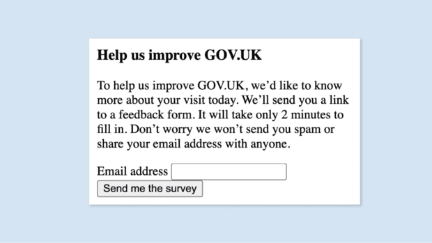
When both CSS and JavaScript are unavailable, people are shown the same survey sign-up feedback form but without styling.
Other improvements
When making these changes, we also realised that the single-line text fields included in the form for “What were you doing?” and “What went wrong?” were too small, making it difficult for visitors to provide detailed feedback.
So, we swapped these fields for text areas to allow for larger amounts of text to be entered. Additionally, the drag handle in the right-hand corner can be used to alter the size of the form control.
Next steps
Progressive enhancement is a principle core to any user interface features developed for GOV.UK.
Sometimes, with components that have not been looked at for a while, we may discover issues that go against those principles. Identifying and resolving these issues is essential to making GOV.UK as accessible as possible.
Subscribe to Inside GOV.UK to keep up to date with our work or apply to join GDS
You may be interested in:
 The GOV.UK app went live in public beta in July 2025. Find out what’s been happening, and what’s coming next,
5 comments
Comment by David posted on
Well done on the work to improve accessibility. We understood there was other work being done on the feedback component as our department was keen to be involved but it has been quiet. One of the main improvements we were wanting to see was the 'Not useful' option providing the same way to report feedback as the 'Report a problem with this page' (but with an added option for the Contact GOV.UK form where a response is sought). This would allow to us to gather feedback relating to specific pages in one place and give us sight of it all. Right now, feedback is fragmented, we can't see the general survey responses and don't think the survey looks particularly useful. Is there a reason why a change like that wasn't considered and is there still work being undertaken to review how the feedback routes work?
Comment by Manuel Rodriguez-Knapik, Associate Product Manager at GOV.UK Insights posted on
Hi David, thank you for your comment. We are currently looking at the feedback component and reviewing the feedback (rather than contact mechanism). This is still in the research stage and we will be moving into A/B testing. It would be great to have a chat about the above points. Please email me at manuel.rodriguezknapik@digital.cabinet-office.gov.uk to arrange, thank you, Manuel.
Comment by David posted on
Hi Manuel, thanks for the quick reply. I've emailed you now to arrange a chat. Speak soon!
Comment by Manu posted on
I absolutely like your transparent communication about what you have worked on! At our university we are on the way to even more accessibility, as well, and I do take a lot of inspiration from your work! Thank you!
Comment by Laura Stevens, Inside GOV.UK Editor posted on
Thank you for your kind words Manu! All the best, Laura