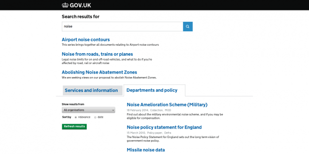
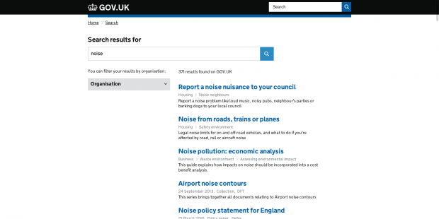
We’re shortly releasing an update to GOV.UK search that we are calling ‘unified search’.
This update presents search results from all of GOV.UK in a single list, rather than the tabbed page layout separating the ‘Services and information’ content from the ‘Departments and policy’ content. It also introduces a more intelligent organisation filter which lists only the organisations responsible for content returned in the results, as opposed to listing all 870 organisations all of the time.


We know through user research that the tabbed layout has not always been well understood, and separating the results in this way makes it harder for us to improve the search experience. Having the results presented as a single list makes it much easier to iterate the design and algorithms that form part of the search experience.
We hope to release this update very soon, but if you would like to see what the new design is like in practice and help us improve the results, you can access unified search at the following URL: https://www.gov.uk/search?ui=unified&q= (it’s hidden behind the ‘ui=unified’ parameter at the moment).
If you spot any results that don't make sense (and you probably will, as we are still tweaking how results are generated), please let us know using the unified search results feedback form. This will allow us to look into why a certain search term might not be returning the most useful results and, if necessary, make a change to the algorithm. If you are unable to access the form, please submit feedback via the usual support tool.
We are keen to get this released as soon as possible so we can learn from real performance and usage data. For this reason, the option to sort by date has not yet been included; it was rarely used (0.2% of all searches), but may be supported later. There will be many other improvements to come, based on user research and other feedback. This is just our next iteration of the search experience.
In the meantime, please do let us know what you think. Are there any search results we can improve in unified search?
- Access the new design: https://www.gov.uk/search?ui=unified&q=
- Search results feedback form: http://bit.ly/UnifiedSearch
Keep in touch. Sign up to email updates from this blog.

15 comments
Comment by Jeni Pitkin posted on
This is great news. We've had feedback from staff and customers that have said they can't find something when actually it has been listed in one of the tabs.
The organisation filter looks like it will be very useful too. We will test with some search terms and let you know if the result isn't useful.
Thanks!
Comment by Graham Lee posted on
Can you fix the issue whereby search results bring up landing pages for obsolete organisations that closed down yonks ago?
I've raised this in several tickets, none of which have been addressed or resolved.
Thanks,
Graham
Comment by Ben Andrews posted on
Thanks for the feedback Graham.
We have a bunch of tweaks planned for results generation and this is on that list so it will be looked at, though not immediately.
Thanks
Ben
Comment by Andrew Robertson posted on
I agree with Jeni, the results look easier to understand by getting rid of the artificial mainstream and departments grouping.
Have you had chance to test whether the 'organisations' tick list should be visitble or hidden? They are hidden on my screen until I click, and I wonder if people won't realise they can filter that way?
Comment by Ben Andrews posted on
Hi Andrew - this is a really good question. We hope to play with the various presentation defaults (open vs closed, left aligned vs right etc) to see what works best for the users. Historically (on the old design) filter usage has been quite low but now the new design is being used properly we can learn from real data and see if this improves.
Thanks
Ben
Comment by Graham Lee posted on
Will people filter by organisation? Do people know which orgs are responsible for the services or info they need, or even care?
Would be interesting to see if anyone uses it.
Comment by Ben Andrews posted on
Hi Graham - from user research we know that some Orgs have a strong brand presence with GOV.UK users and others less so. There is no simple answer to your question however we will be monitoring usage and tweaking the design as we learn more.
Thanks
Ben
Comment by Graham Lee posted on
One problem you may have is that the content for the general public isn't assigned to organisations. Hence search for 'tribunals' produces 0 results for HM Courts & Tribunals Service, which is responsible for the bulk of them. Filter by Ministry of Justice and you just get the corporate info - such as annual statistics. I think Tim alludes to this when he points out that filtering by all organisations leaves out lots of content - which will often be the crucial info someone's looking for.
I was going to suggest allowing users to filter by subject matter, which may be more intuitive, but that would be stymied by the fact that content's split into the Non-Overlapping Magisteria of 'services and information' (split into categories such as 'driving and transport', 'employing people', etc) and 'departments and policy' (divided into distinct 'topics', such as 'transport' and 'employment', etc).
To make matters even more complicated, guidance for those working in particular sectors of the economy and forms relating to 'services and information' sit under 'departments and policy'.
No wonder the search engine struggles to keep track of it all...
Comment by Graham Lee posted on
PS My example wasn't quite right: HMCTS does appear in filter for 'tribunals' search results, but I didn't spot it at first because it appeared 12th in the list of organisations, so required some scrolling to find. Filtered results still left out all the practical guidance, and only showed content published under 'departments and policy', which means unified search is split as soon as a filter is applied.
Comment by Tim Blackwell posted on
This looks like a positive step.
Selecting all organizations generally returns fewer results than having no filter at all. Does this search miss content from GDS itself? If so, could this be added as a filter option?
Selecting lots of organizations sometimes shows a message: "Error. Please try modifying your search and trying again". Sometimes it returns "Error 756 too long request string".
The generic nature of the Did You Mean feature is a bit annoying. Searching for "HB circular" asks "Did you mean HBO circular?" No: HBO circular is not meaningful in .GOV.UK terms. Similarly, searching for "Jobseeker's Allowance" asks "did you mean Job Seeker's Allowance", which returns a rather poorer set of results.
Ideally .GOV.UK would be re-engineered to have a fully browseable structure: search results for relatively non-specific searches (eg benefits for children) would emphasise higher level items. I know some work has been done on making the site browsable, but this could be taken much much further.
Tim
Comment by Ben Andrews posted on
Thanks for the feedback Tim.
All valid points, and we take them all onboard. This is a first pass at how unified search, and filtering, will work and there is lots more to come which should answer many of the above points.
Thanks
Ben
Comment by Andrew Robertson posted on
Is it ok for us to share the search feedback form in this blog post with our internal colleagues, so they can feedback specific examples of problems to you direct? That might avoid comments via your contact us form, or to our web team that we in many cases would need to pass top you via Zendesk.
Related to that, we're getting anonymous feedback, and a few general rumblings from staff, that it's "hard to find anything". So I wonder if you've thought of having a more obvious search feedback link in the search results page, asking for specific problems?
Comment by Ben Andrews posted on
Hi Andrew - thanks for your thoughts.
Please do share the link with your colleagues as the feedback we are collecting is very helpful. I do need to highlight that the feedback form will probably be a temporary thing as it may begin to attract spam. We will keep it in use for as long as it remains effective.
Alternative feedback links are being considered but what is on page is our standard for now.
Thanks
Ben
Comment by Andrew Robertson posted on
Hi Ben, some additional feedback for you on the organisation filter.
I've been speaking to our regulatory staff (who work closely with customers and advise them on using the website) and many are critical of the seemingly unrelated search results, such as foreign travel.
They all suggested there was a filter just to see Environment Agency content. None of them had noticed the 'organisation' filter. Now I've pointed it out, it does exactly what they want.
Being able to filter results by organisation relevant to the organisation page might be a good step forward too (I did read a while ago this was being considered).
We also had this anonymous feedback left today, (19 June): "problem: it searched the whole gov.uk website and didn't find it but the used to be on the EA website. there should be the ability to search under an organsation rather than department as this new set up is just annoying...."
Seems the grey 'organisations' box isn't working well. Let me know if you need any volunteers to help with alternative designs.
Comment by Ben Andrews posted on
Hi Andrew.
We have further improvements planned that will improve search result generation, which all things being in our favour regarding the current development work, should be done before the end of the summer.
We are keeping and eye on the Org filter usage and so far it's performing well so we won't be making changes to it's look and feel in the short term, though this will undoubtedly be revisited in the future. There is obvious room for improvement in our search patterns.
Faceted/scoped search is still on the table, though our User Research proved a default/blanket use of this was confusing to most users. We still feel it can be applied in certain scenarios so we intend to revisit the idea in future sprints.
Thanks again for the feedback. It's very helpful and always appreciated.
Ben