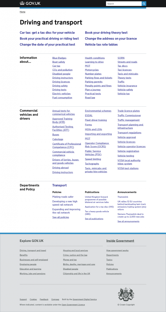
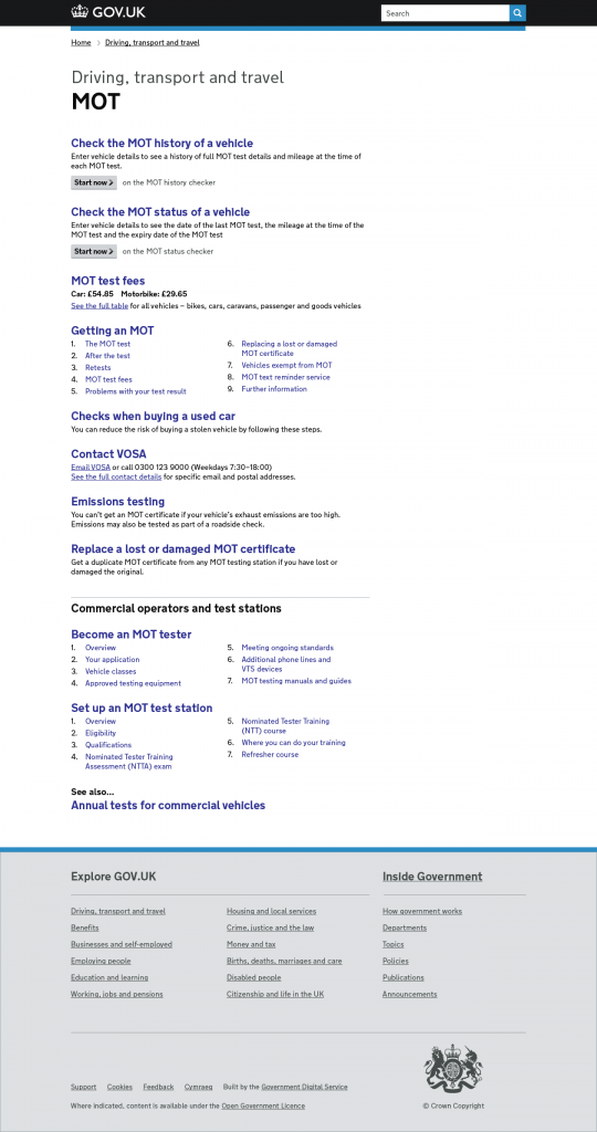
Over the last two weeks, a small team in GOV.UK Mainstream have been developing new browse pages.
We have two challenges
1. Increasingly additional content needs to be linked via the Browse pages
2. Some of the current pages do not meet the users’ needs, language or the way they think of content
Principles
The team came up with three guiding principles for re-designing the pages and the categories.
Simple, Structural and Contextual | NOT Complete and Comprehensive
Simple
- Content display is limited to what will help the users make a decision
- Language is user-focused and consistent
Structured
- We will use information design to show the hierarchy of the articles listed, such as popularity or content type
- The information design will be applied to both the browse pages and display of each content type
Contextual
- No pages will be assigned to a random bucket section
- Appropriate detailed guidance will be incorporated into the pages
- See Also links from other categories will be surfaced
- Topics, departments and publications from Inside Government will be referenced
Complete and Comprehensive access to content will be managed via other navigation and search. Examples of these currently on the site are Licence Finder or Business finance and support finder. Possible navigation types include audience guides, indexes of forms and government contact details.
Designs
Over the next few weeks, we will continue to develop the categories and the designs, including usability testing.


 The GOV.UK app went live in public beta in July 2025. Find out what’s been happening, and what’s coming next,