Visualising analytics data can help us see trends and gain insights into things that aren’t possible to see just by looking at the numbers in our standard analytics interface.
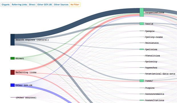
The diagram above (and here in an interactive form) is one of our first experiments with visualising data, and shows how users in August arrived at government pages on GOV.UK. The type of diagram we’ve used is a Sankey diagram - the lines show the different paths that users take - the thicker the lines, the higher the volume of users following the path.
The categories on the left show where users begin their journey. This is broken down by:
-
Search engines (Natural) - search engines such as Google,
-
Direct - users who came directly through typing a url or using a bookmark,
-
Referring links - links clicked on from another website
-
Other GOV.UK - clicks from other pages on GOV.UK.
The text in the centre shows the type of content they first land on - for example, an organisation profile or policy. The categories on the right shows the proportion of users who continued browsing to another page and those who bounced, i.e. left the site.
What the chart indicates
To us, a few things are immediately striking from seeing data visualised in this way. Some of these have confirmed what we knew already - that search is by far the biggest driver of traffic to the site, for example; and that many come to the site with the intention solely of visiting a publication page.
But it also shows us a few areas where things aren’t perhaps working as we’d hoped. When we built topic pages (such as on Europe or Housing, for example), these were intended to provide routes for users into GOV.UK around these topics. But it’s clear they’re not being used as much as we’d expected - and that users continue to identify strongly with particular named government organisations, relying on these for their entry points into GOV.UK .
This type of analytics insight feeds into our prioritisation of things to look at next - for example Neil’s written recently about our work to improve topic pages.
More about diagrams and analytics
Here’s some background info for some of the more hard-core analysts amongst you. We started by running multiple reports in our analytics interface to obtain the raw data we required. To make the data representative and recent the data range was for the whole month of August. Several iterations were made till we settled on the final Sankey visualisation.
Development
The Sankey diagram was created using Mike Bostock’s D3.js Javascript library. The main challenge associated with this type of visualisation is the potential for complexity when charting multiple user journeys. In order to combat this, we reduced the second step to a simple bounce or browse path which is instructive in highlighting the split between these two very different behaviours.
In addition to this, we employed some simple graphical elements such as encoding user volume in the opacity of the links and maintaining a consistent colour code across all distinct entry points (search, direct, referring links etc.). The arrangement of the nodes in the online version is handled programmatically however it is possible to manually arrange them to allow for bespoke groupings.
Whilst Sankey diagrams are often printed out and used as a static snapshot we’ve added a few interactive elements in the web-based offering such as button filters to isolate entry points and a slider that filters by pageviews. These allow us to focus on users from a particular source and isolate the dominant routes they take.
We’ll be doing more data visualisation in the near future and will be interested in knowing what you think.
 The GOV.UK app went live in public beta in July 2025. Find out what’s been happening, and what’s coming next,
3 comments
Comment by Ben posted on
Ashraf - this is great stuff. Do you have a CSV of the raw data you can share?
Comment by Ashraf posted on
Hi Ben
I've emailed you a CSV file containing the raw data we used to create the Sankey diagram
Best
Ashraf
Comment by Matt posted on
Hi Ashraf love this visualisation - could you email me the CSV too?!