The information in this blogpost may now be out of date. See the current GOV.UK content and publishing guidance.
A simple ‘how-to’ guide on understanding basic page level metrics on GOV.UK. Use it to understand how your content is performing - and avoid common mistakes. (This is the first in a series of articles - please let us know what else you’d like us to cover).
Understanding basic reports
A quick way to see how your pages are doing is by mapping them against some key metrics and analysing how those metrics relate to each other.
You can get this by going into Behaviour > Site Content > All Pages in the Google Analytics interface and then searching for the urls of pages you want.
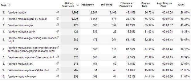
Alternatively, you can create a custom report. The example below shows pages from the GDS Service Manual:
Here’s what each metric means:
Unique Pageviews
This represents the number of visits in which that page was viewed.
So, if a user visits a page 5 times during their browsing session, it will show up as 1 unique pageview in Google Analytics.
Pageviews
This is a count of every time that page was viewed.
For example, if someone visits page X, then goes to page Y and then page X again, then page X will be shown having 2 pageviews (and 1 unique pageview).
Entrances
This is the number of times that page was the first page on the site viewed by users.
Entrances/Pageviews
A simple calculation showing entrances to the page as a percentage of the pageviews.
Bounce Rate
The percentage of ‘single-page sessions’ - that is, users who viewed only this page and then left GOV.UK.
Ave. Time on Page
How long users view the page for on average (NB treat with caution - see below).
% Exit
The percentage of exits that were made from the page (calculated as number of exits/number of pageviews).
How to use the data:
What is the most (and least) popular content?
By default, Google Analytics will order reports by the first metrics column. We can see in the above report that the Service Manual homepage was the highest visited page followed by the Digital by Default page.
The Unique Pageviews column will show you your most visited pages. Clicking on the down arrow at the top of the column will show the reverse order, i.e. the least visited pages.
Note that Google Analytics will only show urls that were visited in the time period (ie, it won’t show up pages which weren’t visited at all). All iterations of urls will appear as well.
Are there potential navigation issues?
Dividing the Pageviews metric by Unique Pageviews will show on average how many times a page was viewed during users’ sessions.
A high ratio (above 1.4) indicates a propensity for users to have to come back to that page within their session. This should be a primer for you to investigate the navigation from that page further to identify any issues.
(You’ll need to work this out yourself by exporting the data to a spreadsheet. Unfortunately Google doesn’t do this for you).
Can pages be better optimised?
If the Entrances/Pageviews percentage metric is low on pages getting a reasonable amount of traffic then it suggests that users have a need for the page but most are having to navigate their way to get to it so better optimisation may be required.
Should I be concerned about the high Bounce rates?
Bounce rates should only be viewed against the Entrances metric and not with Pageviews.
A high bounce rate on navigation pages reveals a problem as it indicates users are not engaging with the page; changes should be made and measured again.
However, a high bounce rate on content pages is not necessarily a bad thing as users could have obtained the information they came for and did not need to go any further beyond the page.
We are looking into adding further analytics instrumentation in the future to give us better engagement metrics such as minimal time spent and scroll depth.
How long are users spending on my pages?
The ‘average time on page’ metric provides a guide to how engaged users are with your page.
However, treat with caution. This is because it excludes data from sessions in which the page was the last one visited on GOV.UK (eg, it doesn’t include single page sessions).
So for pages with high bounce rates (such as news pages), the dwell time displayed by Google may be very wide of the mark. As a general rule, the lower the % Exits rate the more representative the average time on the page will be.
How to build reports for your own content
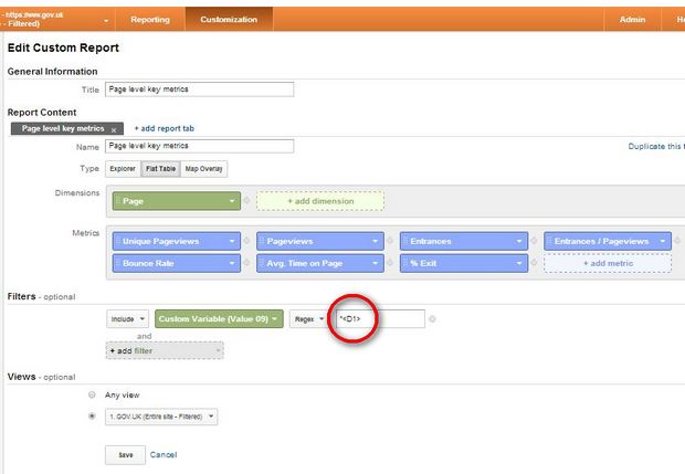
If there are sets of pages you frequently measure, you can save time by building your own custom reports.
To do this, you could replicate the above report and filter it for your own pages or you could click on this custom report and save it in the “1.GOV.UK (Entire site - Filtered)” view.
Note that the report is filtered for Attorney General Office content. To change it to your own department’s content click on Edit in the top left, change the filter value in the triangle brackets to your own department value and then click Save. The custom report can also be saved into a blog profile but the filter must be removed in order to see data.
Currently, only news and organisation pages have department tags but this is soon going to be rolled out to all departments and policy content.
We’ll be blogging more about setting up custom reports - in the meantime, please share any interesting insights.
Find out more
Our next Analytics Show and Tell will be in the afternoon of Tuesday 10 December at GDS. If you are interested in attending please email John Byrne on john.byrne@digital.cabinet-office.gov.uk.
Also, feel free to use this blogpost to suggest topics for further posting.

1 comment
Comment by ilse posted on
Since the death of Google Reader in the beginning of July, I am wondering if RSS / ATOM is stil being used and popular. Or is this rather something online the real experts are using? In user testing I did last year for a heath care site, it seemed hardly any one of the participants knew the RSS icon.
Did you do any research on that already? Even though at the right of the screen, the atom and email alerts icons with label are put quite prominent on the gov.uk site.
Thanks,
ilse