I was lucky enough to attend the first GOV.UK content design conference (#cdcalpha) and lead one of the sessions. I wanted to talk about HTML publications – and I was really chuffed that lots of other people did too.
I don't want anyone to miss out - so here's a recap of the session and why I think HTML publications on GOV.UK are so important.
I think there are 3 really important reasons why we should use HTML publications on GOV.UK:
- they’re better for search
- they’re better for mobile
- they comply with open standards
Better for search
There’s so much great metadata in HTML publications.
We should, of course, make sure that PDFs we publish have this same metadata, but it can get overlooked because of time or technology constraints.
But with HTML publications, we don’t need to worry – it’s all in there for us automatically. This helps to give users better search results.
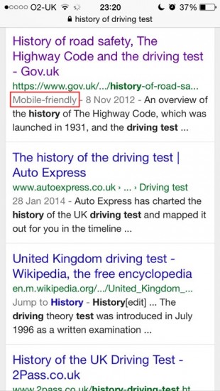
Another reason this is becoming really important is the way that search engines work. You may have noticed that if you search Google on your mobile, it will tell you which pages are mobile-friendly.
If you’re anything like me, this makes a big difference as to whether you click on the result.
Google is already experimenting with using the mobile-friendly criteria as a ranking signal. How much longer before it becomes a much more important criteria?
Better for mobile
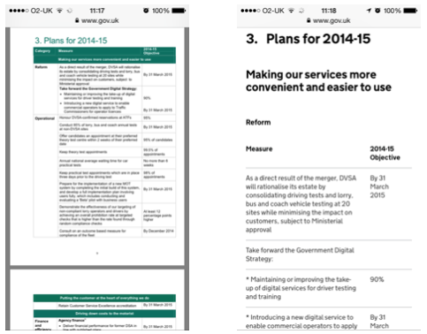
HTML publications work so much better on a mobile device than a PDF does.
With every passing day this becomes more important. More users are accessing our content on mobile devices.
It’s really worth taking a look at your most popular publications and seeing what devices people are using to access them. The results might surprise you.
How to find this in Google Analytics
- Go to the ‘Behaviour’ tab.
- Click on ‘Site Content’.
- Click on ‘All Pages’.
- In the search box above the list of pages, copy and paste the page URL from /government onwards – eg ‘/government/publications/rules-on-drivers-hours-and-tachographs-goods-vehicles-in-gb’ and search.
- Click on the ‘Secondary Dimension’ button and search for ‘Device Category’.
- Click the pie chart icon to get a chart view.
If around half of your users are accessing PDF content on a mobile or tablet, I think you must ask yourself if you’re meeting those users’ needs as best you could.
The print issue
The other reason knowing what type of devices people use is useful is to overcome this statement:
‘It needs to be a PDF because people want a printed copy.’
Although you can print from a mobile device, how many people actually do?
If half your users are using a mobile or tablet, is it really likely that they came with the intention of printing something off? It’s far more likely that they have a question. Burying the answer in a PDF isn’t helping them.
And you can, of course, print a webpage if you need to.
Using data to back up your decisions makes it easier for you to overcome internal resistance to changing how things are done. And most importantly, it makes things better for users.
How to comply with open standards
Back in July 2014 it was announced that government will be moving to publishing documents in newly agreed open formats.
The document ‘viewing’ standards apply to documents designed primarily for people to read, rather than to edit or interact with.
Documents for ‘viewing’ must be available in one or both of the following formats:
- HTML5
- PDF/A
This is really important.
Users need to be able to view government documents on their device of choice, for example a smartphone, a tablet or a laptop, without the need to pay for any additional software.
I’d argue that in most cases it’s just as quick to create an HTML publication in GOV.UK as it is to make a fully accessible PDF/A document. And in some cases, it’s quicker.
We’ve got to do this, so why not choose the option that makes life easier for users and for us?
My top 7 tips on using HTML publications
These are my top 7 tips for using the HTML publication format. If you have any, do leave them in the comments.
1. Get people resistant to change to view a PDF on a mobile device.
This is a really effective way of making people experience what your users are experiencing. When you’ve got them to see how painful it is, hit them with the figures.
2. Use Google Analytics to see how users are viewing your publications.
You can use Google Analytics to see what types of devices are being used to access any page on GOV.UK. Find out how many people are using mobiles and tablets to access your most viewed publications to get a feel for things.
3. Use Feedex to see real feedback from users who are struggling with existing formats.
Feedback Explorer (Feedex) is a simple way of seeing what anonymous feedback has been left about any page on GOV.UK.
4. Use the Whitehall publisher preview environment to have a go.
You can use the Whitehall publisher preview environment to create and publish HTML publications. It can be another useful way of showing subject matter experts how things will look and how navigation will work when it’s published.
5. Publish a real one and see how it performs.
There’s nothing like actually having a real HTML publication live on GOV.UK to see how users actually use it. Use Google Analytics to look at how people are viewing it, which links they click on, and whether they start internal searches from your publication. This can help you find out if there’s anything missing from your publication, or if it’s full of links that nobody is using (ie clutter).
6. See what other organisations are doing with HTML publications.
Be nosey. There are some great examples of HTML publications on GOV.UK. From business plans to the national curriculum, content designers are already using the format really well. Look at what they’re doing and follow their lead.
7. Consider making it the default unless there’s a user need to use PDF/A.
Why not make HTML publications the default format for publications in your organisation? You can publish in PDF/A format if there’s a compelling user need, and there’s evidence to support it. But if you start to change the culture by changing your default stance, internal people will get used to it surprisingly quickly.
Then we talked about how we could overcome some of the challenges to using HTML publications.


 The GOV.UK app went live in public beta in July 2025. Find out what’s been happening, and what’s coming next,
3 comments
Comment by E. Brown posted on
Hi John,
For our team, the single biggest obstacle to improving HTML takeup is a technical one: there's no working preview available using the fact check feature.
If you attempt to send an HTML item to a subject matter expert using the fact check from Whitehall Publisher, you get a lovely view of the title and summary, and the rest is blank - as if the HTML document doesn't exist.
I'll send you a screen cap example to show you what I mean.
Surprising that noone mentioned this limitation in your session.
It's our biggest blocker, and it's a known issue.
We have to use the browser to print to PDF to send this content to fact checkers. Given that, along with the limited formatting, table and graph options...what's the incentive to use HTML?
Do you know if there's any intention to change this fact check feature to allow users to view HTML?
Cheers,
E. Brown
Comment by John Ploughman posted on
Hi
The lack of preview of the HTML attachment is something that I too had raised with GDS as it's causing us problems for the same reason.
I believe it's on the backlog to get to.
At the moment we've been getting around it pretty much the same way as yourself - by copying and pasting, or creating a PDF.
The other option is create and publish the document on the preview environment, and send a link to that for factcheck - but being very aware that preview gets wiped once a week.
I'd say that the incentive to use HTML is to make sure that we're serving the needs of those accessing our content on mobile devices, and making sure it's accessible.
At the moment that means we have to do a bit more work than is ideal. But my personal opinion is that the positives for the user outweigh the negatives for content designers.
Perhaps one of the product managers from GDS might be able to give us an update on factchecks for HTML publications on this thread?
John
Comment by Petter Thorsrud posted on
Hi
Interesting to follow what you are working on at GOV.UK.
I’m part of the team developing regjeringen.no, the site for the Norwegian Government and the Ministries (excluding the agencies and municipalities). We have been inspired a lot by what you are doing, but I honestly think that when it comes to “Publications” – or long/complex documents – we have done some groundbreaking work.
As you say, PDFs are bad for online reading (especially on small devices) and bad for search/findability (on Google or internal search). And Norwegian legislation demands that the primary publishing format for public sector websites should be HTML, mainly for accessibility reasons, but also for the reasons mentioned above.
The Norwegian Government's website http://www.regjeringen.no has since 1995 (!) published long documents in HTML format. Until December 2014 the reports were split in chapters and sub-chapters, with a left side menu for navigation (see below for example). A new version of the site – launched in December – introduces a new method for publishing and reading of long documents. An example at regjeringen.no/en/id762916/ shows how a 110 page report can be navigated and searched from any screen size, including mobile. There is also a download option, offering PDF, RTF and ePub versions. So those demanding a PDF – or even better; ePub – for offline reading, are well served. And PDF is fine for printing.
The production process starts with a Word template used by authors, includes conversion to XML and transformation to appropriate structured file formats. Printed versions are supplied for physical distribution, as well as HTML, PDF, ePUB and RTF versions. We use internal XML formats that allow for reformatting or retransformation, so that when we changed the methods for storing and presentation in December, we could batch process content dating back to 1994 with hardly any human intervention.
The downside of this is that the process involves manual correction and conversion of the manuscripts (supplied by the typesetting/printing industry), and is time comsuming and costly. But the results are very good, in our humble opinion.
For the time being, we only offer this way of publishing long documents for a limited set of document types, but we hope to be able to offer a generic template and conversion that will allow more or less any kind of long, complex document (including tables and illustrations) to be published at regjeringen.no At lot more examples may be found at regjeringen.no/dokument, but most will be in Norwegian...
One of these regjeringen.no/id2353568 shows a document in a timeline, showing the political process around a specific document and the issue it covers. We believe that publishing the Government's documents in an accessible format helps creating openness in democratic processes and engages the public and the media in a positive way.
A previous version of Long documents may be seen at omega.regjeringen.no/nb.html?id=697260
The team behind regjeringen.no is enthusiastic about sharing our solutions – do get in touch for more information and sharing