In the GOV.UK content team we spend 20% of our time on ‘improvement themes’ where we iterate content based on data and user feedback. We identify content that needs improving by working with performance analysts, user researchers and analysing feedback from members of the public.
We’ve recently been improving the user journey through the ‘Claim your State Pension’ ‘smart answer’. This directs eligible users through to the ‘State Pension Online' service.
Feedback from users indicated that the smart answer wasn’t providing a good user journey - they were confused by certain questions and getting stuck before getting to the service.
Understanding the end-to-end journey
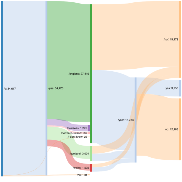
Our performance analyst, Chris Russell, made a diagram to help us view how users made their way through the smart answer:

This gave us an idea of the most common user journeys and where to focus our efforts. But we soon realised that we couldn’t look at the smart answer in isolation - we needed to know more about how it fitted into a wider user journey.
We started talking to the service team at Department for Work and Pensions (DWP) that manages the 'State Pension Online' service, led by Faye Churchill. They were really keen to work with us to increase the number of users being directed to their service from GOV.UK.
The DWP service team shared their performance data, as well as insights from their call centre and copies of letters sent out to users. This helped us to build a picture of the end-to-end user journey.
Together we developed some hypotheses about current user behaviour and how we could improve the smart answer.
Measuring the impact on the service
Collaborating and sharing data with the service team at DWP meant that we could measure the impact of our content changes on the service itself. As a result of the changes we made, the service saw an immediate and sustained increase in users being directed to the service from GOV.UK and a decrease in their drop-out rate.
Sharing expertise and building relationships across government
We made things better for users by collaborating with the service team at DWP. It meant we could pool our knowledge about different stages in the user journey. We also established a better working relationship across our teams:
"I can’t stress enough how good it was to have what felt like a partnership when it came to content design, I felt empowered as a product owner and learned a few things along the way!” - DWP product owner, Faye Churchill.
 The GOV.UK app went live in public beta in July 2025. Find out what’s been happening, and what’s coming next,
2 comments
Comment by Jim posted on
How did Chris produce that wonderful flow chart?
Comment by Tara Stockford posted on
Hi Jim
Chris used a Sankey diagram maker such as sankeymatic.com, to make a flow diagram where the thickness of each line reflects its quantity.
Tara