In December 2016 we wrote about our fifth round of benchmarking on GOV.UK. Since the blog post we’ve been analysing and sharing our results across GDS. Although we learned a lot about the specific tasks, we also found out more about the way people use GOV.UK in general.
In this blog post we’re sharing some of the high level findings about GOV.UK.
Navigating GOV.UK is difficult when there are similar titles
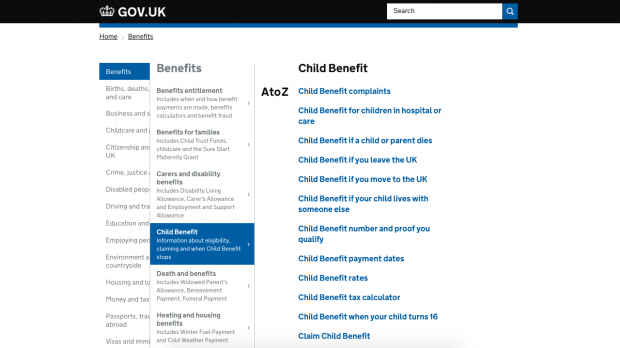
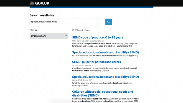
Across the GOV.UK website there are page titles that start similarly - only the last part is different. There are pages called ‘Child benefit if a child or parent dies’, ‘Child benefit if your child lives with someone else’, ‘Child benefit if you leave the UK’, and ‘Child benefit if you move to the UK’. We saw this causing problems for users when they were searching and browsing.
Similar titles make it harder for users to scan items on the page and choose the most relevant option. If the titles are similar, it takes more mental effort to work out what each page is about. The screenshots below show two examples of this.


What we’re going to do about this
Part of the work of the Group and Transform Content team is to improve things like titles, making it easier for users to identify the content that’s relevant to them. The team will blog in more detail about this work soon.
Search isn’t working in the way users expect
People use search when they struggle to find a piece of content by browsing the website, when there’s not a clear entry point on the homepage, or to quickly narrow down options.
GOV.UK search doesn't always give you a narrower and more specific list of content items related to the search query. For example, when you search for ‘passport’, the results include links that aren't relevant, such as content about driving licences and the 'Register to vote' service.
We saw one participant searching for ‘passport renewal times’ and selecting the answer for ‘driving licence renewal times’. Even though she had searched for passports, she didn’t notice the results were about driving licences. She clicked through to the driving licences page, assuming it was passport information.
What we’re going to do about this
We have a dedicated team looking at how search works on GOV.UK. One area they’re looking at is making sure search results are as helpful as possible for users.
Linking too early leads to users missing important information and circular journeys
Many pages on GOV.UK have links within the text, just like this blog post. When people use GOV.UK, they already have a task in mind that they want to complete. So they tend to quickly skim a page looking for something that will help them to do that task. Links often stand out on the page as they’re styled differently and grab people’s attention.
So having too many links within the text can be a problem. Users will click on them and miss important information that might be further down the page. They might make circular journeys, not realising which pages they’ve been to already and which ones they haven’t. This means it’ll take them longer to complete their task, and it makes for a frustrating experience.
What we’re going to do about this
In April this year, we formed a new team to focus on fixing the user journeys related to our benchmarking tasks. They’re free to pick the task or area that they want to work on, having learned the pain points from the previous rounds of benchmarking.
Following their work we’ll run another round of benchmarking with the same methodology to measure the improvements they’ve made. Keep an eye on this blog for future updates, if you'd like to read more about how this work is going.
 The GOV.UK app went live in public beta in July 2025. Find out what’s been happening, and what’s coming next,
2 comments
Comment by James Low posted on
Might we finally be about to see an option to create and display alternative/contextual content titles to help streamline navigation? Long overdue improvement if that's the case.
Comment by Sam Dub posted on
Hi James,
We definitely see the benefits of different content titles in different contexts, particularly for navigation as you mention. We’re also aware that, depending on how we implement this, it introduces some extra work for publishers and additional complexity for the platform as a whole. We want to make navigating content easier, but we'll need to explore the implications a bit more before we can start building this as a feature.