Last quarter, a multidisciplinary team explored how we can improve the transaction (or ‘start page’) content format.
A start page marks the point in the user’s journey where they move from finding out information on GOV.UK to completing a transaction or task in a service. They enter the service by clicking the green button on the page. The format itself was designed when GOV.UK first launched over 5 years ago.
There’s now a lot more variety in the things users can do with government online, which has affected what users need to know before they use a service. In many cases, this has resulted in us adding more content to the start page than the format was originally designed to accommodate.
We set out to reduce the amount of content on start pages for some of the higher volume services on GOV.UK. We found that some services can be accessed in multiple ways, for example using Government Gateway, GOV.UK Verify or a service-specific account.
Until now, we’ve presented these options on the start page. Although effective in providing users with a clear entry point to the service, the green button can sometimes overshadow other content on the start page. As we can only have one green button per start page, using it to link to one way of accessing the service would risk making it more prominent than other options on the page.
We decided to focus on services that users can access using either Government Gateway or GOV.UK Verify. We explored ways we could present this choice in a clearer, more balanced way while simultaneously reducing the amount of content on the start page.
Introducing the service sign-in page
We’ve developed a new content format for services which can be accessed in more than one way. We call this the service sign-in page.
This page sits in between the start page and the service. It presents users with the different ways they can access the service. All they need to do is choose one of the options, enter their sign-in credentials and then they can access the service.
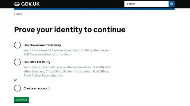
For users who are brand new to the service, we’ve added another option. This will take them to guidance about what they need to do to create an account.
We found that users who had already used the service might not remember exactly how they accessed it. This is especially true when it comes to tasks they need to complete infrequently.
We made sure there was space underneath each option on the service sign-in page to add short prompt text to help jog users’ memories. For example, where GOV.UK Verify is an option we’ve referenced all the certified companies that can help double check a user’s identity. As users spend most of their time on one of these companies’ websites when they sign up, it’s likely they’ll recognise that name more than GOV.UK Verify.
Testing the design
We worked with HM Revenue and Customs (HMRC) to test our design with the ‘file a Self Assessment tax return’ service. We ran an A/B test for one week in November 2017, during which 70% of users saw the then-current version of the start page. The other 30% saw a different design which, once they clicked the green button, took them to the new service sign-in page.
After the A/B test, we saw an increase in the number of users who chose to sign in with GOV.UK Verify. This option was previously on the start page, directly underneath the green button, where it was clicked by 4.3% of users. Moving this link to the service sign-in page nearly doubled how many users clicked on it.
This change didn’t affect how many users were able to complete the service with Government Gateway. Users who wanted to sign in using that particular option were still able to find their way through to the service.
We also saw a decrease in some of the most popular search terms on this page, namely “sign in” and “log in”. From this we can infer that having fewer conflicting calls to action on the start page has made it easier for users to identify a way to access the service.
What’s next
The service sign-in page is now live for the ‘file a Self Assessment tax return’ service. We’ve also rolled it out to 2 other HMRC services - ‘check or update company car tax’ and ‘check Income Tax for the current year’.
Over the next few months, we’ll keep an eye on the available user feedback and analytics to see how the new pages are performing. Please get in touch if you work on a service that you think would benefit from having a service sign-in page.
Tom is a senior content designer on GOV.UK.

2 comments
Comment by Dominic Timms posted on
Hi Tom,
How easy is it to run A/B test on GOV.UK and how does one go about it? At the moment we are relying on fairly clumsy surveys to get feedback from users but I have used multivariate testing in previous private sector roles with great success.
Comment by Tom Hughes posted on
Hi Dominic,
We need help from a developer to set up and run A/B tests. How they do it is explained in the GOV.UK developer documentation - https://docs.publishing.service.gov.uk/manual/ab-testing.html
If you're interested, you can read about some of the other A/B tests we’ve recently run to improve user journeys in this blog post - https://insidegovuk.blog.gov.uk/2017/11/14/using-ab-testing-to-measurably-improve-common-user-journeys/
Thanks,
Tom