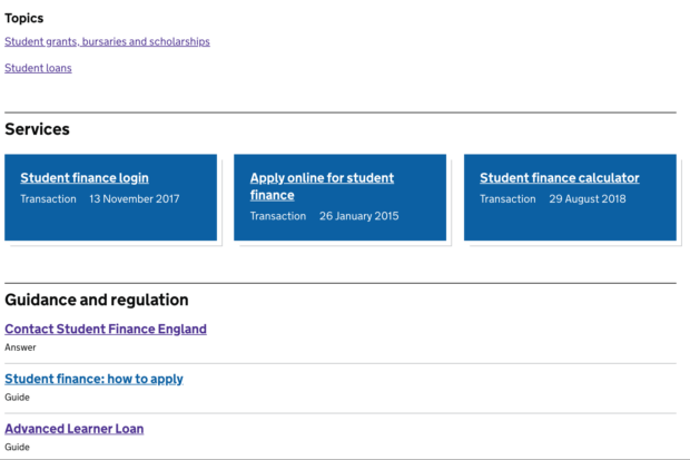
We want to make it easier for users to move between different types of content if and when they want to. This is sometimes called a 'sideways push'. The content pages and site navigation team experimented with a new way of doing this over the summer.
Context is king
The site-wide topic taxonomy makes it possible for us to show everything about a subject on GOV.UK. But we wanted to experiment with showing more contextually appropriate links on different kinds of pages. For example, users reading a news story might be interested in a consultation in the same area.
It's common practice on other large websites and we wanted to see if GOV.UK users explore in similar ways.
We developed a design to show tagged content on a particular topic at the bottom of a wide range of content types.
Working out what to put where
We developed rules based on the job users are likely to be doing when they're on a type of page. For example, users viewing consultations may be contributing to the formation of government policy, so we tailored the types of content displayed on that format.
This helped us mitigate the impact on users who are likely to be focused on the straightforward task they're doing and to avoid overloading the page.
We were mindful of the latter risk and increasing the cognitive load on users with links that were not relevant. So we ran a limited A/B test which lasted long enough for us to gather data for analysis, using the standard GOV.UK pages as the control, with our added navigational elements as the variant.
Results and what's next
We've monitored things like:
- usage of the types of links on different content types
- average time spent on page
Alongside the A/B test, we also conducted some lab-based and contextual user research sessions with people like researchers and other regular users of departmental policy content. We believe these contextual links will be useful to people coming to GOV.UK for those reasons.
What we learned:
- interaction with the supergroup links averaged at 2% of clicks on the pages, which is a reasonable number for links to other content pages and shows they were somewhat useful to some users
- links to guidance content averaged higher at 6%, showing users found this the more useful of the 2 options
- we tried a new design for a breadcrumb for content tagged to multiple topics but it did not work as well as we'd hoped
- people interacted more with topic links at the bottom of the page than in the sidebar
- people clicking on topic links at the bottom of the page tended to explore topics further
- users of mainstream content were less likely to click the supergroup links and stay focused on their task
- bounce rates, exit rates and average time on page were largely unaffected
From this work, the immediate change we’ve made is to move topic links to the bottom of pages. These attract more interaction from users and encourage further exploration.
We plan to use our other findings to feed into our future work in this area and continue improving user journeys on GOV.UK.
Alan is a senior content designer and Ganesh is a product manager on GOV.UK.
 The GOV.UK app went live in public beta in July 2025. Find out what’s been happening, and what’s coming next,