In the last few weeks, we've been taking a look at how people browse and navigate GOV.UK. We've just made a start with some HTML prototypes and research in the usability lab.
Right now, we're not very good at helping people find content, even really popular content. We're also not very good at helping people explore new areas they're unfamiliar with. But we're thinking hard about how to make these interactions better for users.
Here's an example. The tax disc page is the second most popular on GOV.UK, with 2.5m visitors a month. Yet there's no prominent link on the homepage; there's not even a prominent link on the browse page for Driving and transport.
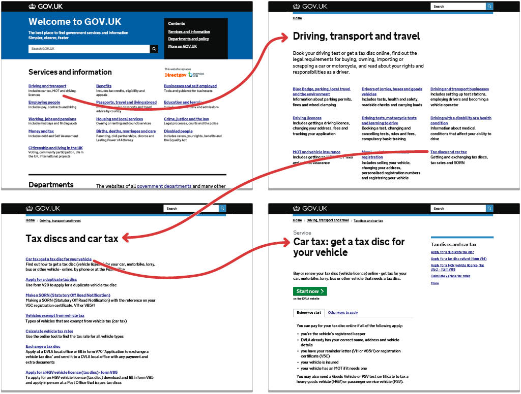
Simpler, clearer and faster
In our new design for the Driving and transport page, the tax disc service is right at the top of the page. We've also highlighted two other popular areas – Learning to drive and Driving licences. Analytics will automatically show popular links in every category.
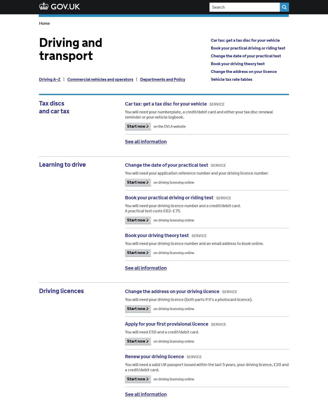
We've also made it easier to find niche information and services. The Driving A–Z shows all the general topics in driving and transport. There's also a separate A–Z for Commercial vehicles and operators.
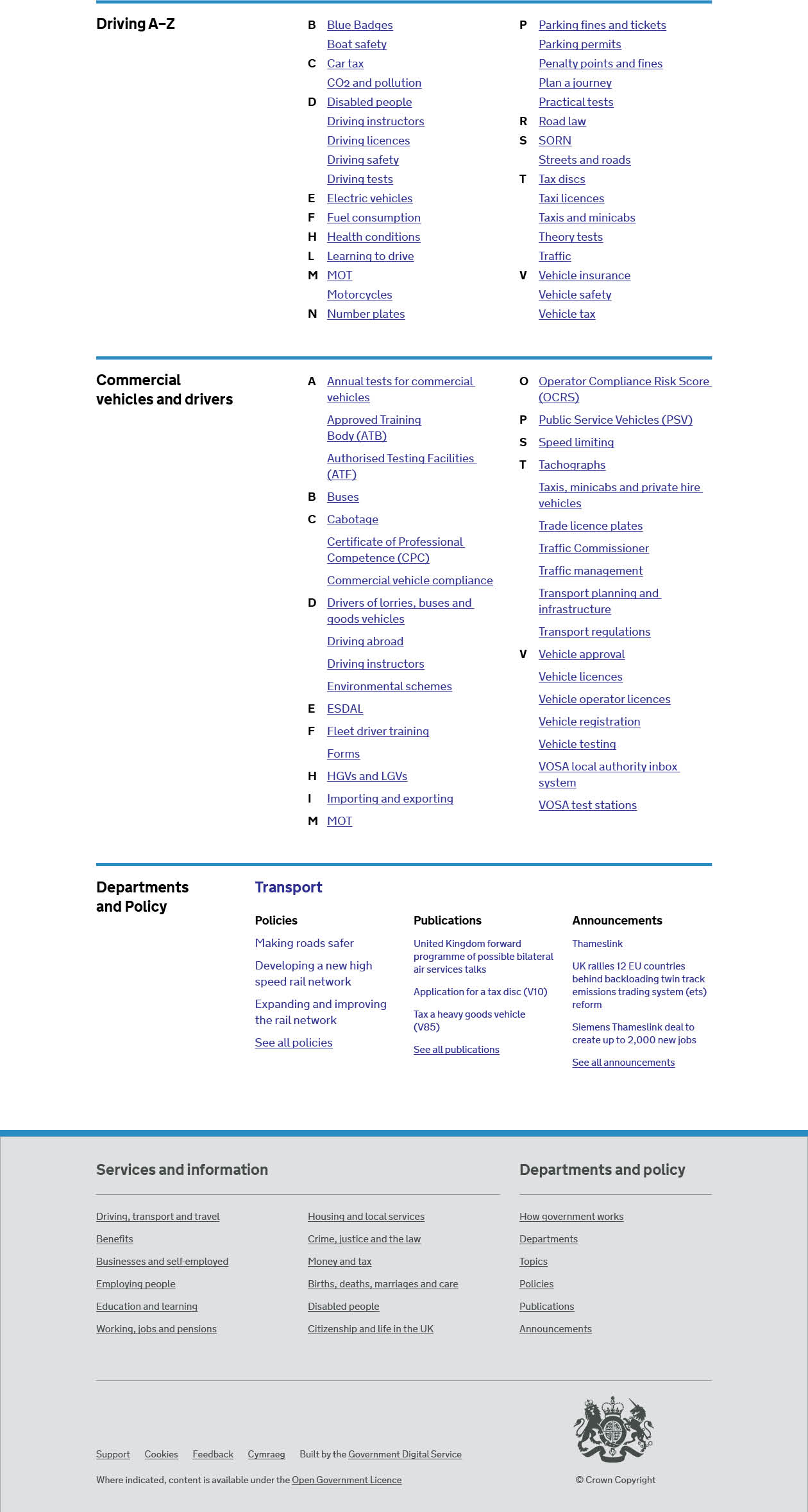
We're surfacing Departments and policy information here too. This is only relevant for a niche audience, but it's very important for people to the people who need it.
Increased focus
We've also taken a look at the subcategories, like MOT or Driving licences. We're making them much more focused – no more categories like these.
In our prototype of the MOT subcategory, we've put the two most popular pages right at the top. We're not just surfacing popular links. We're putting the information people are looking for right in the page. For example, directly under the link to MOT test fees you can see that cars costs £54.85 and motorbikes £29.65.
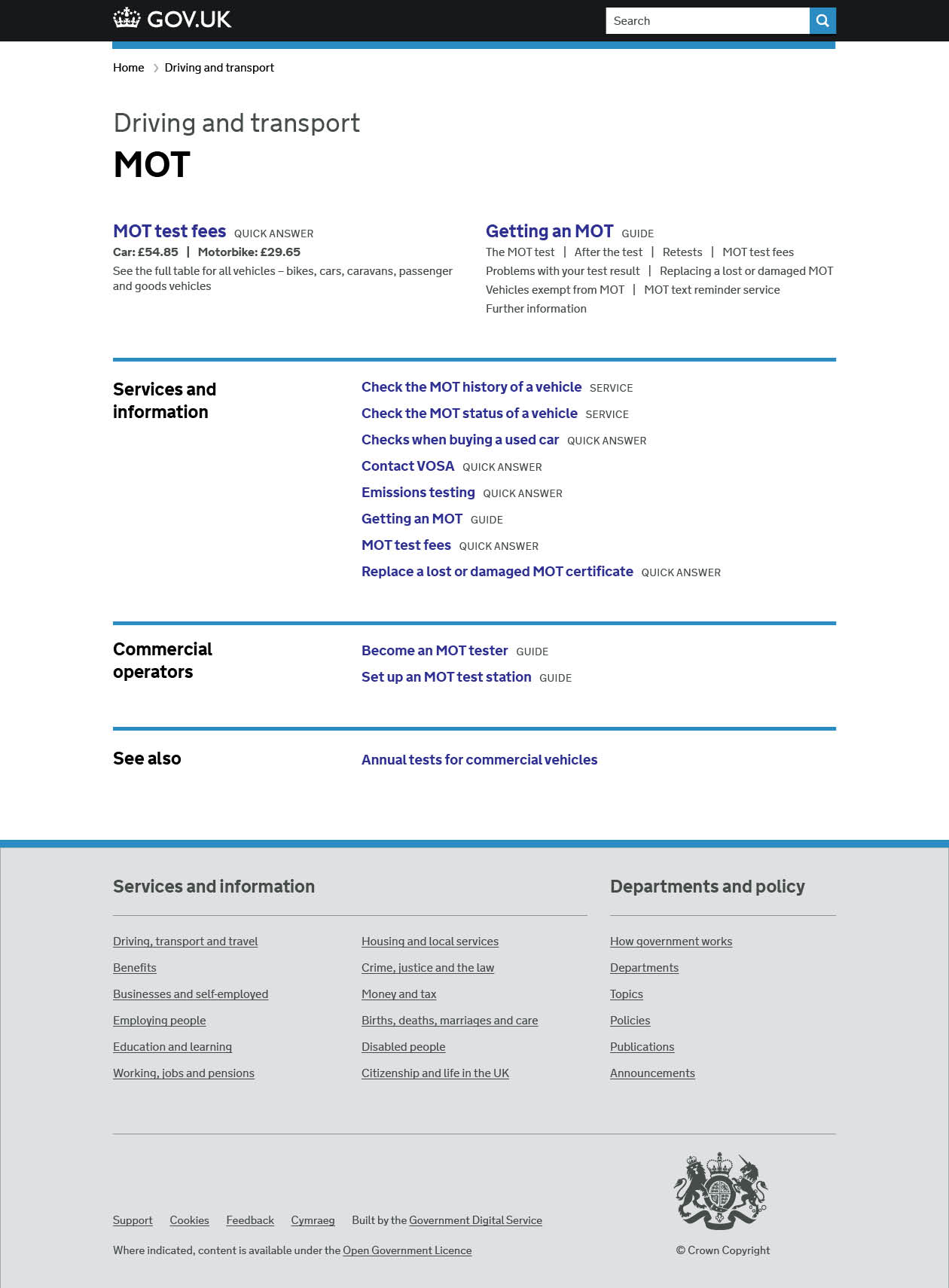
The other pages are listed underneath, with mainstream pages listed before the more specialist information about setting up your own MOT testing business.
Some subcategories have to handle a lot more content. Exporting includes about 20 'mainstream' articles and around 250 detailed guides for export specialists. Filters, sorting and search help users get around more complex subject areas.
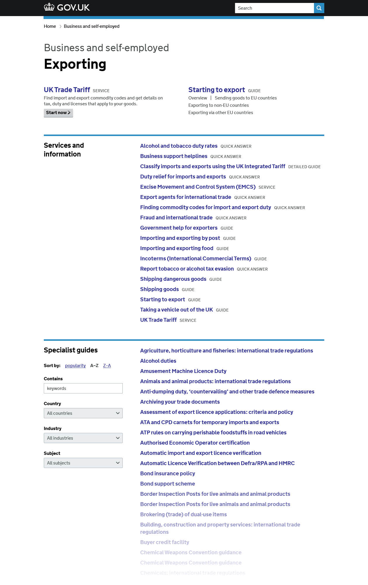
We're also planning to include Departments and policy information on subcategory pages, as well as a feed of the latest updates in that area.
Better URLs
We're no longer just thinking of these pages as simple directories of links. We're aiming to make 'start pages' – pages which get you exactly what you need, whether you visit once a year to renew your tax disc or you visit every day to get the latest in your industry sector.
To reflect this, we're planning to drop /browse from the URL structure. www.gov.uk/browse/driving will live at www.gov.uk/driving. Of course, the old pages will redirect. We're also planning to flatten the URL structure – www.gov.uk/browse/driving/mot will live at www.gov.uk/mot. Say you were an exporting specialist – www.gov.uk/exporting would help you stay up to date with the government's latest guidance and policy changes.
What next?
It's still early days for the browse and navigation project and we'll be testing and iterating these designs over the coming weeks and months. Watch this space!
 The GOV.UK app went live in public beta in July 2025. Find out what’s been happening, and what’s coming next,
14 comments
Comment by Andrew Robertson posted on
That's all looking really good to direct people to related content. Good luck with the testing.
I'd be interested to hear (may be in future blogs) how the A-Z works. For instance, would people who are on a 'driving' page intuitively look under v for vehicle insurance or just i for insurance, as the page is about driving and vehicles? Is there scope to tag the same thing under different A-Z letters, for example Holiday or Vacation might be the same thing? Does the A-Z grouping rely on the tagging and titling of pages and content or manually organised?
Comment by Henry Hadlow posted on
Hi Andrew, thanks for your comments.
Right now, the A–Z is more of a proof-of-concept than a final decision.
You're probably right that insurance is clearer than vehicle insurance.
We'll keep looking at the searches people make from these pages to see where the gaps are. We are intending to tag certain content under two headings, for example health/medical.
We want to find the right balance for the length of these lists, so we're grouping certain things, like Taxis & minicabs.
In terms of implementation, we're going to continue using the current category-subcategory system, just with lots more subcategories (and one or two more top-level categories), at least for the time being.
Comment by Liz M posted on
It would be good to know how this might works for topics where there is no 'mainstream' content e.g. there is no Health equivalent for the Driving and Transport page.
Comment by Henry Hadlow posted on
Hi Liz, where there isn't any mainstream content, such as Health, we don't have a browse category, since there's nothing to browse. We're looking into whether it would make sense to have a health category containing links to other useful sites, such as NHS Choices.
We're also aware that certain pages on GOV.UK don't fit neatly into any of our categories, such as the 'Bank Holidays' page. We're researching where people expect to find these using online testing tools. We can then list these 'problem' pages in all the places people try to find them – pages can appear in more than one place in the browse structure.
Comment by Liz M posted on
Hi Henry, thanks for your reply. It's good hear that this is being looked into. But what I was really driving at is that, in your new description of the navigation, having no mainstream topic really disadvantages users trying to find guidance, reports and other inside government information. We will not have the 'sub-category' pages you describe, due to the lack of mainstream content. Much of the 'insid government' information like guidance and reports cannot be reached by any form of navigation other than Topics such as 'public health', which are very broad, and Policies which are very specific (not all public health content will fall under a policy). So the sole means of reaching most detailed information about health topics will remain the search.
Comment by E.A. Brown posted on
I appreciate you're working to improve the results, and that it is a work in progress. However, I feel there's still something amiss when I enter the word 'health' in the search engine, and find
a) Department of health is the *third* entry in the general search results behind an entry about health conditions, and driving and mental health tribunals,
b) In the 'departments and policy' the Department of health does *not* appear, at all. Some of DH's subpages appear, several of its agencies and ALBs appear, but not the landing page for DH.
I find this baffling. I'm sure there's a reason for it, based on the way the search engine functions - can anyone explain?
Comment by Henry Hadlow posted on
Hi, thanks for your comment. Health is a tricky one because we don't really have any mainstream content for this – NHS Choices and others handle most of the citizen facing content here. We are considering adding a health category with links to these external domains but have no firm decision yet.
I'm working mainly on the browse experience so can't really comment on the search experience. In answer to your second point – the results page shows the top three results from both tabs at the top of the page – they're not repeated below.
Comment by Martin posted on
I searched for the DVLA and typed dvla.gov.uk and I got to a very unhelpful page that seemed to want to talk to 'engage me in transport conversation' with blog posts and who the management team was - I was looking for how to report a license lost - there were some quick links at the top but not what I needed. bizarre contact forms that actually did eventually get me to submit a request along the lines of a lost license THEN low and behold an email with a link BACK TO THE WEBSITE to the online content I was looking for.
What a waste of time.
had I searched for lost driver's licence uk it would have got me good links I have to admit but I was very confused by this submitting of forms, receiving emails just to send me back to the website....
Comment by Henry Hadlow posted on
Hi Martin, thanks for your comment. We've recently included those quick links and we're still looking into how we can improve Dept pages further.
Comment by Malcolm Farmiloe posted on
The V11 form does not even reflect the correct URL!
It states in 2 places (The fake Post-it note & just above the large Cap reference number) the URL http://www.gov.uk/taxdisc when t should read http://www.gov.uk/tax-disc (with the hyphen)
The NI feedback form won't even let you report the problem as it won't let you input hyperlinks! - They could go in as plain text so as not to create issues.
Crazy.
Comment by Andrew Robertson posted on
Hi Malcolm
I too spotted the two ways 'tax disc' is displayed in the url on printed material, but it's not a problem: the link without the dash magically redirects to the page with the dash so people can get to the same page.
Comment by Sebastian posted on
Hi, how come you have multiple links with the same name on a single web page? Or links that out of context won't give you a clue where they go. I thought there was accessibility issues with such approach (no good for visitors using screen readers).
On one prototype you have "Se all information" multiple times. And on the current start page you have links like "Read more" or "Find out more".
Cheers
Comment by Henry Hadlow posted on
Hi Sebastian, thanks for your comment. These are our very first prototypes and I've not yet checked them over with our accessibility lead. We will definitely make sure they're watertight before we launch them on the live site.
Comment by Nathan W posted on
Really keen to learn more about why
"We’re also planning to flatten the URL structure – http://www.gov.uk/browse/driving/mot will live at http://www.gov.uk/mot"
Dropping /browse makes sense, but does this change mean that you arent having subcategories any more? Or would the MOT page still 'claim' to be part of the Driving section?
The A-Z looks like an interesting approach. Definitely going to keep an eye out on that.