Back in October, Ben and Henry posted about planned changes to the Business and self-employed browse page. Testing revealed that on some things we achieved our goals - but in others we didn't, and we'll need to iterate further. So here's quite a #longread about how digital analysis and user research explored user behaviour in some depth.

What the changes to the Business browse page were
The main changes were:
- Replacing the page description with shortcuts to popular pages, to get the majority of users to their destination faster.
- Changing the categories list to a single column and removing the descriptions. The goal was to make them easier to scan and review.
- Introducing highlighted content areas. The goal was to support users exploring areas where they may need a range of content.
As the changes were deployed, we used digital analytics and user research to understand the impact of the changes and whether our goals were met.
The answer is a conditional 'yes'. The redesign has been effective in getting users directly to the popular pages and to the highlighted section, but user research sessions showed people focusing on the popular pages section and not exploring further down the page.
How the page performed originally
We began by looking at how the Business browse page performed in September, before any changes were made.
From this original page, 15.2% of traffic exited GOV.UK and 84.8% visited another page.

The chart shows the 15 most popular links. Setting up a business browse page and the homepage were most popular, with nearly a third of all click-throughs. Note that the original browse page only had links to other browse pages, to the homepage and search.
The top site search terms made from the business browse page were: self employed, sole trader, jobs, redundancy and self assessment.
Measuring the effect of changes
The team tested and measured the page over several iterations, but as each iteration was implemented quickly we only had short time periods to compare data. The following data is for the 20 days following the implementation of the final version, which provided a longer comparison.
From the ‘new’ Business browse page, 14.0% of traffic exited GOV.UK and 85.0% visited another page; so the exit rate fell slightly.
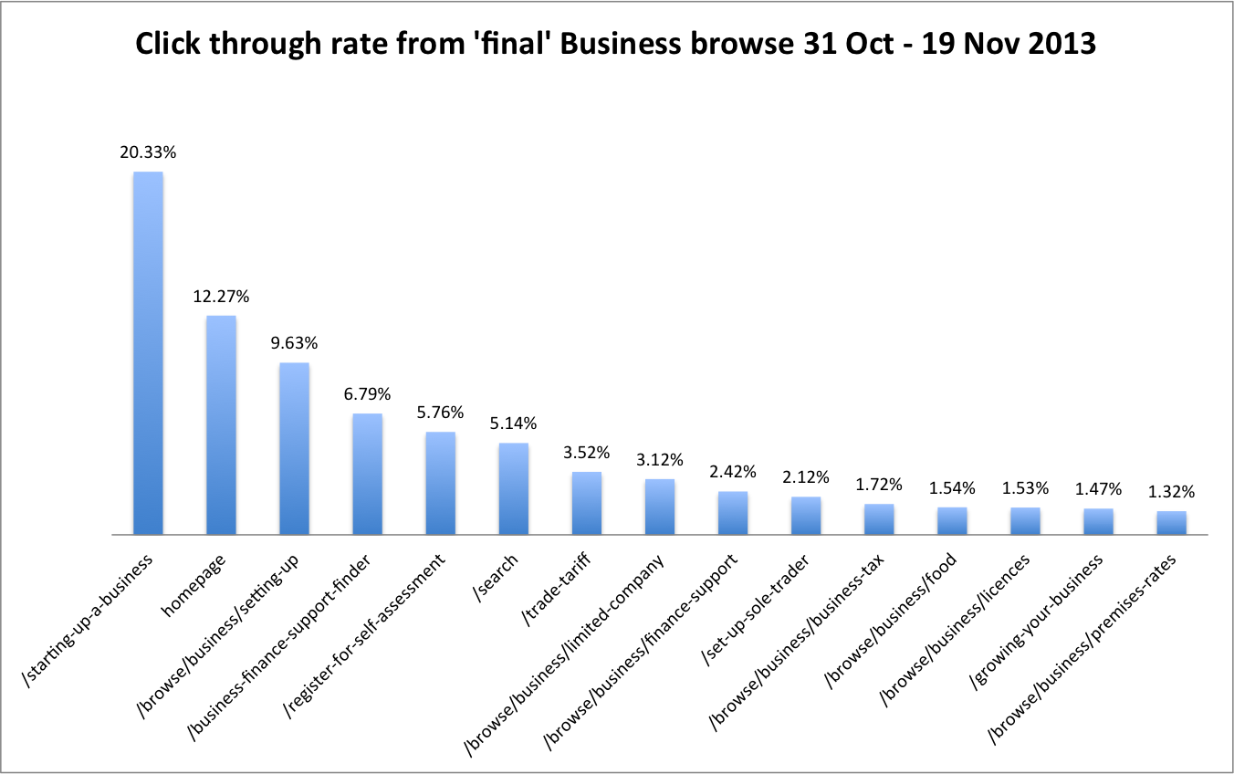
The chart here again shows the 15 most popular links. The most popular link was direct to Starting up a business, with the homepage still second, but less important.
Mapping these most popular links to the page layout shows that the redesign has been effective in getting users directly to the popular pages and to the highlighted links sections:

We were also interested in what users do after selecting one of the links on the /business page. Initial analysis shows that the the links at the top of the 2nd level browse pages perform better than those lower down. Links in the Get started in business section performed quite strongly too.
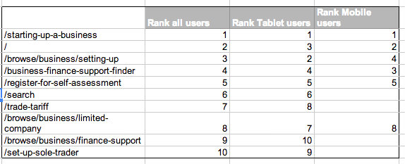
We also checked for any differences in click-through popularity for tablet and mobile users. As the table below shows, there were few:
Using qualitative research to understand the analytics
The data gathered during the trial showed a small uplift in the number of click-throughs to the most popular link - starting up a business, and a reduction in the exit rate.
To give us greater confidence in interpreting the data, we also carried out user research so we could understand why users were clicking on these links.
We carried out research with 19 participants in total, asking them to complete tasks based on analytics data. So we asked users to find business content that we already knew was popular on GOV.UK were looking for. We saw consistent patterns of behaviour across participants.
Are the 'popular pages' too popular?
The most striking observation was that participants were not interacting with the whole Business browse. Instead, we saw participants repeatedly selecting one section of the page and then using that as the starting point for the majority of the tasks.
The section that most participants ‘chose’ at first, was the Popular Pages, and we saw a number of participants who failed to scroll down to the other sections until they were well into the session and it was clear to them that the Popular Pages links wouldn’t suffice as starting points for all the tasks that they had been set.
We were testing the page at the most popular screen resolution (1366x768), and at this setting, the Popular Pages links take up the entire screen above the fold. If we think about this in relation to what we saw in the analytics data, we could make some hypotheses:
- that the uplift we saw in the number of click-throughs was due more to the fact that the Popular Pages are at the top of the page and take up the entire screen above the fold, rather than the success of these links in meeting user needs
- based on the lack of scrolling that we observed, that users did not realise that the Popular Pages were only the top 4 most popular links, but interpreted these as the main route into Business content
- that the number of click-throughs to ‘Starting up a business’ and ‘Growing your business’, which appeared were the 3rd and 8th most popular links in the analytics data, were influenced by the visual design - appearing more visible to the user in their vertical line of sight as they scanned down the page
The task completion rate was highest for those participants who were using the A-Z list as their starting point, but we also observed users repeatedly only scrolling halfway down the A-Z list, suggestion that the scannability and length of the list were barriers to engagement. Participants also commented on the lack of congruence between the links in the list (e.g. Maritime vessels and work at sea vs. Selling your business and closing down)
Next steps: iterate and retest
So we will revisit the design concepts to try to better distinguish the three sections and encourage exploration of the whole page. Of course, we’ll do further research that allows us to assess, evaluate and iterate the design.
We plan to test test new designs with content from other areas as well as Business, so that we can distinguish design issues from those to do with the information architecture and content about business.
From an analytics perspective, we want to measure the ‘quality’ of interactions of visitors arriving through the Business page. How will different designs of the Business page impact on how users get to and engage with content after they have followed a link?

8 comments
Comment by Andrew Wiles posted on
Trying to create a single browse page for 'business' is massive and does not seem to be responding to user needs.
From your data it looks like it would be best to create a new browse/area dedicated to new and start up business, one to growing an existing business and then the rest is running an existing business.
At the moment you are in danger of creating a website within a website and one that is looking increasingly like the old Business Link.
Comment by Ben Andrews posted on
Hi Andrew,
You're right, building a single domain website for government is a difficult problem to solve. One of the many things we're looking at is how the IA can be changed and improved which means all areas on GOV.UK, including ../business, will evolve. We won't get it right first time but we will iterate the design to improve it and we'll be blogging as we go to share what we have learnt.
Thanks,
Ben
Comment by Lesley Twitchen posted on
Interesting that users using the 'Find out more' section had better task completion rates. I'd be interested in knowing if users realised it was an alphabetical list as they used it, especially if the reasons given for leaving was lack of congruence. They clearly failed to see any connection with the labels.
Maybe compare with pages like this https://www.gov.uk/expenses-and-benefits-a-to-z to compare if calling it an A-Z increases the users' willingness to scroll.
Comment by Naintara Land posted on
Hi Lesley
I think you're right - labelling the A-Z 'Find out more' left too much ambiguity around whether this was an exhaustive list and how it differed from the other navigational modules on the page. In our testing, users commented on the lack of congruence between the items in the list, but this wasn't in itself a reason for leaving. That was to do more with the length of the list, after having already scrolled down and past the other navigational elements on the page.
We're currently feeding back the research findings into the design concept work, and are looking at cleaner, leaner concepts based around the A-Z list as one of the options.
Tara
Comment by Sue posted on
I am interested in finding out whether you have any information on employer satisfaction with the advice provided on the Business and self employed pages. Can someone help with this please?
Comment by Naintara Land posted on
Hi Sue
Happy to help - would you be able to clarify what specific information you're interested in?
Many thanks
Tara
Comment by Sue posted on
Hi Tara
I am particularly interested in any information on employer satisfaction with the information on DWP and Jobcentre Plus services for employers.
Thank you
Sue
Comment by Naintara Land posted on
Hi Sue,
Apologies for the delay - I've been digging around to see if we have any relevant insight for you. Our research was specifically focussed on the user needs and behaviour of new businesses and businesses employing staff for the first time. However, it may be worth contacting the DWP directly to see if they have any research for you.
Tara