We're using a new data visualisation tool called Tableau to reveal new information on how 'departments and policy' content is being viewed on GOV.UK.
The GDS departments and policy content team currently uses Google Analytics to track how content is viewed and the effects of changes made on the site. This helps departmental and agency editors identify gaps in their content and improve their content strategy.
Although Google Analytics provides the ability to do some data visualisation within the interface, it's limited by the number of columns of data it can work with and the types of visualisations it offers. We needed a tool which could use data from Google Analytics and other sources, to provide us with detailed analysis of how users interacted with different content formats on GOV.UK.
Using Tableau
Tableau can give quick, varied visualisations which will allow us to give web teams in departments data to inform decisions about content. We're currently only using it to look at content from the 26 departments but will gradually extend this to agencies as well.
We want to use Tableau to:
- understand how content formats are being used and be able to break this down by department
- group content by page views, exploring both the highly and seldom viewed
- create 'triggers' (measures) to feed back to departments, for example when the content share is much higher than the page view share
Experimenting with data
We exported several different usage reports from Google Analytics for the 26 departments' content for the month of May, to create a dataset in Excel. After cleaning up the data, we plugged it into Tableau. We excluded policies data for technical reasons.
We already knew that departments publish at different rates and that the volume of content sections varies. However, by visualising our underlying data in Tableau we discovered a lot more. Here are some examples.
Make up and popularity of sections
This treemap shows the number of content items that exist and the relative number of pageviews they received in the month. The size of the rectangles relates to the number of content items within each section and the colour intensity shows the popularity of the section. The darker the tone the higher the number of pageviews.
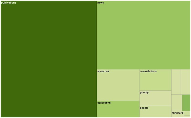
Overall, around half of departmental content is made up of publications and overall they are being visited a lot. News pages make up more than a quarter of content.
Treemaps by department
The data gets more interesting when broken down by individual departments. The treemap below shows DCMS content.
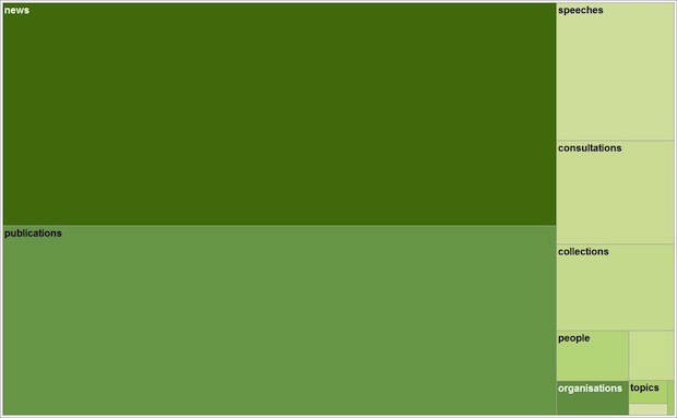
Publications and News pages dominate DCMS' content but in this case more users went to the news section in the month.
% of section pageviews
This stacked bar chart shows the breakdown of section pageviews for each department.
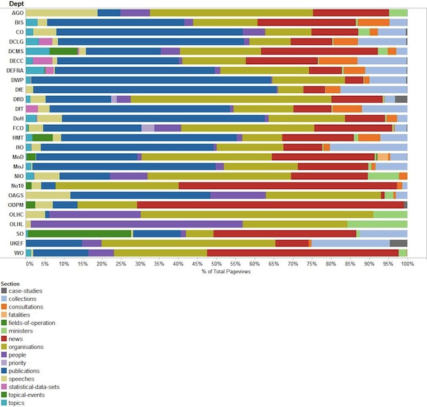
Departments who publish a lot, like the Department of Work and Pensions (DWP), Department for Education (DfE), and Department of Health (DH), have large percentages of publications pageviews. By contrast, the Attorney General's Office (AGO) and Department for International Development (DfID) have most pageviews coming from their organisation section.
Content vs Pageviews share
In this example, which excludes news pages, we compared each department's percentage share of content with their respective share of pageviews.
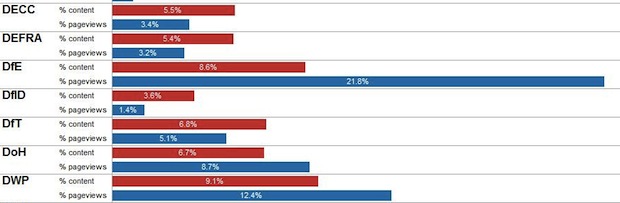
DfE's content makes up 8.6% of pages on GOV.UK and receives 21.8% of page views. This is a good publishing model because it suggests DfE is publishing what people are looking for.
Sharing data with departments
This was the first time we've been able to visualise data from grouped pages, and we're really excited to use Tableau to help departments improve and manage their content.
We want to make data more available to departments in the future and we'll continue to blog about developments.
Rosie Cowling is a Content Designer in the departments and policy content team and Ashraf Chohan is a Product Analyst.
Keep in touch. Sign up to email updates from this blog.
