A great thing about having lots of government organisations publishing content in one place is the ability to see how the various parts of the machine fit together.
GOV.UK offers a few ways for users to do just that, for instance links at the top of pages in the departments and policy section quickly let users see which organisations are involved in the activity described by each page.
But what does that data look like as a whole?
Just before Christmas, developer Edd Sowden thought it might be interesting to build a this visualisation of the degree to which government organisations are tagging their content to one another on GOV.UK. (He was wrong, it’s fascinating).
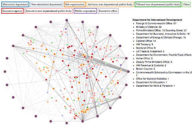
By clicking on the dots and dragging them around, you can get a sense of which organisations tag content to each other most often, and which operate more discretely, based on the numbers of pages they share.
Some health warnings
1. The data covers all content published in the departments and policy section prior to 13th December 2013. That’s some 70,000 documents, but well over half of those were migrated over automatically from organisations’ former sites and have not been edited since, so will not have been tagged to any organisation other than the one which produced it.
2. This was a side-project of Edd’s and as such is an unsupported tool. It has not been tested for accessibility or compatibility with older browsers, so please don’t write in if it doesn’t work with your setup. It should work fine in the latest versions of Chrome and Firefox, and IE9+ (but it won’t work in IE6-8).
3. We’d also caution against drawing conclusions about how departments are really collaborating. This data simply illustrates how tagging is being used by departments in the early days of GOV.UK and true collaboration takes many forms.
4. It’s a bit addictive. If it eats into your Candy Crush Saga time, we apologise.
We were pleased to see the extent to which organisations are starting to make good use of GOV.UK’s data model to present a unified view of government activity to end users. There’s obviously room to do more - the numbers are not huge - but it’s a great start.
Stay in touch. Sign up now for email updates from this blog.
Other GDS blogposts we think you might find interesting
We think people like being able to preview CSV files
Improving browse and navigation
Topic analysis and top tasks
...and all posts over on the Data at GDS blog

6 comments
Comment by Elliot posted on
This is really cool. Good to see Government making the sort of things people used to make at hackdays!
Comment by Alan posted on
Statisticians at the Home Office have been asking questions about how they can make their data have greater impact and how visualisations like this can be achieved via GOV.UK. Does GDS have any plans to make this kind of functionality available through Publisher?
Comment by Neil Williams posted on
We'd certainly like to, but realistically it's going to take us a while to get around to that. In the meantime we advise you to make use of third party tools (DFT have good form on this, talk to Tim Stamp) and promote them from your GOV.UK pages using static images and links.
Comment by Alan posted on
Thanks.
Comment by Graham posted on
Brings back fond childhood memories of spirographs.
In terms of Alan's point, should sites like Open Justice remain off the common platform until we can display data visualisations on GOV.UK?
Comment by Neil Williams posted on
Yes, that's fine and sensible, until the time comes. But bear in mind any new spend on such platforms needs to go through the usual controls.