We recently wrote about how we’re changing browse pages across GOV.UK. Here’s a bit more detail about how we tested and iterated the designs.
The new design: our goals
As we noted previously, the aim of GOV.UK’s browse pages is to get users to the task they are looking for as quickly as possible.
However, we know from research that the current design of GOV.UK’s ‘services and information’ (or ‘mainstream’) browse pages caused a number of problems with this.
For example, the descriptions under each link can make pages very long, and combined with the number of navigational routes, users can become disoriented and end up ‘lost in browse’ - going round in circles without even realising.
To prevent this happening, we decided to try a design that exposed the architecture of mainstream browse and stripped back the descriptions, to see whether that would help.
The first prototype
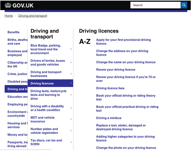
The screenshot above shows the first prototype we tested.
We took this prototype out to pop-up research with the general public, going to libraries and offices in central London and in 2 small North Yorkshire towns, and putting it in front of as many people as we could. This approach enabled us to explore the views of people of all different backgrounds, ages, and levels of digital skill.
What we found was really interesting.
In London, we mostly ended up speaking to city workers, who used the internet daily. We found that they were broadly able to find information far quicker than when using the current design.
However, the design tested less well in our North Yorkshire research, when we spoke to a wider range of people, some of whom were less confident with using the internet.
These findings meant we needed to research the new design further, to understand and iterate on the potential problems we had identified.
So we organised another research session, in a Bournemouth research lab. We tested with 3 users who were confident with computers, and 3 pairs of users - one or both of whom were so low in confidence using a computer that they preferred to do it together. We gave them a list of tasks, left the room, and watched as they used the new design. We then chatted to them afterwards about what we had observed.
From this research, we learned 4 main things about the first prototype:
- users were confused where to look when presented with multiple columns
- having multiple lists exposed on the page was also distracting when users were trying to scan for a keyword
- without the context that category descriptions offer, it was difficult for users to know which option to select
- users weren’t moving back and forth through browse as hoped, but were instead using the back button to ‘start again’
We then fed these findings back to the product team, and used them to create a second version of the prototype.
The second prototype

The second prototype, above, responded to our findings from user research by:
- greying out non-selected options in the top level navigation, to make these less prominent
- revealing second-level category descriptions
- introducing animation to show the levels of browse slide over each other
We tested this iteration in a second lab day, this time in our in-house London lab. This meant we could use eye-tracking software to see where users were actually looking when using the new browse design.
We found that the changes we had made were largely successful. In particular, the second-level descriptions really appeared to increase users’ confidence in selecting a category.
From eye-tracking, we were also able to tell that users were taking time to read the descriptions, and were no longer being distracted by the (now less visually prominent) top-level categories. See the below video for an example of this.
http://player.vimeo.com/video/99934154?title=0&byline=0
Next steps: release, analyse and iterate
Based on the results of this research, we think that we are at a point where we have a solution ready to try out on the live site.
We’ll monitor the percentage of users exiting or resorting to search from browse, as well as conducting in-depth analysis of common user journeys. If we spot any problems, we’ll make changes based on this data.
Keep in touch. Sign up to email updates from this blog.

1 comment
Comment by mitesh posted on
Hi,
Is the code for this available on GitHub ?
Thanks