Recently a small team of us have been revisiting the GOV.UK navigation and search. We’re making lots of changes, big and small, to make moving around GOV.UK easier.
This blog post is about the problems people have been having with GOV.UK’s navigation and what we’re doing to fix it. It’s the story of about 3 months of work, and what we found out about our users along the way.
Why navigating GOV.UK is hard at the moment
Currently the site covers 3 different content areas, split into pages:
- for the majority of citizens interacting with government
- for those with a professional-level interest in a specific subject area
- about the government and what it is doing
Within GDS these areas are referred to as 'mainstream', 'specialist' and 'whitehall', which are horrible names and a bit misleading, but you know how nicknames stick.
The information architectures of these 3 different areas were developed fairly autonomously. This was largely because the transition brought (and is still bringing) a vast quantity of content from so many different websites.
Working like this allowed us to concentrate on addressing the needs of the specific audiences and content types that we already knew existed. It meant we didn’t get bogged down in an endless task of creating a speculative taxonomy for every object and idea in the UK.
It was also an acknowledgment that we didn't know how user behaviours and expectations of government websites would change once everything moved to a single domain. We decided it was better to make the thing, observe users and then iterate.
It was the right decision then, but now’s the time to change it.
Problems people have getting around GOV.UK
One of the founding design rules of GOV.UK was that there should be "no need for a user to understand government to interact with it".
Years later we've seen that whilst this holds true for the majority of users, simply removing services and information from their organisational context is confusing users who have already invested time into understanding how government works.
These users often start their journeys at the homepage of the department they're used to interacting with (the 'whitehall' area of GOV.UK) when the content they want is actually in the mainstream or specialist areas.
On top of that we’ve got 3 routes of navigation which are often named very similarly to each other, but contain very different content.
For example, if you want to find the GOV.UK list page for schools content you have to choose between:
- gov.uk/browse/education/school-life (mainstream navigation)
- gov.uk/schools-colleges (specialist navigation)
- gov.uk/government/topics/schools (whitehall navigation)
That means if a user wants to find out what government is doing about schools and only about that, then they can visit gov.uk/government/topics/schools. But if they want to find out what government is doing about schools and see what’s on the national curriculum, then they start having problems.
Changing mainstream navigation
Pages written for the majority of citizens interacting with government - 'mainstream content' - are organised loosely by task themes, for example ‘School admissions and transport to school’ or ‘Your rights at work and trade unions’.
But we know that task-focused users want to get to something specific: an essential piece of information or a particular service. "Get to the quick do" as Tom Loosemore used to say.
We realised that the thematic navigation pages we're providing for these users are actually quite obstructive. To users exploring them, they seem like an endless journey of identical looking lists, each appearing in search and none of them really offering any value.
GOV.UK is way too big a site for a simple menu bar to fit everything, but we need something closer to that than the current model.
We started looking at alternative forms of menu user interface (UI) and found miller columns.
They're not commonly used on the web but they've been a core interaction in just about every graphical computer UI since 1980 (including Windows, MacOS, NeXT and iOS). They give us the twin benefits of:
- reducing page fatigue for users
- removing the need for all the confusing list page URLs that show up in search (although yes, every part of the miller column UI will be linkable and accessible without JavaScript).
When built, they’ll replace all current navigation pages across mainstream and look like this:
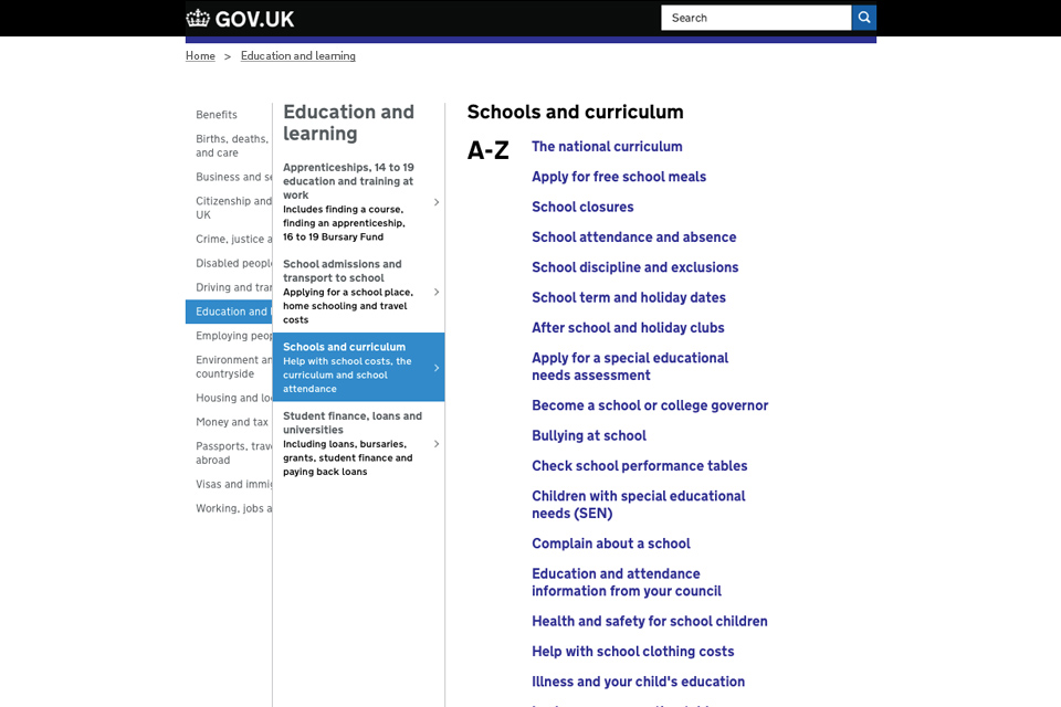
Charlotte has blogged separately about our research and iteration of this design.
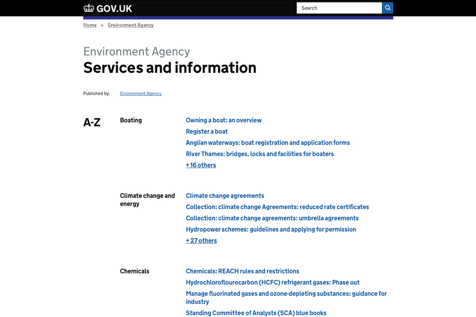
Changing specialist navigation
We use the term 'specialist content' to refer to pages for those with a professional-level interest in a specific subject area.
This stuff is organised by very specific subjects. But the interesting thing we discovered about the users of specialist content is that it's really important for them to have a clear domain knowledge of their particular category – all of it.
Users often bookmark and periodically revisit navigation pages in specialist content. This is because they assume that the page contains all the resources they need to comply with the law in their job or task, for example commercial waste disposal.
Rather than just optimising for speedy user flow through these pages, we've realised that we also need to concentrate on showing the edges of the content contained on them.
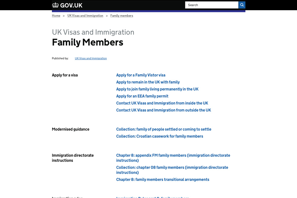
Another problem is that at the moment mainstream and specialist navigation pages don't really link to each other. It's possible for a user to get stuck in the wrong part of the site (especially when they arrive via a search engine), which shouldn't be the case.
On the specialist navigation pages we're going to list all the relevant mainstream content on the page alongside the specialist content. The research we’ve done indicates that it’s useful for people who want to know everything about a subject, for example accountants. It also helps people who are just looking to do one task get where they need to go.
It's a little more complicated at the mainstream end - we don't want to complicate the navigation for the majority of users by filling the categories with niche content.
At the moment we're experimenting with overflow links from the mainstream navigation categories that take the user to relevant specialist ones, but getting the phrasing right is proving to be difficult. (See Cath Richardson's blogpost on this).
Vicky blogged more about the specialist navigation pages last week.
Changing whitehall navigation
Finally we have 'whitehall' – pages about the government and what it is doing. Content there is organised by publisher (the department or organisation) or document type, but also has a layer of subject-based navigation.
According to the analytics, no one looks at the subject-based navigation in this part of the site. But we do think the functionality is important. Citizens should be able to see what the government is doing about something, like High Speed Rail, without knowing which bit of government owns the project. When we experiment with showing relevant content about the government areas to users, they do find it interesting.
We need to do more research to make sure, but it looks like we’re currently surfacing this navigation method to the wrong users - that users engaged with particular topics are not necessarily engaged with the departments associated with those topics.
So we're planning on taking this content to the area of the site they already use – removing it as a navigation route from whitehall and making it part of specialist.
The other problem whitehall users encounter is that it’s currently not clear what services and information a particular organisation has responsibility for. So we're building a sort of 'directory' page for each organisation on GOV.UK, which should mean that you can get to anything published by an organisation within 2 clicks from their homepage.
Iterate. Then iterate again
Combined, we're expecting the changes to these 3 areas to remove the problem of duplicate navigation pages.
In the schools example I gave earlier, there'll only be one relevant navigation page: gov.uk/schools-colleges. But from that page you'll be able to access all the content that used to be split across the previous 3.
We’ll be monitoring and iterating these changes, and we’ve got plenty more work to do to the GOV.UK navigation. The search and browse team is going to be a permanent workstream within the bigger GOV.UK product team.
Keep in touch. Sign up to email updates from this blog.

15 comments
Comment by Lissa Allcock posted on
Will the Miller lists work with touch screen computers like iPads? Typically the extra levels in such things apear when you mouse over them and the odd other site I have found using these tends not to play well when the mouse is lacking.
Comment by Mark Hurrell posted on
Hey Lissa, we're using click or touch interactions on our miller lists rather than mouse overs, so they work well with touchscreen devices.
Comment by Harry posted on
I have noticed huge improvements in gov.uk and it is clear to me that accessibility and navigation are valued very strongly on the site. It is friendly and overwhelmingly the best way a website can work for such a diverse range of users.
Comment by Umair posted on
Hi. The A-Z directory concept is interesting. Will organisations be responsible for managing and editing these pages? Thanks.
Comment by Mark Hurrell posted on
Hi Umair, the directory pages are generated automatically. This means they'll be comprehensive and stay updated without any extra work for the organisation
Comment by Andrew Robertson posted on
This is great news and should go a long way to address customer criticism about not being able to find things
You said it should be possible to find all information from an organisation within 2 clicks. Have you had chance to think how organisation home pages may need to change?
Comment by Mark Hurrell posted on
Hi Andrew, we've observed a lot of users with this work so I'm sure everyone on the team has ideas they'd like to try. However, for the moment we've been keeping focused on solving the particular problems I outlined above.
Comment by Chris posted on
I am an avid watcher of the GOV.UK developments and wish to thank you guys. all of you across all the wortkstreams for producing a living, breathing site that is constantly adapting to user needs. What you are doing is truly groundbreaking work and I as a citizen thank you greatly.
Chris
Comment by Jamie Tetlow posted on
Lovely interface, very intuitive. Small bug: The breadcrumb parent URL logic seems a little out of whack, the final item in the breadcrumb has a 404ing link when you're at the second level of a menu selection. For example on this page https://www.gov.uk/browse/business/premises-rates the breadcrumb item "Business and self-employed" links to this 404 https://www.gov.uk/browse/finance-support - that is all.
Comment by Sam posted on
As a web developer, I'm lucky to get three months to get a whole website built, never mind just perfecting the navigation! It's really interesting & useful reading stuff like this. Thank you.
Comment by Council Worker posted on
Will be interested to see how the analytics from this show it's being used.
Does throw up some weird quirks.
See eg https://www.gov.uk/browse/driving/vehicle-safety
Why is "The drink drive limit" under T?
Comment by Russell Larke posted on
Great stuff in general but some things just seem like a pointless extra step like accessing the EA's waste carriers register. There doesn't actually seem much point in the .gov page when you used to be able to go straight to it.
Comment by Russell Larke posted on
Thank you very much for passing my comments on to the guy at the EA who very kindly sent me an email. We had a little discussion about my comments, excellent service.
Comment by Mitesh posted on
Hi,
Do you guys have js/css for the miller columns on Github. Would be interested in implementing a similar concept. Thanks
Comment by Mark Hurrell posted on
Hi Mitesh, the code for the miller columns is part of the collections app on github
https://github.com/alphagov/collections/tree/master/app/views/browse (link to the view files)
unfortunately the code for that particular interface is quite embedded throughout the app, so it might be simpler to recreate the front-end code from viewing source than via the repo