The information in this blogpost may now be out of date. See the current GOV.UK content and publishing guidance.
As you may have noticed, we’ve recently been hard at work developing and testing a new navigation for GOV.UK.
In doing this, we’ve often asked ourselves “why shouldn’t we just say, in our navigation, who this particular piece of information is for?”. It seems so simple and user-focused.
But whenever we’ve tested this audience-based navigation approach, it’s run into problems.
Here’s why.
It's hard to know what to call people
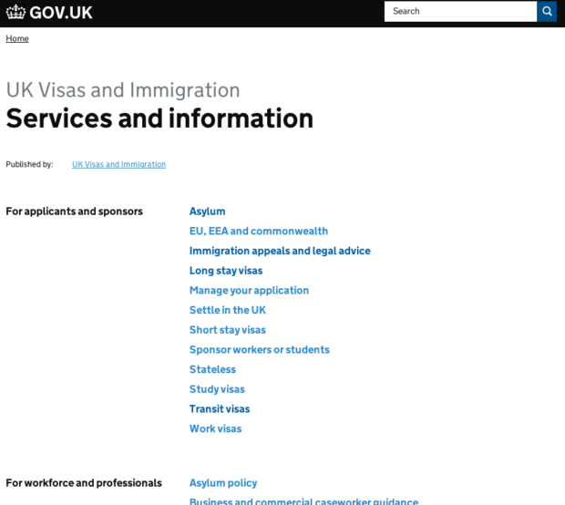
We tried a few different words for labelling specialist topics such as 'professionals', 'workforce' and 'industry' - thinking that, although wording like this might not be meaningful to everyone, it might provide a useful signal to the users it was directed at.

However, we found that although these terms worked well for users whose mental models fitted the language we were using, they were not well understood by everyone.
For example, some people ignore phrasing like “professionals” because it sounds like it’s to do with HR or training.
I was looking at that and thinking, would I use that, or is that more about training and professional development?
It's easy to accidentally send people away from the information they're looking for
If you explicitly say that more detailed and specialist information is only for a certain type of user, then you run the risk that other people will ignore things they may need to know.
Or, in a worse case, they may think the information for them is not even available.

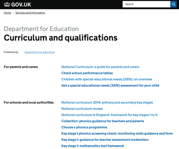
For example, on a recent round of research we labelled educational topics as either ‘for parents and carers’ or ‘for schools and local authorities’.
A school governor explained why he didn’t know what to look at on a page with information about the curriculum:
I would think it is all there - I start panicking that there is nothing there for governors.
We also found that some professionals objected to this approach as they felt that the information labelled for them was still really important to other users.
For example, when we tested this approach with immigration lawyers, they felt concerned that labelling the technical guidance in this way could harm applicants.
From the point of view of judicial reviews - the applicant may fail due to something in the policy and guidance. They need to see that too.
It’s hard to get the audience groups right
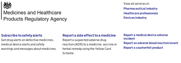
We tried creating different topics for the Medicines and Healthcare Products Regulatory Agency’s (MHRA) 3 main user groups: the pharmaceutical industry, healthcare professionals and the medical devices industry.

When we began doing research we quickly discovered that users aren’t easily categorised into these 3 groups.
For example, there are a number of hospitals who make medicines and need information on best practice - this information was grouped under ‘pharmaceutical industry’. There are also a number of people working in the pharmaceutical industry who want to find out about drug safety information - this information was all grouped under ‘healthcare professionals’.
Although we could have duplicated information by putting it in both topics, we felt we could meet the user needs better by using the topic label to describe the information covered (for example, ‘medicines: manufacturing and licensing’, or ‘drug and device safety’.
People aren’t ‘specialists’ or ‘mainstream' users
We talk a lot about ‘mainstream users’ and ‘specialist users’ as shorthand for describing the types of use cases we need to design for.
But sometimes, people aren’t so easy to group. Parents become governors; business people get involved as charity trustees; people complete their own tax returns in complex circumstances.
Even within a particular group, people have changing needs.
For example, teachers often take on new responsibilities in their school and need to find out about a topic for the first time. In a research session, a teacher was looking for information on teaching a child with special needs, but the specialist information was too detailed for her. She needed an overview to introduce her to the topic - which is what the mainstream guide does.
If I had a child with special needs [at my school] I’d come here thinking what do we need to do, and I’d click on here and think, "oh bloody hell!"
People approach a service based on the task they need to complete; not on their job description.
Unless users’ needs can be clearly divided into distinct audience groups, then it’s very difficult to get audience navigation right without introducing lots of duplication and potential for people to get lost.
As we often find, our research points us back at the design principle 'do less'.
Gerry McGovern came to a similar conclusion in his research into audience based navigation.
So, does audience labelling ever work?
So far, there is one place where our research has shown audience-based labelling can support users to find relevant information.
It’s at the level of a specific piece of content.
At this level, there’s more space to describe the users to whom the content will be most relevant. When you’re describing one item it’s also much easier to say who it’s written for, than it is when you’re trying to apply a label to a group of things.
We’ve also found that by the time users get to the content level, there's enough information for them to decide if they want to read something. Based on the title, the description and a quick scan of the contents, they can make an informed decision for themselves. (This is even true if the audiences listed don’t match them exactly.)
It’s not as easy to support this when users are browsing at the navigational level where there is less information about each individual item.
Our conclusions
So - the upshot of all this user research is that at the navigational level, we recommend using labels that describe the information contained in a topic, not labels based on audience type.
Of course we’ll continue to test and iterate this approach.
If we find that there are circumstances where audience-based navigation works, we’ll use it - but only where we have evidence it’s the best way to meet users’ needs.
Keep in touch. Sign up to email updates from this blog.
 The GOV.UK app went live in public beta in July 2025. Find out what’s been happening, and what’s coming next,
5 comments
Comment by Graham Lee posted on
Excellent blog!
Will this research help reshape the overall nav and approach to content on GOV.UK?
It does seem to undermine the whole mainstream/specialist split (reflected in 'info & services' and 'depts & policy' labels in the top level nav).
Comment by Cath Richardson posted on
Hi Graham,
we are evolving the navigation and it does challenge the mainstream / specialist split. There's a lot more on that in this blog post - https://insidegovuk.blog.gov.uk/2014/07/15/improving-gov-uks-navigation/
There is still a need for the most common tasks and information (the top user needs) to be surfaced most prominently through browse - this is effectively what we call mainstream browse. We're now looking at the best places to link through from here to the more detailed / comprehensive view of all the services and guidance on a particular topic. I expect there will be other changes to navigation as we continue to iterate this and find the best ways to get users to the things they are looking for.
Comment by Kate Roberts posted on
Brilliant post. I’ve worked for a few non-profits who either have, or want to have, a section called ‘For professionals’ or something like that, and found similar problems when testing it - the people whom we think of as ‘professionals’ don’t always identify as such; and sometimes donors or service users want the same information as ‘professionals’.
Comment by simonfj posted on
He Cath,
Can I just mention of thing here. It's to do with "when one only has a hammer, every prob is nail".
The approach you're taking as a publisher is one that every commercial publisher goes through. But that was before the social web was introduced over a decade ago. Now we have people who read and compile by collaborating on pages/articles in encyclopedias. They, especially librarians, often help one another find something around the web, so long as there's a place to talk.
But that approach doesn't appear to be considered in the gov.uk domain. We have "does this page have a problem?", the response to which goes into a black hole (to be fixed). But if the same link said something like "are you after related information?" and pointed at an online social hub, then it's natural (for experienced people) to use it as a way of exchanging useful stuff. It often acts to help people to find their peers and collaborate.
You know "the long tail." You'll never get to the stage, through classification of information, where every reader will be satisfied, cause we all think so differently and have such different learning paths. Any chance we might take the modern approach to online learning and just offer readers the opportunity to collaborate?
Comment by Richard posted on
Bang on.
I worked for a large telco once, which was determined to present information by audience type for its B2B services. It failed miserably when user tested as people repeatedly expressed dislike of being pigeon-holed and the categories really did not map onto the main differences between how users wanted to structure their journeys.