We'll shortly be reordering the ‘services and information’ part on the GOV.UK homepage into A to Z order.
This change is the first step in launching the new 'mainstream browse' that Mark blogged about last week.
During user research, we saw that users were confused when moving from the current, unordered, homepage to the new browse and back again. Changing the GOV.UK homepage to A to Z order fixed the problem.
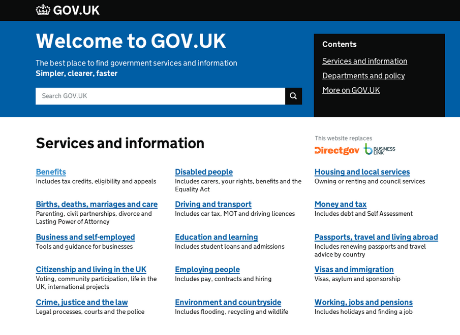
This is what the new homepage will look like:
We'll be keeping an eye on these browse changes and, as ever, will iterate accordingly. If you've any questions or comments please do post below.

10 comments
Comment by John Ploughman posted on
Hey Will.
Just wondered if any testing had been done on the 'top to bottom' A to Z, rather than 'left to right'.
I just looked at the screenshot, knowing that I was looking for an A to Z ordered list, but I naturally found myself reading it to left to right across the rows.
Comment by Dan Craddock posted on
Interesting decision. I agree with John, that this seemingly runs counter to the 'F-shape' reading pattern. However, being a responsive design, presumably it'll make more sense when displayed in a single column on a mobile screen.
Will - did you find that the new ordering reduced users' ease in finding the more popular content/top tasks? e.g. I would've thought 'Working, jobs and pensions' would be more popular than 'Disabled people', for instance, but the former is nine links (or 13 links if reading left to right) lower than the latter.
Comment by Will Callaghan posted on
Hi both, thanks for posting.
Right now we're going for 'top to bottom' A to Z as it matches the arrangement on mainstream browse. We're keeping an eye on this though as it may well be that left to right is better.
Comment by Andrew Robertson posted on
Will you be altering the services and information link in the grey section at the bottom of the pages? The 'environment and countryside' option is missing from the footer section. Do people even use the links in the footer, I wonder?
Comment by Will Callaghan posted on
Hi Andrew, would you send us a ticket about this? Thanks. I don't have footer stats to hand, but we're planning to review it in the future. We'll post here before any work starts.
Comment by Andrew Robertson posted on
Done: ticket #788870
Comment by Will Callaghan posted on
Thanks!
Comment by Rahna posted on
Agree with this approach. Following guidance and usability testing I did the same on Rochdale.gov.uk last Nov. Focused on speed and customer satisfaction; not just task completion.
Comment by Donna Freeman posted on
I'm also interested in the top to bottom vs. left to right. As a user, left to right always throws me. Did the responsive design have anything to do with the decision?
Comment by Will Callaghan posted on
Hi Donna, thanks for your comment. We've decided on top to bottom as it matches the new mainstream browse. As always we'll be keeping an eye on this and making any changes as needed. All the best, Will